What You REALLY Need To Know About The US Dollar… And How It Might Impact U.S. Equities
Most active investors are aware of the near vertical move of the US Dollar Index over the past 7-months or so. Some investors might agree that the long-term RSI readings are at extremely overbought levels, implying some kind of forthcoming pullback. While still others might argue that such a pullback only alleviates such an overbought condition, setting the stage for the continuation of a rallying US Dollar.
These are all great conversation pieces whether at the office or over a drink, but in my mind, there is something more important that should be discussed as this could impact the way that you view the overall health of the U.S. Equities market.
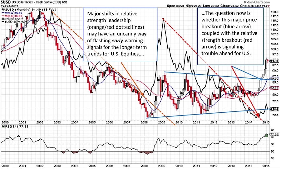
Getting right to it and without overcomplicating matters I want to focus your attention on the chart below. Note the solid black line as it is the key driver of my analysis. It represents a relative strength (RS) comparison of the US Dollar Index (USD) to the S&P 500 (SPX). A falling trend suggests an outperforming U.S. Equities market (via SPX) and a rising trend denotes a relatively stronger USD.
Here are four key takeaways from the chart below:
1. A major RS peak ended abruptly in 2002 as SPX was launching into a major cyclical bull market. As a result, the SPX began a cycle of outperformance over the USD (orange dotted line). However, the late 2007 RS breakout of the USD (orange solid line) warned of a shift favoring the relative safety of the USD over SPX which strikingly mirrored a major price peak in SPX.
2. The strong US Dollar outperformance then suddenly peaked in early 2009 near what looks to be slightly before the end of the 2007-2009 bear market (March 2009) and the beginning of the next major bull market to follow.
3. SPX have since steadily outperformed the USD… until recently as the 2009-2014 RS downtrend looks to have been broken towards the end of last year (red dotted line and arrow).
4. Note the multi-year symmetrical triangle breakout in the US Dollar as this accurately signaled a surge higher in prices. The size of this pattern also suggests that even higher prices are still possible and that any pullbacks could provide attractive entry levels.
Now with SPX nearly 6 years into its bull market and a U.S. Dollar that looks to have emerged as a leader on a relative strength basis, could this be pointing to a weary US equities market, or perhaps something a bit worse? This analysis does not suggest that SPX has peaked, but it may rather be flashing a warning signal into this trading year ahead.
In my mind, this is the question that investors and traders need to keep in the back of their mind. See chart below.
As a personal disclosure, I do not own or have a direct financial interest in any security mentioned. Although I am affiliated with T3 Trading Group LLC, opinions reflected are my own and should not be considered as investment advice. Thanks for reading.
Follow Jonathan on Twitter: @jbeckinvest

: Showing Some Signs of Emerging Strength")

