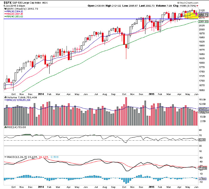
The S&P 500 appears to be confirming a false breakout as it starts to pull back off a major Fibonacci extension level mentioned here before. The broad market bears are winning the battle. At the same time, long biased stock traders are still rolling in it. Really, The only people not winning in this market right now are bond bulls.
At the same time, there seems to be this stigma attached to the next stock market correction as ‘the big one’. The ah-ha you can’t fool me sentiment has grown stronger, which just seems structurally bullish. Obviously, it’s allowing for some massive gains in individual stocks.
Friday’s bounce was incredibly broad in growth stocks after the false breakout early in the week. Are correlations picking up? Maybe. Regardless stock action was pretty great.
As well, defensive sectors like utilities and staples are struggling. Treasuries are hitting new lows and Gold can’t find a bid. That speaks volumes to me.
Enough talk, let’s dig into the charts.
MACRO
There are so many layers of support in the S&P 500. I’m particularly watching the weekly candle bottomy tails down to 2070ish.
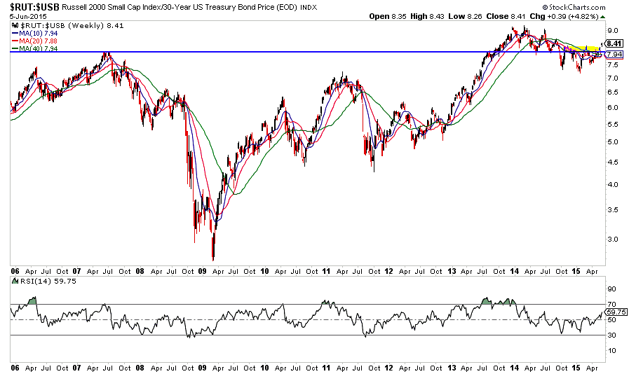
The Russell 2000 to 30 Year Treasury ratio is ripping out of a 9 month bottoming pattern as the moving average’s turn up. How much bond money is flowing into stocks?
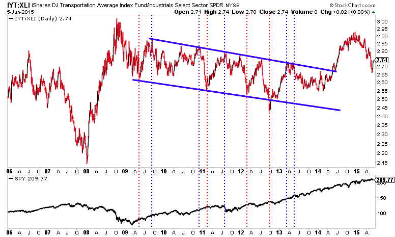
With all the talk of the transports divergence, not once has somebody mentioned the extreme dislocation in the second half of 2014 where transports massively outperformed relative to industrials. Now that major dislocation has been resolved.
The Bond Market
Clearly the bond market is the biggest “in-our-faces” risk. Instability and uncertainty of any sort historically drives valuations lower. However, that didn’t really happen with one of the strongest U.S. dollar rallies ever. It’ll be interesting to see how this all plays out.
Jonathan Beck laid out the signs of a widening yield curve last month.
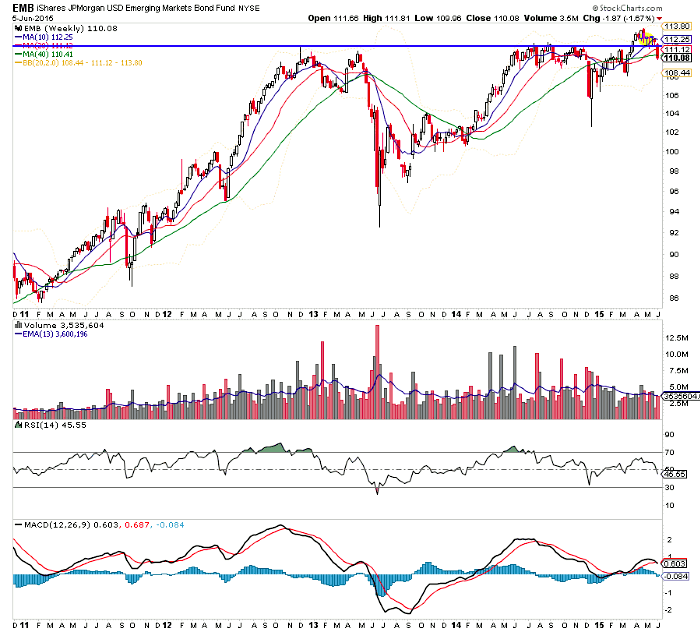
A couple of weeks back I noted the relative strength in emerging market bonds. Well, that’s gone now and we saw a pretty nasty base breakdown.
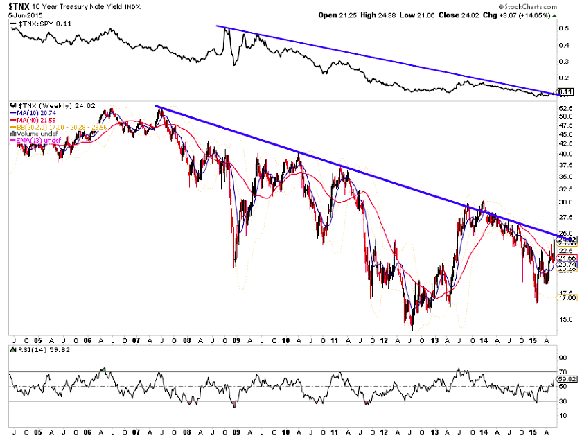
The U.S. 10 Year Treasury (TNX) is testing major resistance here (blue line).
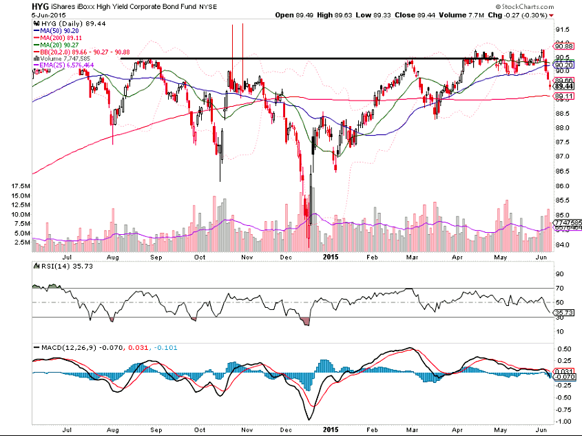
High Yield Corporate Bonds also broke down in a big way. But, it’s probably not worth getting that worked up about until the March low is taken out. The worst case scenario is this is a year long M top as sellers have shown up at the 90-91 level time and again.
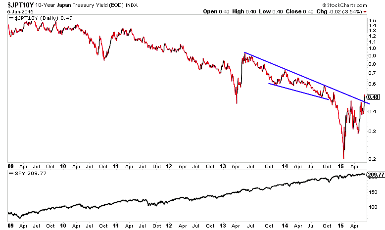
Japan’s 10 year note has broken a multi-year downtrend.
Other Markets
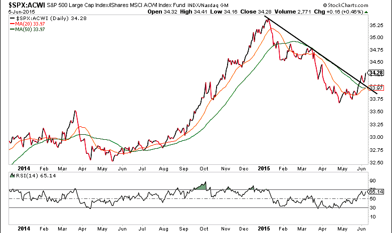
U.S. Markets (represented by the S&P 500) have broken clear of the 2015 downtrend relative to the rest of the world.
Thanks for reading and have a great week!
Twitter: @ATMcharts
Read more from Aaron on his blog.
No position in any of the mentioned securities at the time of publication. Any opinions expressed herein are solely those of the author, and do not in any way represent the views or opinions of any other person or entity.

: Showing Some Signs of Emerging Strength")
