It’s always interesting to see how investors and traders handle market tension. Typically market tension evolves after big runs higher and lower, or alternatively when the market moves sideways.
Over the past 18 months, one could argue that we’ve seen both in the stock market… over the broad time frame, as well as within select shorter-term time frames.
This has lead to on-going tension between bulls and bears that ratchets up even higher at select times. Right now is one of those times.
We’ve seen a big move higher in stocks over the past several weeks and bulls and bears are both aware of what is at stake: A potential breakout to new highs or the possibility of falling short and forming a lower high. But within that view, let’s also be aware that there are many short-term opportunities.
If you are a short-term trader, you may be looking for a “long” trade setup here… or you could be sitting on a profitable “short” trade. If you are a swing trader, you may be managing (trading) around a “long” trade… or building a new “short” trade. And finally, if you are a portfolio manager or longer-term investor, you are more than likely diversified with a skew to the “long” or “short” side.
So what’s all this mean and why am I mentioning this? Time frames matter. A long-term investor shouldn’t be debating with a short-term trader (and vice versa). Research comes in all time-frames and it’s our job to either ignore it, or take it in within its given time frame. Respect.
Below are a few charts that I found insightful, given the current juncture in the equities market. The first comes from fellow See It Market contributor Steve Deppe – here’s his tweet from Tuesday. It shows some Fibonacci retracement levels for the S&P 500 Index… along with a note that even a move to 1973 wouldn’t necessarily be bearish for investors. Likely a heck of a trade, though, for traders…
It’s not even remotely “bearish” to trade back down to ~1,973. Smartest of bulls should be looking for this. #spx pic.twitter.com/eV1VXf14T0
— SJD10304 (@SJD10304) April 5, 2016
The next is a simple chart of the broad-based Wilshire 5000 Index that shows the current downtrend line and range that we’ve been in. This tweet came yesterday from fellow See It Market contributor Dana Lyons.
Wilshire 5000 Rejected by Post-2015 Down Trendline $W5000 pic.twitter.com/19fpZMGlSo
— Dana Lyons (@JLyonsFundMgmt) April 6, 2016
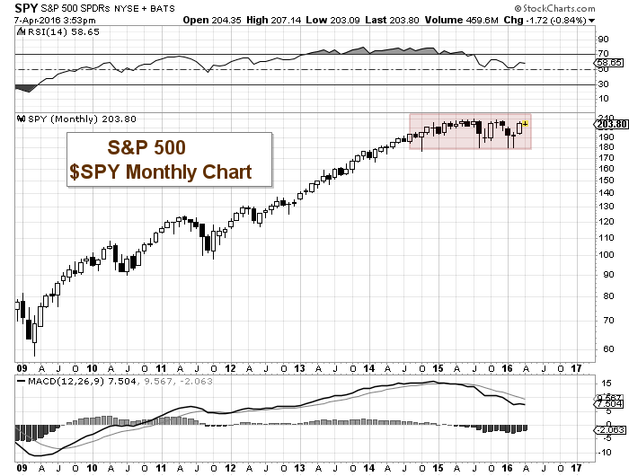
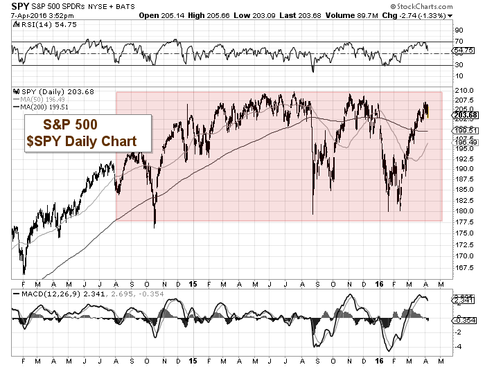
The next two charts are of the S&P 500 ETF (SPY) using a monthly candle chart vs a daily candle chart. The monthly appears a bit calmer, while the daily offers more character to the current environment for stocks. The range has been wide and there’s been a lot of room to play within it for those with discipline.
S&P 500 ($SPY) Monthly Chart
S&P 500 ($SPY) Daily Chart
Stock picking and shorter-term trading have been en vogue for a while now… but that market environment can change quickly so stay tuned.
I’ll take a more in-depth look at the S&P 500 over the weekend. Trade safe and thanks for reading.
Read more from Andy: “Nasdaq Composite Runs Into Major Price Resistance“
Twitter: @andrewnyquist
The author does not have a position in any mentioned securities at the time of publication. Any opinions expressed herein are solely those of the author, and do not in any way represent the views or opinions of any other person or entity.


