A commodity currency describes currencies of countries that rely heavily on the production and export of commodities. And three commodity currencies that I often use in my commodities analysis are the Australian “Aussie” (AUDUSD), New Zealand “Kiwi” (NZDUSD) and Canadian “Loonie” (CADUSD). I find that these currencies can be helpful in exploring correlations with different commodities. And today we’ll look at Gasoline prices and show an interesting correlation to the Aussie.
But first, let’s take a look at an example of how commodities and commodity currencies can work. A couple of months ago, I looked at the correlation between the Loonie and the Oil Services Index (OSX) and Crude Oil. While not EXACT, they did offer a heads up of potential support.
- Why I Think 44.22 Is A Low For Now On Crude
- Will Crude Oil Prices And Services Bottom With A USDCAD Top?
Okay, so as I mentioned in the intro, today I’ll be looking at Gasoline prices and the correlation between Gasoline futures and the Australian Dollar (“Aussie”).
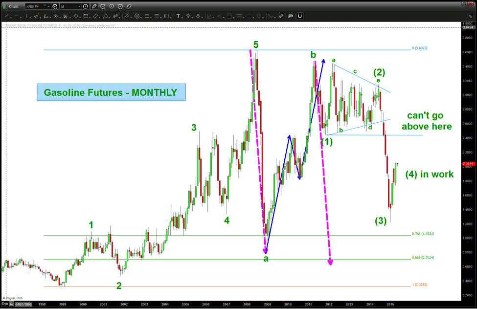
Let’s start by taking a look at the monthly chart of Gasoline futures (see chart below). Here are some takeaways:
- If the count is correct then we are bouncing in a 4th wave higher which should not (according to the rules of Elliott ) exceed wave (1)
- The dashed pink arrows show a potential target once the 5th wave gets going to the downside. That will have to be updated as this plays out.
Gasoline Prices Long-Term Elliott Wave Chart
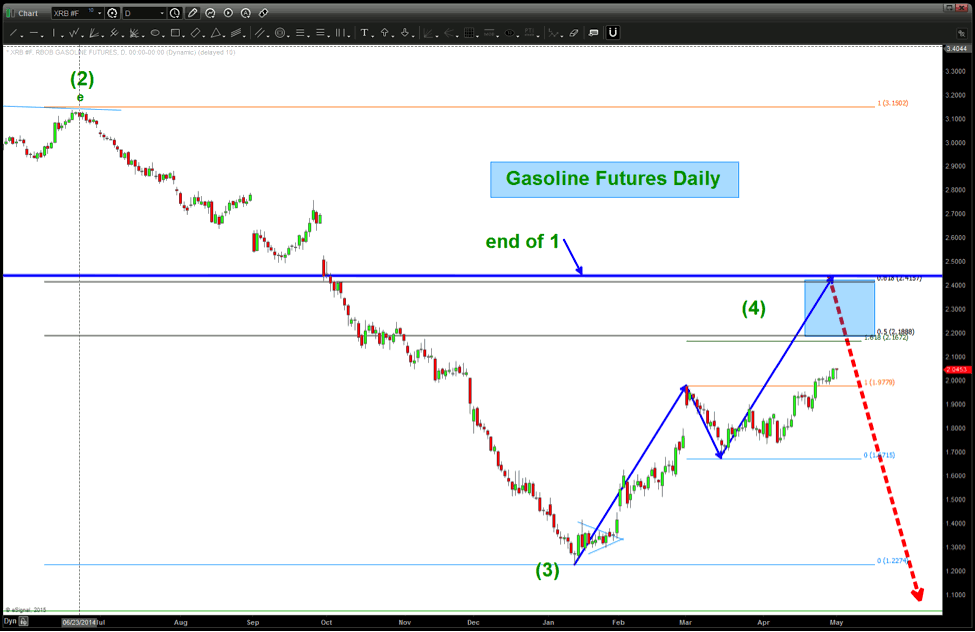
Now let’s zoom in and look at the daily chart showing potential 4th wave price targets:
Gasoline Prices Short-Term Elliott Wave Chart
Now, below is Gasoline Futures chart with the Aussie Dollar overlaid on top of it.
Gasoline Prices vs the “AUSSIE” Chart
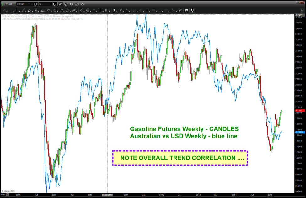
As you can see above this is a pretty nice correlation and, while not exact, it’s pretty darn close to moving together and in the same trend/direction.
Here’s the “Aussie” Monthly Chart.
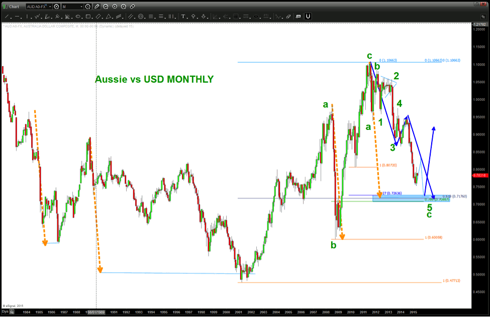
Please follow me as there is a lot going on here. Let’s break it down.
- The orange dashed line is a measured move and is present at “every” major area of support.
- The count, much like the gasoline futures, shows one more wave up (in progress) and then another move lower.
- We have multiple ratio’s coming together from two nodes of retracements, an extension and then the measured move AB=CD (blue arrows going lower)
Folks, this could take months to set up but it’s going to offer a monster opportunity, in my opinion.
So in the meantime, make it a great week and watch the game plan work out over the coming weeks and months. Thanks for reading.
Follow Bart on Twitter: @BartsCharts
No position in any of the mentioned securities at the time of publication. Any opinions expressed herein are solely those of the author, and do not in any way represent the views or opinions of any other person or entity.


 Ready To Break Out?")
