 If you haven’t noticed, large cap tech stocks have been on fire of late. And there’s no better measure for this sector than the Nasdaq 100 (NDX).
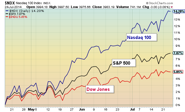
Check this out: Since mid-April, the Nasdaq 100 is outperforming the S&P 500 by almost 2 to 1 and the Dow Jones Industrial Average by almost 3 to 1.
And since the equity markets typically only go as far as its leaders take them (before a material pullback), I thought it would be good to dedicate a post to the index that tracks 100 of the largest tech stocks.
OUTPERFORMANCE CHART – The chart below highlights the NDX’s outperformance over the past few months. Wow, 14.2%… that reminds me of NBA Jam when the announcer would say “He’s on fire!”
DAILY CHART – But with outperformance comes concern. How long can the Nasdaq 100 keep up this pace without a pullback or consolidation? And what would that look like? Well, let’s start with the daily bar chart since April (see below). The NDX has put together a nice bullish channel and is currently trading near the top of that channel. Although today’s euphoric open and tempered red bar close appears to be rather small in the scheme of things, it is worth watching for any follow through weakness. As well, RSi is showing a divergence with price. This is simply a short-term caution that bears watching.
Minor supports can be found at the lower end of the channel (3875) and 50 day moving average (3800). More meaningful support is found at the June breakout level around 3750.
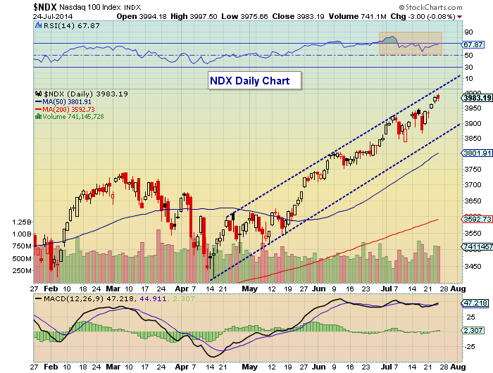
It’s also worth noting that the Nasdaq 100 is trading 11% above its 200 day moving average. Although this is relatively high, it’s worth noting that the index traded between 10.5 and 15 percent above the 200 day moving average between late October 2013 and mid January 2014.
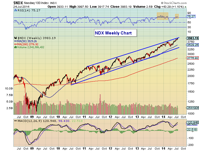
WEEKLY CHART – Zooming out to a more macro view, let’s take a peak at the weekly bar chart since the 2009 bottom. Once again, we see the NDX riding near the top of the trend channel. We also have an overheating RSI at +75. This could limit performance over the near-term and may be reason enough to stick to strong tech names.
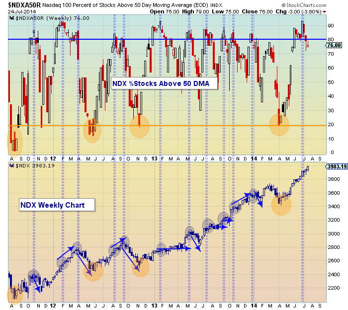
Another indicator that can be useful for tracking breadth is the %stocks above the 50 day moving average. For logical reasons, it’s bullish when the percent is rising and bearish when it’s falling. But when the percent begins to tick above 80 or below 20, it’s generally a trend caution signal. Here are three takeaways from the chart below:
- Of the 11 instances that the percent went over 80, 5 lead to pullbacks, 3 triggered consolidation, and 3 saw the index continue higher.
- Today’s price trend and indicator are very similar to early 2012. During that period, the indicator hit 90, but stocks didn’t top until weeks later. We are currently 3 weeks past a push above 90. So perhaps we have a few more weeks to move higher before a material pullback.
- All of the instances that saw the percent drop under 20 marked substantial bottoms.
Thanks for reading.
No position in any of the mentioned securities at the time of publication. Any opinions expressed herein are solely those of the author, and do not in any way represent the views or opinions of any other person or entity.


