 By Alex Bernal
A lot of people have their pet theories on what a steepening or flattening yield curve means for the stock market. From CNBC to Bloomberg, there are no shortages of academic explanations. That said, I have been analyzing and trading the treasury & Eurodollar curve for many years now and have formed my own theories.
One thing that is clear in my mind is that interest rates have a huge effect on stock prices. But sometimes those relationships are very complex to see.
Let’s first take a short trip back through time to get a better look at where we are today.
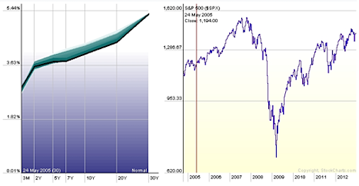
May 2005: Signs of Flattening in the mid section of the Curve – The first forewarning of a possible slowdown in the business cycle is when the short end finally becomes saturated and the market chases yield. The Bull market in equities enters a grinding range bound phase as the liquidity was still saturating into the housing market sector to fuel the upward move rather than reinvesting into the capital structure of the economy.
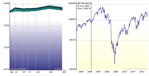
June 2006: Flat Yield Curve – This is the classic dead canary in the coalmine preceding an economic slump; the short end of the curve is sold by bond vigilantes, as they demand higher yield. The flat yield curve signaled that the bond market was weighing the severity of the risks that the toxic debt… an explosion that was about to take hold.
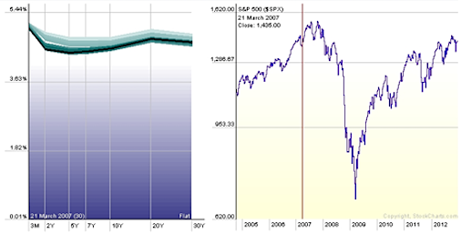
March 2007: Inverted Yield Curve – This is the definitive sign of the end of the secular bull market in equities and high yield instruments. The Inverted yield curve points out that fears of inflation were putting a lot of pressure on the short end of the treasury curve. Unbeknownst to the stock market were the effects of a credit “squeeze” that was about to take hold. I have seen statistics over the past several years that indicate an inverted yield curve has a 80% to 90% probability of predicting a recession within the next 6 months. This is often seen as a “last call for alcohol” for getting out of stocks and parking funds into the short end of the yield curve, which starts to pay much higher interest rates than the long end. This is exactly the paradox that tells us that something irrational is going on in the market. Let the hysteria ensue…
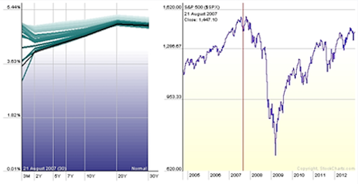
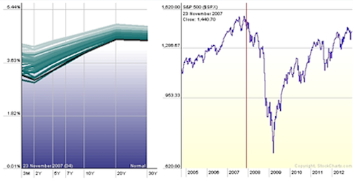
August 2007: Volatility expansion in the Short end of the Yield Curve –Smart Money Opens the flood gate spill of liquidity that is dumping into the short end of the curve. This is a key chart to visualize because when we get to where we are in the curve today the “wiggle” room as I like to call it is nonexistent in the short end. Consequently, and rather suddenly, just before the Stock Market makes a major peak, the yield-hungry investors start running for cover in the so called “flight to quality,” loading onto the short end and depressing the yield like it’s the last Black Friday on earth. This heightened rate of change in the yield curve slope is one of the key measurements to note. The stock market here retreated from its all-time high seemingly unbeknownst to the fear that was being shown in the yield curve.
October 2007: And We Have Liftoff, The Steepening Begins – The stock market makes a clear double top formation and shortly after confirms a lower low reversal in the dominant trend. However the yield curve steepening accelerates, and according to some pundits at the time, a “normalizing yield curve” was telling the story that the goldilocks economy was all right and the good times would roll forever (complacency is a classic sentiment indicator of the terminal phase of bull markets). Please see “Peter Schiff was Right” on YouTube if you enjoy a good truth smack.
Meanwhile, I remember this period of time very vividly because it occurred during my first weeks trading yield curve spreads. I still have the look of all my cohorts faces burned forever in my mind… mostly coming by way of the curve movement in the next chart. I’m sorry to say that this period was a career-ending one for many spread traders whom did not see the tectonic shift in the entire space coming.
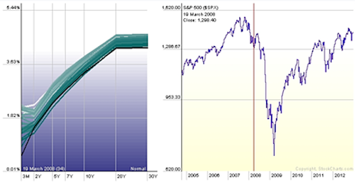
February 2008: “There She Blows” flight to quality depresses the short end of the yield curve – This is where I clearly realized it was not necessarily the direction of treasuries that matters or even the upward or downward movement of the curve as a whole, but the Rate of Change of the curve slope and the difference between bond spreads of different qualities. The chart clearly indicates how the insatiable buying in the short end pushed down the short end yields. And suddenly the bond market realized that the titanic was sinking and all the life rafts where gone. But, at the same time, the majority of stock traders were considering this a “buy the dip” opportunity. The secular bull market in stocks had a few more weeks to be confirmed by classic Dow Theory sell signals, but the “official” bear market wasn’t publicly declared & broadcasted until the second part of 2008 when the S&P breached the 1280 lows and went into the panic phase of the bear market.
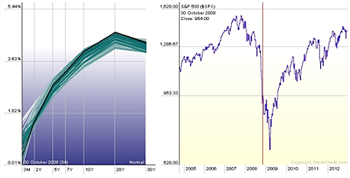
October 2008: Helicopter Ben shifts the printing presses to warp speed
Zero Interest Rate Policy (ZIRP) – Short end is anchored at 0% – The emergency rate cuts orchestrated by the FED and implemented on a global scale by the major Central Banks aimed to unfreeze the global credit market. This was the start of the battle against the deflationary death spiral, which was my first few months of trading treasuries; I consider it being baptized by fire; Eurodollar Blow Out, 10yr Gone Special, and Cash is King very much dominated the vernaculars at the time. Meanwhile the ends of the yield curve were marching in completely opposite directions.
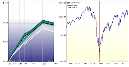
March 2009: Yield Curve Bull Flattener with a hump – The psychological factor at the bottom was critical as the market reversed to its sentiment extreme: We are all gonna DIE! and All hope is abandoned was the dominate psychological environment. At the time the 10-year Note was at record low yields and seemingly had a restless permanent bid. Very irregular “humped” profiles of the curve also emerged as the different parts wandered aimlessly with low correlations.
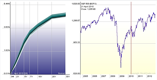
April 2010: Normalized Yield Curve but still anchored at 0% – Liquidity Trap Begins – I still remember for 3 weeks straight on CNBC they were asking if this last surge in that stock market in March ’09 from the 666 lows was real and nobody believed it. In hindsight it is now easy to see, but hard not to have been engulfed by the panic at the time. A generationally steep yield curve, extreme bearish “the end is near” sentiment and oversold technical readings off the Richter scale were signs that the bear market might be over. Bear market rallies are said to be the most violent because of the massive short covering by highly leveraged hedge fund managers who in desperation are trying to fade any upward moves to ride perceived dead stocks back into the ground. But, Lord Bernanke and the FED’s committed to holding the interest rates at zero “forever,” which started to penalize those hoarding cash. Fund managers were pressured by the dismal performance (and losses from 2008) to chase performance and were forced to overweight stocks (to save their jobs). Also note in this chart that the market was at a swing high and had no signs of inversion or even high levels of volatility across the curve.
Adjusted for Inflation
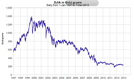
Around this time, most of the street, and all the Perma Bears & Academic authorities who were late to the game, were calling for new lows. But the new ZIRP world order was pumping cash into the system and those dollars needed allocation somewhere. This type of environment is in my view classically described as an invisible crash, similar to what James Dines predicted in the 70’s where nominally we see a rising stock market but in real terms (priced in gold) the Dow Jones Industrial Average continues its journey south (as in the picture above).
May 2011 High- Liquidity Pump Still Primed
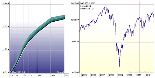
Still no Inversion, still very steep & no spike in volatility anywhere on the curve. At this point momentum technicals were suggesting the S&P 500 was getting a little frothy but there weren’t any bond market signals of another major top or bear market. At that time I remember wondering, “If the short end is anchored how could it signal anything? Maybe the FEDs manipulation has taken away the short end of the curves ability to announce fears of inflation.”
August Low 2011 – Race to the Bottom
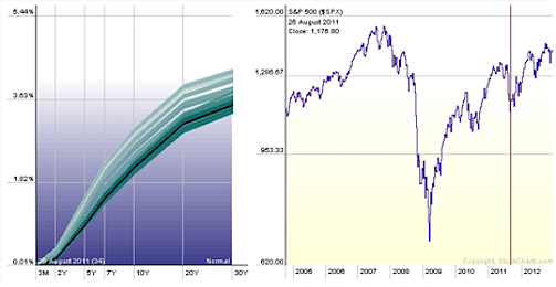
After the 2011 retracement you can see there was another slight flight to quality in the long end of the curve as the market clearly had nowhere to go in the front end.
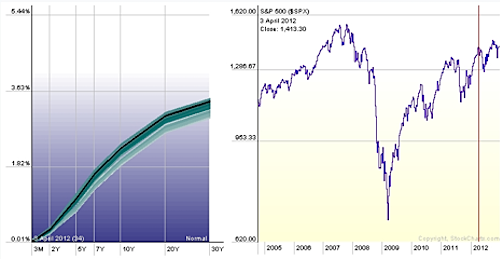
April 2012 – A little less steep
Now it is clear that Operation QE Infinity is cemented into global monetary policy. Again, there weren’t any signs of inversion. Be mindful, since the FED is manipulating the interest rate curve it could be possible that we won’t be able to see a signal from the short end going forward until it cracks open and the invisible hand takes away control of this manipulation by very rapid inflation and a crisis of confidence in the dollar.
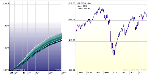
June 2012 low – Pancaked even lower
As you can clearly see, there is a flattening starting to occur with every drop of the stock market, pushing real interest rates even more negative. This makes ownership of equities, even ones with little or no profits even more attractive.
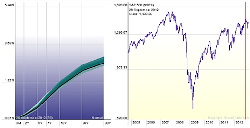
Sept 2012 – Most Recent High –
No Inversion. No Yield Curve Signals.
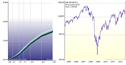
Today – Big Question: Is yield curve analysis even useful anymore? If all these rates are fictitious how can we visualize and measure any movement in the capital markets?
How much purchasing power of our dollar will vanish before the megalodon mountain of M2 spills over the floodgate & tsunamis back into the economy? To me, the recent price action of the metals complex confirms that inflation is looming and a Frankenstein-like return could be close at hand. James Turk of GoldMoney.com concurs and explains it well in this video.
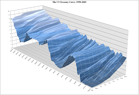
Picture Chart Source: Zerohedge.com
Today: Where Can We go From Here?
The chart above gives us an even more detailed view of the yield curves movement over the last 10 years. The only question on everyone’s lips is where do we go from here? Or better yet where can we go?
The “nuclear option” that Benny boy is trying to achieve is outright complete monetization of the debt and Super Duper Stimulus through sustained negative real interest rates. The FED is issuing as much debt in all times frames, as much as it can get away with as indicated by the shape of the curve and the continued successes at monthly treasury auctions. Fun Fact: The laughable “debt ceiling” was created in 1917 and has since been raised 104 times. Why not just raise it to 100 trillion and give us some time before we bump our heads again?!
I personally think the critical point of no return has come and passed but we are being hypnotized into not seeing it. This mirage is currently in the form of curve flattening and will be painted as the telltale sign of “recovery.” Only those who see through the facade will realize that its true identity will be unveiled by a sparked crisis in confidence, otherwise known as a re-awakening of a monetary Frankenstein known as Inflation. I believe that double-digit interest rates are on the horizon. The MOVE Bond Volatility Index will be the next big ETF. And 30 yr Bond will collapse in price soon.
If we are in the final innings of a debt super-cycle, what is the catalyst that will end the game? And how will we see it forming if the short end is dead?
Because of Fed interest-rate pegging, all of the rates and spreads between different quality bonds are a mirage. The yield curve is not market driven & none of the free market forces seem to matter anymore. The price of money is dictated by the powers that be & Wall Street has turned into a killer shark algo swarm merely front-running any next move. One other area of fixed income that can be useful this time around are the high spread between treasuries and high yield bonds. They have been the warning signal for large treasury market moves in the past. Keeping Track of the SPDR Barclays High Yield Bond (JNK), iShares iBoxx $ High Yield Corporate BD (HYG), and Market Vectors Intl High Yield Bond (IHY), are a way to watch this.
So I guess my final thesis is that since the front end of the curve is set in stone to stay at zero we might not get a final treasury curve inversion to signal the next bear market. I’ve heard unconfirmed reports that the FED already owns over 27% of all duration treasuries and is increasing its holdings by over 10% a year. One thing I do know is when this game does end, the move up in rates for the long end of the curve will be legendary.
Disclaimer: This in no way constitutes investing advice. All of these opinions are my own and I am simply sharing them. I am not trying to convince anybody to do anything with their money. I am simply offering up ideas for the sake of discussion. As always, everybody is expected to do their own due diligence and to ultimately be comfortable with their own investing decisions. Any actions taken based on the views expressed in this blog are solely the responsibility of the user. In no event will Aether Analytics or its owner be liable for any decision made or action taken by you based upon the information and/or opinion provided in this blog.
Twitter: @InterestRateArb and @seeitmarket Facebook: See It Market
At the time of publication, the author had positions in RRPIX and was Short TLT Call Spreads.
Any opinions expressed herein are solely those of the author, and do not in any way represent the views or opinions of his employer or any other person or entity.

