Tech stocks have gotten off to a poor start this year, as investors continued their buying strike against growth stocks.
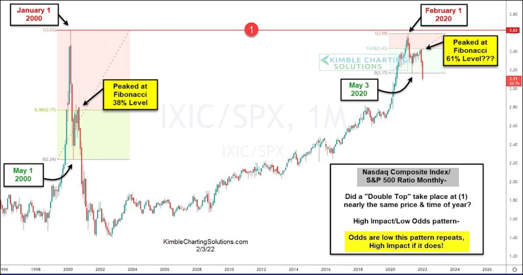
This is exemplified in today’s ratio chart, as we track the long term price performance of the Nasdaq Composite versus the S&P 500 Index.
You’ll quickly notice that this ratio stalled out in February of 2020 at the year 2000 high, raising double top concerns at (1). Same price, same time of year!
Although the odds are low that we see a repeat of the 2000 crash, it is worth noting that (1) is/was major resistance and that the first wave lower has played out similarly (albeit with less severe selling. We saw a trading low on May 1 of 2000 and a trading low on May 3 of 2020. We also saw a trading peak at the 38% Fibonacci level on the prior, and a trading peak at the 61% Fibonacci level on the latter.
Odds are low that this pattern repeats, but there’s high impact if it does (even if to a lesser degree). Stay tuned!
Nasdaq Composite / S&P 500 Index Ratio Chart (monthly)
Note that KimbleCharting is offering a 2 week Free trial to See It Market readers. Just send me an email to services@kimblechartingsolutions.com for details to get set up.
Twitter: @KimbleCharting
Any opinions expressed herein are solely those of the author, and do not in any way represent the views or opinions of any other person or entity.


