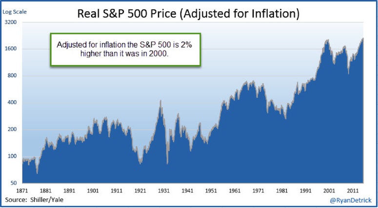
So the S&P 500 is just a good day away from new highs. Also, it is more than 33% above the previous major peak in 2007, right?
Well, if you look at nominal prices, the answer is yes. But if you look at inflation adjusted prices (real prices), you might be surprised to hear the S&P 500 is just 2% above the 2000 peak!
In other words, it has gone virtually nowhere for 16 years.
S&P 500 Inflation Adjusted Price – Historical Chart
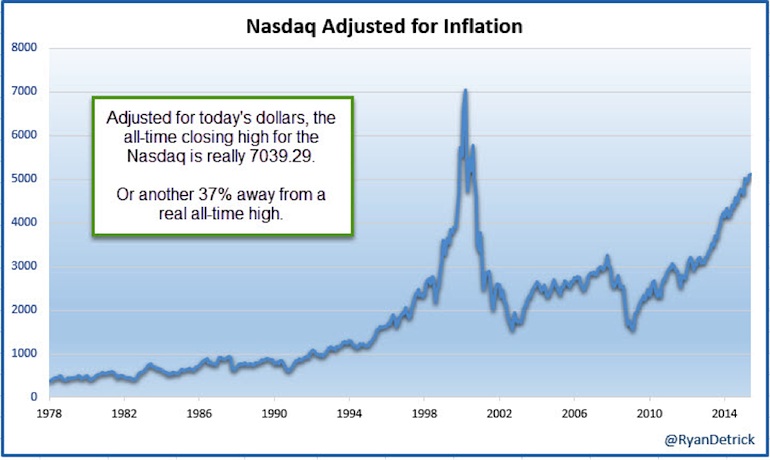
Last week, on Yahoo Finance I talked about how the Nasdaq adjusted for inflation was actually still 37% away from new all-time highs, not making them. That’s two major stock market indices that look dramatically different with inflation adjusted prices.
Here’s that chart of the Nasdaq.
Nasdaq Inflation Adjusted Price – 1978-Present
What does all of this mean? To me, it is very important to look at returns this way. Inflation eats away at your portfolio every year, yet all everyone wants to talk about is Greece or when the Fed will lift rates a minuscule 25 basis points. There are some much more important things to consider and the effects of inflation on your portfolio is one of them. Inflation is currently running around 1%, but should it start to pick up again, this will be quietly eating away at your real gains more and more.
Lastly, fellow SIM Contributor Andrew Thrasher asked me a question on Twitter the other day and I had never thought of this.
@RyanDetrick Ryan do you think infl-adjusted is that important? shifts focus away from actual price supply/demand don’t you think?
— Andrew Thrasher, CMT (@AndrewThrasher) June 23, 2015
He had a great point. My reply was I wouldn’t want to use technical analysis or draw trendlines on a chart that has been inflation adjusted. The reason being, it is always changing. Each month when the new CPI data comes out, the chart changes. For pure charting purposes we want actual supply/demand as Andrew puts it and nothing else.
Now that doesn’t mean this isn’t extremely important. I think people need to understand the effects of inflation on their portfolio and the stock market and stop worrying about the silly headlines out there. But when it comes to charting, stick with nominal prices/charts.
Thanks for reading and be sure to let me know what you think about the whole charting inflation-adjusted charts in the comments below.
Twitter: @RyanDetrick
Any opinions expressed herein are solely those of the author, and do not in any way represent the views or opinions of any other person or entity.

: Showing Some Signs of Emerging Strength")
