The past 18 months have been pretty rough for the Euro (EURUSD). And it may get worse.
Below are a series of charts highlighting the price action on the Euro. Note that I find it the most beneficial to step back and start with the longest available time frame. This allows me to see longer-term trends and discuss what I see, not believe.
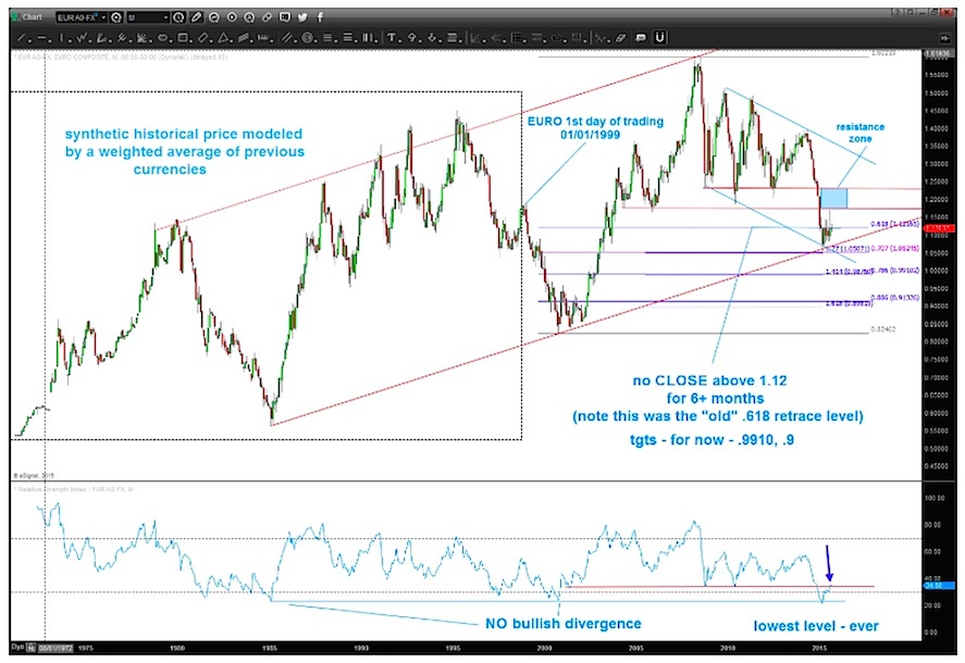
The chart below looks at the Euro since its inception. Here are a few observations:
- The Euro officially began trading in 1999. This chart includes prior “synthetic prices” (or those based on interest rates, GDP, compilation of combined currencies, etc) – see the black box.
- The Relative Strength Index (RSI) is at its lowest point ever. Note that the Euro doesn’t need a bullish divergence to get going.
- The trend line from 1984 is being tested.
- The Euro hasn’t seen a monthly closing above 1.12 for over 6 months.
- The 1.27 Fib “extension” point below the 2005 low nailed the low for this year (thus far). Note that 1.27 is the square root of 1.618.
- Lower targets for the Euro… If/When the Euro breaks down, it “should” initially target .9910 or .9000.
Euro Long-Term Monthly Chart
Here’s another look at pattern formation (and lower targets).
This chart also highlights a technique that I use when looking for chart patterns called mirror image holdbacks. More on that below.
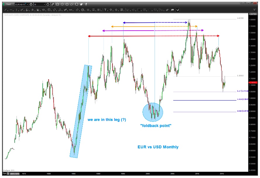
Mirror Image Foldbacks – They are planetary in nature and think of the rule in math… the angle of incidence equals the angle of coincidence. In short, price will come INTO a point and, sometimes, go back out of that point in the same manner.
- Note the blue shaded “holdback point”. Then note how after the 2009 high the Euro came down the EXACT same way and now it appears we are in the final blow off move lower. I think there is lower to go based on this foldback picture.
Now let’s look at another chart looking within this pattern and highlighting how the price swings on the foldback are almost exact.

 Rolling Over At Key Fibonacci Level?")


