The short pull-back in mid-April caught those of us who expected a deeper correction by surprise. Instead, the market served up a volley of breakouts from weekly bases. The sheer variety of groups breaking out begs the question: as we approach the six-month point of this latest uptrend, what stage of the expected four- to five-year market cycle are we in? The comparison of the market stage chart below and the sector perfcharts of the last five years may surprise you where we are in the market cycle according to the market sector rotation.
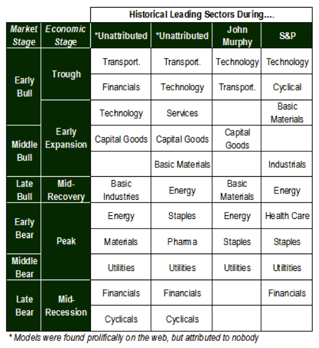
This market stage chart, found with a simple Bing media search of “sector rotation,” is a summary of market rotation. Note the market stage chart image is from TheMicroCapPress. There are slight differences of what leads during each stage of the cycle in the columns, but as we will see from a summary of the last two markets cycles, what leads in one cycle may not be the same in the next.
Overview of the Two Bull Markets
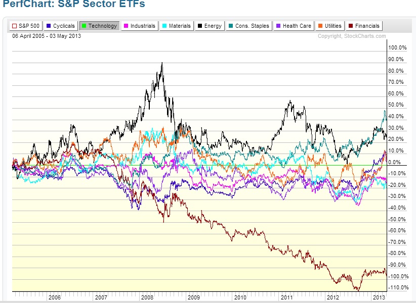
Following the Dot.com bubble, technology underperformed all other sectors (see lime green horizontal line in Figure 1 below). The top three sectors of the 2003-2007 bull market were energy, materials and financials; it should be no surprise that following the banking crisis that lead to the Great Recession, the financial sector underperformed overall. However, the sector perfcharts in Figure 1 and Figure 2 show energy and materials dominating the markets during both market cycles. This seeming contradiction of the conventional wisdom about what leads and what lags in the ‘normal course of a market cycle’ highlights a diverging macroeconomic picture: the debilitating deflationary environment (secular bear market) in the developed nations coupled with the rapid growth and consumption in emerging markets, shown by the last decade’s outperformance of the energy and materials sectors. Click images to enlarge.
Figure 1
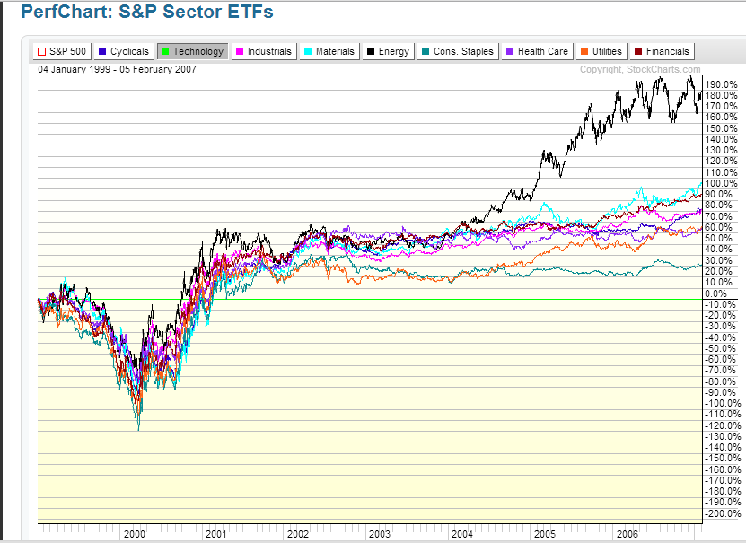
Figure 2
Breaking Down the Last Five Years
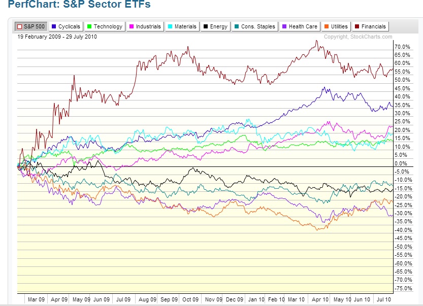
To gain perspective of where we might be in the market cycle, examine the sector perfcharts below. Not surprisingly, finance and technology were among the top performing sectors during the first year of the market recovery (2009). Two anomalies include the outperformance of healthcare and consumer staples. Healthcare sector performance is reflective of the healthcare debate and reforms; the strength in consumer staples is reflective of the ongoing poor wage and employment rates here in the U.S. and other developed nations reflective of the last decade’s deflationary environment.
Figure 3
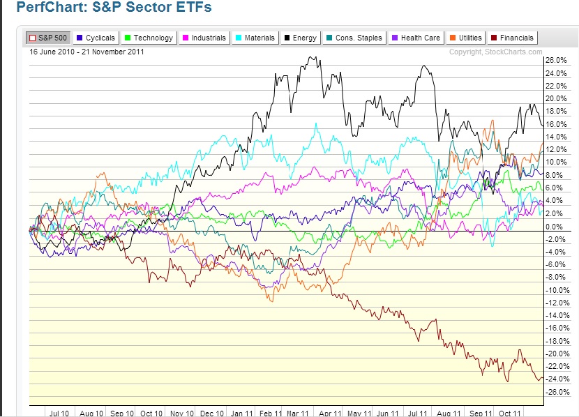
The next chart starts with the summer market bottom following the Gulf Coast oil spill and Chinese markets topping in the spring of 2010, and ends with the escalation of the European debt crisis in the summer of 2011. The top four performing sectors until the spring of 2011 were energy, materials, industrials, and cyclicals. Industrials and capital goods lead during the expansion stage of the bull market, while energy and materials lead during the late stage of a bull market.
Figure 4
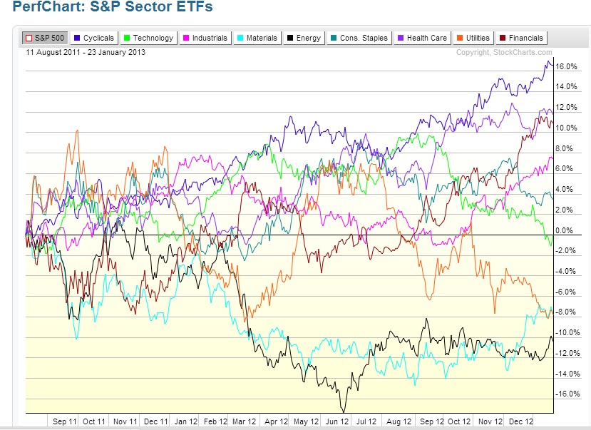
By early 2012, pundits in the media began proclaiming 2012 was year four of the bull market. Given the expansion of energy and materials, along with utilities, it is easy to see why some analyst expected the markets to begin topping in 2012. What we see in the next chart is energy turning down by March 2012, presaging the market downturn in the summer of 2012. However, instead of the equity markets topping the summer 2012, the markets resumed their uptrend in the fall, led by technology, cyclicals, health and financials. The health sector continues to be the anomaly of this bull market, which is not surprising given the healthcare debate and reform that have dominated the sector over the last five years. Technology, financials and cyclicals are indicative of a late bear market or early bull market cycle.
Figure 5
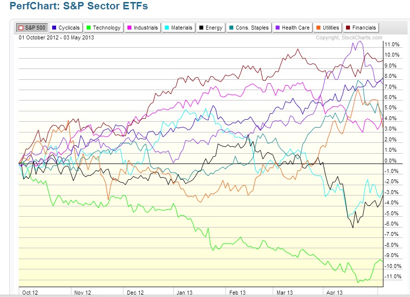
Just in case the last chart was not confusing enough, what do the past six months of the sectors’ perfchart have to tell us? Financials, industrials and cyclicals, along with healthcare, lead, while energy, materials and technology lag. Financials and cyclicals are indicative of a recovering economy. The housing market appears to have bottomed as shown by the strength in the financial sector and performance of home builders in the fall. One of the leading groups among the cyclicals has been the automakers, who prior to emerging as one of the early market leaders in December 2012, had moved relatively sideways since early 2011. A review of Figure 4, the 2011 sector perfchart, prior to the escalation of the European debt crisis, shows the sectors that led included energy, materials, industrials, and cyclicals. The four are usually seen at the expansion or late stage of a bull market. Comparing the S&P sector perfcharts over the last six months to those in 2011, the last six months appear to reflect more the sector rotation seen at the late stage of a bear market as opposed to the late stage of a bull market. A caveat is that the utility sector has turned up, as it did in the summer of 2011 (which presaged the escalation of the European debt crises), and the fall of 2008 (which presaged the U.S. banking crises).
Figure 6
The interpretation of the last two charts may appear contradictory when viewed in isolation. However, given the last five years reflect more the domino effect of a global banking crisis that began in the U.S. (then escalated in Europe) rather than a normal market recovery, it may not be surprising that the market behaves today as if it is in the late stages of bear market as opposed to the late stages of a bull market. The sector perfcharts over the last year, which indicate we are either at a late stage bear market or an early bull market, tell us that rather than being at the top of a four-five year market cycle, we are instead near a bottom. While there are contradictory signals, including the utility sector has recently turned up, the larger sector rotation themes point to a nascent, albeit shaky, recovery rather than the end of a five year bull market. Moreover, the charts offer clues to determine which sectors may be worth watching in this or the next round of uptrends, e.g. financials, technology, and cyclicals.
S&P Sector ETFs Perfcharts by StockCharts.com
Data Supports and Recommended Reading
- Ellis, Joseph H. (2005). Ahead of the Curve: A Commonsense Guide to Forecasting Business and Market Cycles. Harvard Business School Press: Boston, MA.
- Fisher Investments (200). Fisher Investments on Industrials. John Wiley & Sons, Inc.: Hoboken, NJ
- Murphy, John (2004). Intermarket Analysis: Profiting from Global Market Relationships. John Wiley & Sons, Inc.: Hoboken, NJ
Twitter: @RinehartMaria and @seeitmarket
No position in any of the mentioned securities at the time of publication.
Any opinions expressed herein are solely those of the author, and do not in any way represent the views or opinions of any other person or entity.


