 By Andrew Nyquist
After yet another low volume, low volatility week in which the markets slowly climbed higher, caution flags are starting to appear. As we near the spring highs on many indices, I’m starting to see some complacency seep in… at least enough to signal an increasing likelihood for a pullback.
Whether that pullback is 3-5 percent, or of greater variety, shouldn’t be of current concern. Right now the markets are still moving higher (not lower), so a proactive, protective approach is warranted within this context, especially for short term active investors like myself. For more color on the current state of the markets, let’s turn our attention to the charts.
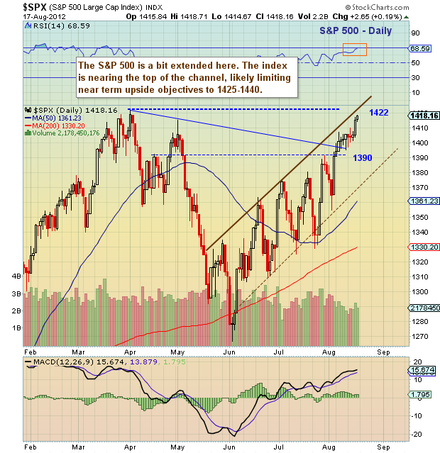
After reviewing many of the major indices, I’m having trouble seeing the S&P 500 get above 1425-1450 without seeing a minimum of some backing and filling first.
Here are 5 charts that color my reasoning:
1) S&P 500 daily chart: The S&P 500 is getting extended and nearing the top of its rising channel. It’s also nearing new four year highs – initial ascent to, or slightly above old highs often brings increased investor emotion, and this corresponds to increased volatility. Furthermore, investors start to play “watch the indices” at times like this and that can be a dangerous game to play. Best to just focus on your individual investments and managing risk within them.
Note that the S&P 500 is two days into a DeMark daily sell setup and one week into a weekly sell setup. This also tells me that the window of time for a further squeeze is dwindling.
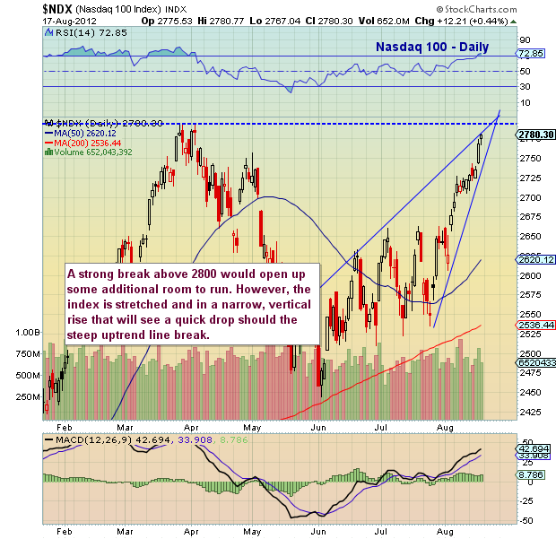
2) Nasdaq 100 daily chart: The Nasdaq 100 is in a steep uptrend that appears to also be a rising wedge. Monitor the uptrend line closely. As well the index is nearing spring highs and the weekly chart (not shown here) is also one week in to a sell setup (similar to the S&P 500).
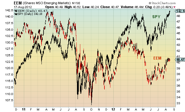
3) Emerging Markets iShares (EEM) vs S&P 500 Index (SPY) chart: The Emerging Markets have been underperforming the major U.S. equity indices since early February (here shown against the S&P 500 index fund – SPY). This can mean one of two things: either the emerging markets are going to play catch up, or the S&P 500 is going to pull back. Either one of these scenarios raises a yellow caution flag for the S&P 500 over the near term.
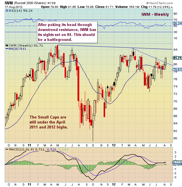
4) Russell 2000 iShares (IWM) Weekly chart: The higher beta small caps are showing strength (as well as reason for the rally to push a bit higher near term), but are still underperforming at 3 percent off spring 2012 highs and 6 percent off 2011 highs.
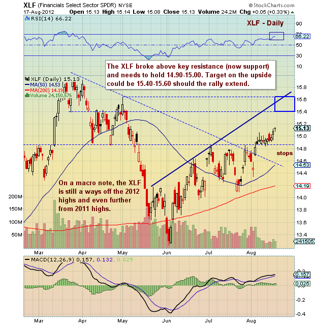
5) Financials Select Sector (XLF): The financials have come along for the ride, albeit on lower volume. Bulls would like to see a high volume follow through day. Potential near-term upside targets are two to three percent away and still under 2011 and 2012 highs. In short, also underperforming.
Have a great week ahead. Remember to trade safe and trade disciplined.
———————————————————
Twitter: @andrewnyquist and @seeitmarket Facebook: See It Market
No position in any of the securities mentioned at the time of publication.
Any opinions expressed herein are solely those of the author, and do not in any way represent the views or opinions of his employer or any other person or entity.

