Investors who have been following the long-term uptrend in gold have begun to question the sustainability of the bullish phase. Here are three charts that suggest that the primary trend remains positive.
And until and unless we see a negative signal from these charts, we’re following the uptrend higher.
Bullish charts bounce off the 50-day moving average
Our daily chart of the SPDR Gold Shares (GLD) features a breakout above resistance in January 2025, followed by three months of new all-time highs for the yellow metal. The GLD did log a lower high in early May, when the ETF failed to push above the April high around $318.
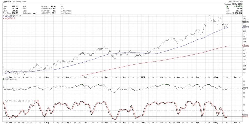
Since that lower high was logged, GLD pulled back to an ascending 50-day moving average. This moving average represents a common destination for pullbacks within primary uptrend, with a similar pattern shown in early April.
We can see the Relative Strength Index (RSI) remained above 40 on the recent pullback, further confirming a tactical drop within a primary uptrend phase. Finally, the stochastics indicator, shown in the bottom panel, recently flashed a buy signal as the short-term trend reversed higher.
Ichimoku model shows gold over cloud support
While our main daily chart reinforces the thesis that we’ve witnessed a pullback within a bullish phase, we can compare these signals to other technical indicators such as the Ichimoku cloud model. This is a traditional technical analysis model from Japan, and the cloud is unique in that it is plotted 26 days in the future.
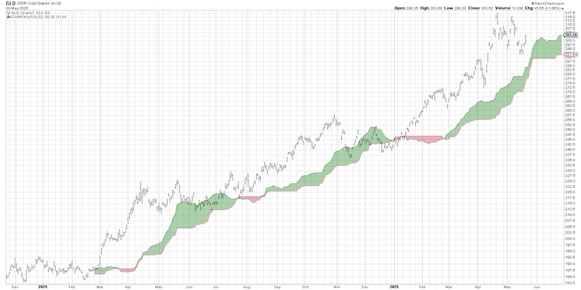
Previous pullbacks to the cloud, in June 2024 and November 2024, resulted in an upside rotation and new swing highs soon after the signal. The recent pullback for GLD shows the price remaining above cloud support. As long as gold stays above this trend-following mechanism, the Ichimoku model would suggest the uptrend is still in place.
Our market trend model confirms a primary uptrend
We designed a Market Trend Model years ago to help us define the trend for any stock or ETF based on three different time frames. By using weekly exponential moving averages, we can describe the trend on short-term, medium-term, and long-term time frames.
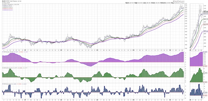
Below the price, we can see the long-term trend (purple bars) has been bullish since January 2023. The medium-term trend (green bars) turned bullish in October 2023, after the downtrend into a major low. The short-term model (blue) was bearish last week, but may be switching back to a bullish signal this Friday.
With the short-term model bearish, and the medium-term and long-term models still bullish, we would have to define the recent pullback as a tactical drawdown within a primary uptrend phase. If and when the medium-term model breaks below the zero level, that would indicate a more significant corrective phase for gold.One of the great benefits of the technical analysis toolkit is the opportunity to triangulate signals using various techniques and different time frames. Based on these three charts that we consider central to our investment process, gold still remains in a positive trend with upside potential.
Twitter: @DKellerCMT
The author may have positions in mentioned securities at the time of publication. Any opinions expressed herein are solely those of the author, and do not in any way represent the views or opinions of any other person or entity.


