One thing that stands out this weekend is the conflict between daily and weekly market charts in several cases. And especially from a momentum standpoint. Last week the markets put in a key reversal on the weekly charts. More impressive, though, is how several sectors and country ETFs held up.
There just aren’t a lot of bear markets out there, which is interesting considering the news flow of late. Instinctively, that seems very bullish. That said, I’m still a fan of sticking to macro trading and being patient as I don’t believe we’ve seen signs of improved market breadth yet. Let’s dig in and look at the S&P 500, as well as some macro market indicators are saying.
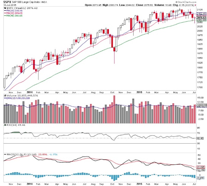
Looking at a weekly chart of the S&P 500 Index (SPX) we can see a noteworthy bounce off the 40 week moving average.
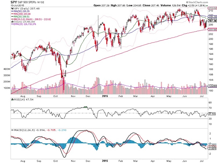
And on the daily chart of the SPDR S&P 500 ETF (SPY) we see falling 20 and 50 day moving averages. The 50/100 day moving average near the equivalent of SPX 2095 will be an area of interest this week. Moving averages are often good yard-stick market indicators.
More Macro Analysis
As I’ve mentioned several times, the recent high remains the strongest, most obvious level for a potential correction since the bull market began. With that in mind, I continually try to search for evidence and market indicators that refute this – keeps me on my toes.
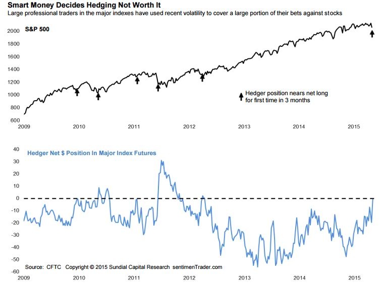
Jason Goepfert of SentimenTrader points out smart money is continuously removing hedges throughout 2015, and now at an accelerated pace.
Dana Lyons notes the extreme rush to protection of late. And this is yet another bullish piece of evidence.
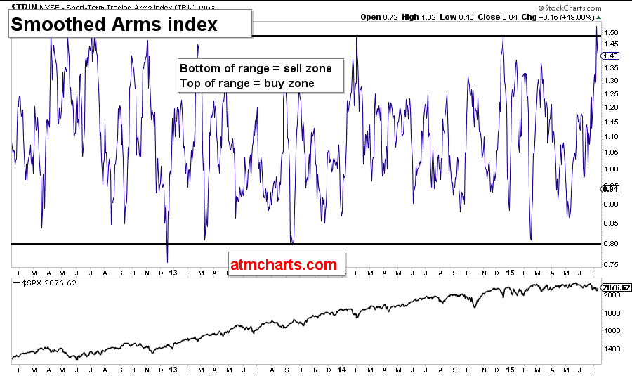
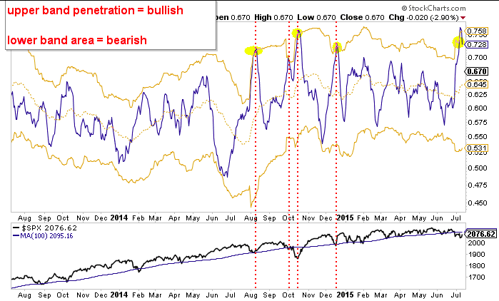
One of the market indicators that I’m watching is the Smoothed Arms Index. This can help identify true changes in market posture. For the past several years it has been stuck in this range; bear markets tend to push this reading higher.
Tuesday Night I noted a couple of go to market indicators had flashed buy signals..
The put call ratio reached an extreme that has led to meaningful bottoms. Note that the 100 day moving average 2095 on the S&P 500 will be key this week.
The NYSE Stock Only Advance-Decline Line has flashed numerous signals of late. Too much for my liking, but we’re still seeing bounces when things move too far and too fast.
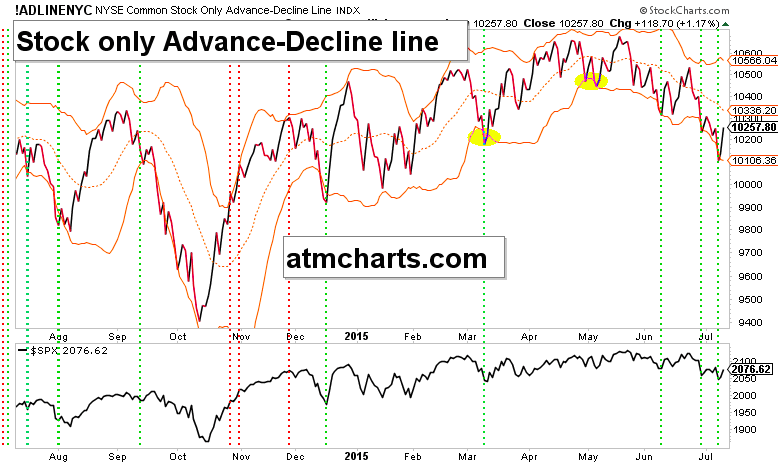
Stocks jumped yet again on Friday, but market breadth worsened and hit new recent lows. This still feels like a ‘buy the big boys’ type of market.
Thanks for reading and have a good week.
Twitter: @ATMcharts
Read more from Aaron on his blog.
No position in any of the mentioned securities at the time of publication. Any opinions expressed herein are solely those of the author, and do not in any way represent the views or opinions of any other person or entity.


