The action in the mega cap leaders has just been absurd of late. For example, take Amazon (AMZN). It was already significantly overbought on its weekly time-frame leading into earnings and it just happened to gap up 100 dollars and open 15 percent above the weekly upper bollinger band (the most since 1999). You don’t see this action very often. Sure seems like late stage bull market stuff. But how late?
Chris Kimble notes the recent high in the Dow Industrials is also the 161.8 fibonacci extension from the 2007-2009 range. That index joins the S&P 500 with the same extension level peak. The markets are syncing up.
Heading into next week we have two scenarios setting up for the markets: Scenario A, the stock market bounces early in the week off this major pivot zone (see below). Scenario B, stocks completely fall apart. Let’s dig in and prepare for this week’s price action.
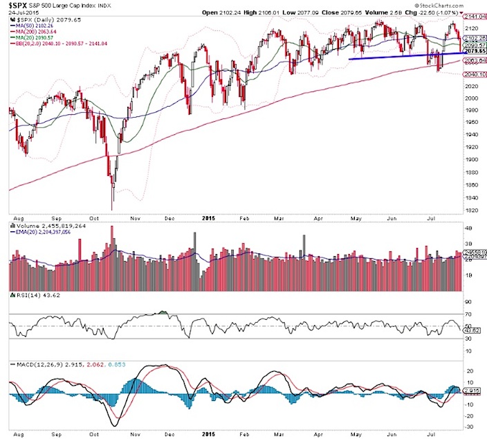
The S&P 500 weekly chart looks ugly with a bearish engulfing week. I think that’s just a timing matter that is scaring people this weekend.
S&P 500 Weekly Chart
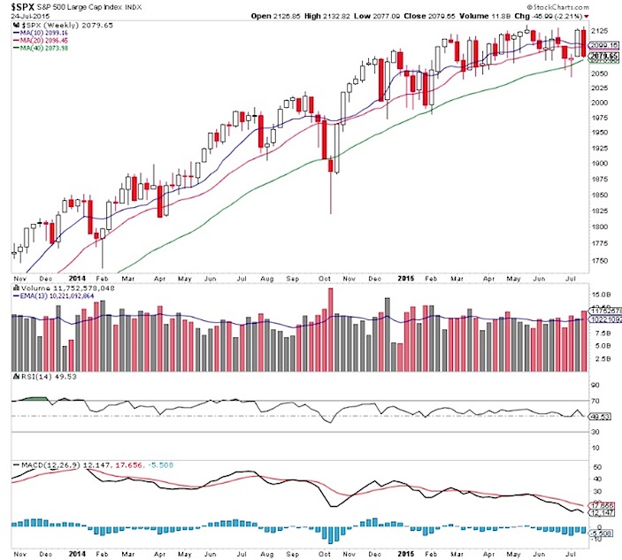
Looking at the daily chart there is plenty for bulls to work with… either here or even on weakness. Again, barring a complete drop out of bed.
S&P 500 Daily Chart
Market Measures
Of course breadth is a ‘scary’ divergent. Dana Lyons did a great job explaining how market breadth has massively deteriorated of late.
Looking at the NYSE breadth dashboard, it’s clear that the market is having issues.
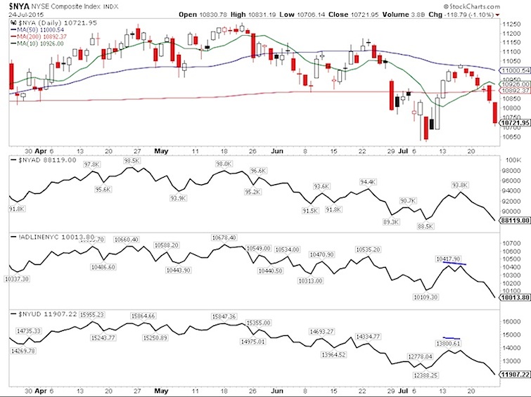
From a market measure perspective, it is getting scary. And the difference between now and a month ago is that there isn’t a big in your face issue that needs resolution like Greece. This action is coming from weak market internals and poor commentary from corporations.
With all the concerns about breadth, there’s not much fear in the market per the volatility term structure.
VIX:VXV Ratio Chart
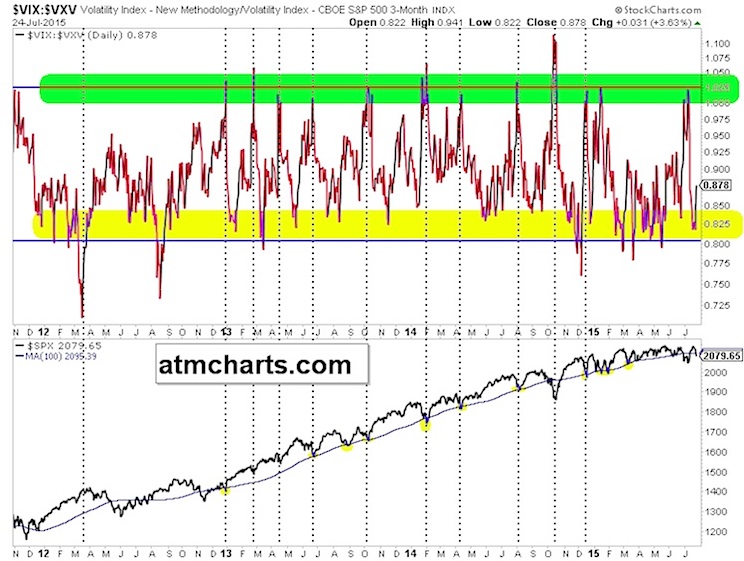
The Volatility Index (VIX) is only trading with a 13 handle.
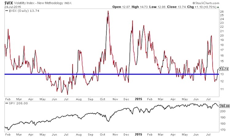
This all suggests we should be careful. Especially with limited upside capped by the major Fibonacci extension levels in the Dow and S&P 500.
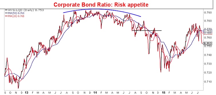
For a year I’ve harped on the major top in bond market risk appetite. I’ve been wrong in thinking it’s a coincidental indicator. However, now we have a lower high breaking down that could weigh heavily on the market.
Around The World
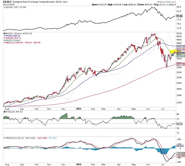
Friday was the clearest bearish reversal candle we’ve seen out of China (The Shanghai Exchange) since the counter rally began. We could definitely see a test of the low area in the next week or two.
Shanghai Stock Market Chart
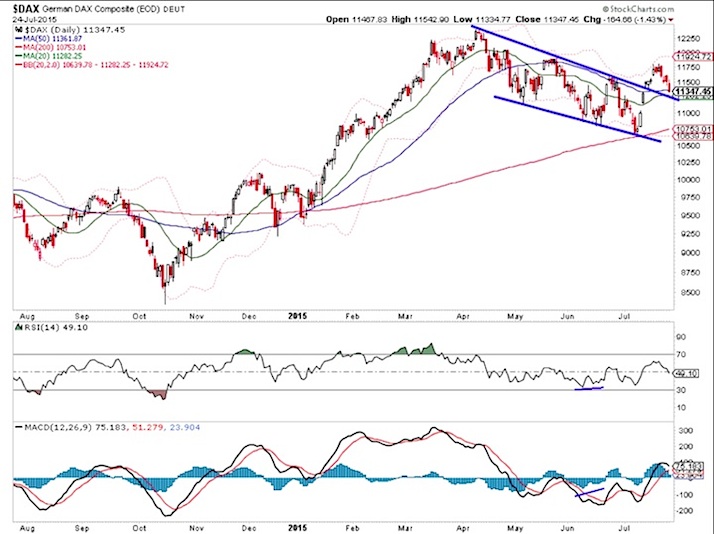
The German DAX has reached a moving average confluence. Even if that were to give way, there is a strong chance that a bottoming base is forming.
German DAX Stock Market Chart
Thanks for reading and good luck out there this week.
Twitter: @ATMcharts
Read more from Aaron on his blog.
No position in any of the mentioned securities at the time of publication. Any opinions expressed herein are solely those of the author, and do not in any way represent the views or opinions of any other person or entity.


