I was taught that the markets go up the escalator and down the elevator. To rephrase, uptrends tend be long and drawn out while downtrends tend to be more sudden and severe.
How can we anticipate when the uptrend phase is winding down? Can a better understanding of market breadth indicators help us determine when “the top” is in?
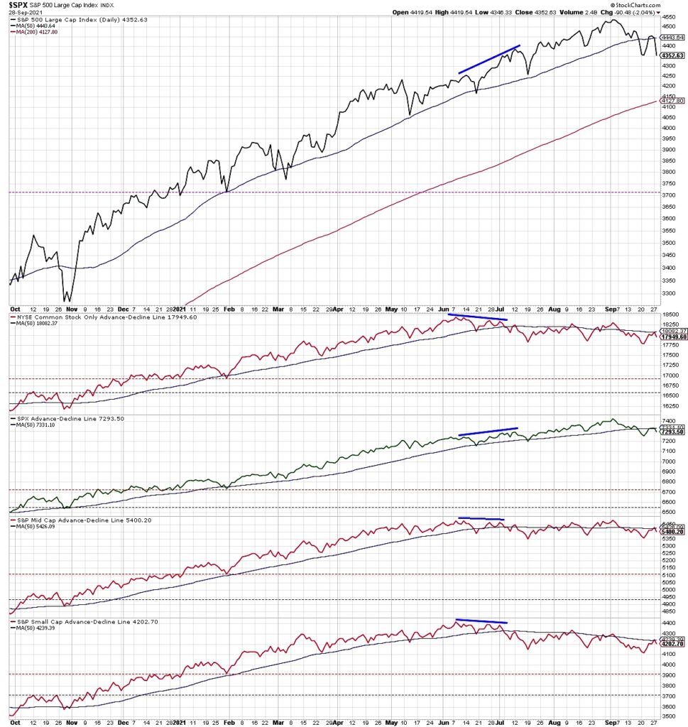
In today’s video, we will review the recent deterioration in market breadth for the S&P 500 Index, including how the advance-decline lines played out through three major market tops: 2020, 2007 and 2000. We’ll also discuss why these breadth indicators are equal-weighted and why they are based on simple relationships instead of percentage changes. Here’s a summary of questions we tackle:
- Why does the large cap advance-decline line tend to diverge from other cap tiers, and what can that tell us about leadership themes?
- How can the equal-weighted advance-decline data help you understand the relationship between large cap and small cap stocks in different phases in the market cycle?
- What are the current breadth conditions suggesting in terms of short-term weakness and long-term strength?
Ready to upgrade your investment process? Check out my free course on behavioral investing!
(VIDEO) How To Use Breadth Indicators – Market Topping?
S&P 500 Index with Market Breadth Indicators Chart
Twitter: @DKellerCMT
The author may have positions in mentioned securities at the time of publication. Any opinions expressed herein are solely those of the author, and do not in any way represent the views or opinions of any other person or entity.

 Rolling Over At Key Fibonacci Level?")


