In Sleepwalking Toward a Precipice (2012), I wrote the following:
“With the failure of political leadership, “central planning” has been ceded to central banks to “reflate” markets and reliquify insolvent banking systems and insolvent sovereign nations.”
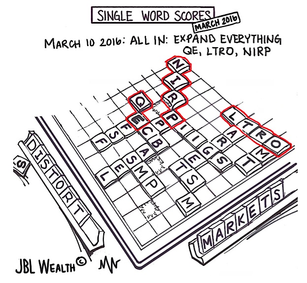
At its March 10th meeting, the ECB expanded its “Single Word Scores”, increasing QE to ~$87 billion per month and adding corporate bonds to the buy list, lowering Negative Interest Rate Policy (NIRP) to -0.4%, and easing credit to banks through Long-Term Refinancing Operations (LTRO).
At the March FOMC meeting, the Federal Reserve lowered its rate hike expectations for 2016 to two from four, and the central bank appears to have increased its mandates from two (full employment and price stability) to four (employment, prices, global growth and market stability), or more.
The Federal Reserve’s QE-Tight normalization (raising rates while keeping the $4.5 trillion balance sheet stable) is off to an inauspicious start. It does seem the Fed is “winging it” on a week by week basis, with Yellen and Federal Reserve members fumbling over each other like a Banana Republic.

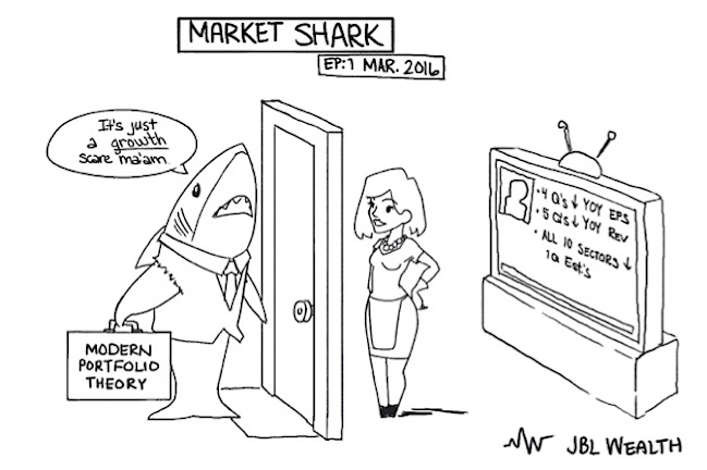
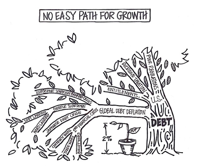
As discussed in Respect Our Stimuli, over the longer term, central banks – “Generalissimos” or “Fourth Branches of Government” – may not only be losing credibility, but control. Both the Euro and Yen have risen after recent NIRP announcements (the exact opposite of what the BOJ and ECB wanted), and despite all the LTRO, QE, and NIRP, Euro Area non-bank lending remains on a steady nine year decline (down ~14% from 2007 peak). In the U.S., markets have experienced three violent 10% stock market corrections since the end of QE (October 2014) and start of QE-Tight (December 2015), while the S&P 500 is headed for four consecutive quarters of YOY earnings declines, five consecutive quarters of YOY revenue declines, with all ten S&P sectors having lower 1Q16 earnings estimates from December (Factset). Long only market pundits are quick to sell the January-February correction as just a “growth scare”, but they would be “well advised” to note that in addition to the anticipated 8%-9% 1Q16 YOY earnings decline, the Atlanta Fed has revised down its 1Q16 annualized GDP forecast from 1.9% to 0.6% in recent weeks. It may not be just a dolphin ma’am.
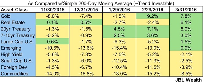
As I have discussed in previous posts, a ten month moving average is a good delineator for whether an asset class is in uptrend or downtrend. A close cousin is the 200-day moving average (in fact, it is watched more closely than virtually any indicator). Given the monumental bounce in the stock market off the February 11th lows, there is marked improvement in the number of asset classes that may be deemed investable as of March month end. That said, safety dominates the list, and large cap and emerging markets are less than 2% above their 200-day moving averages. In November large caps’ “tag” of the 200-day led to roll over.

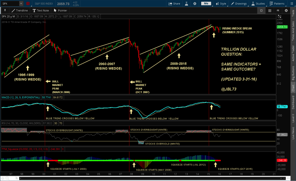
For the last year, I have been updating a chart I call the Trillion Dollar Question. It asks the question: Same Indicators = Same Outcome? – where rising wedges, a turn down in MACD, and falling RSI are shown in 2000, 2007, and 2015. Of late the Bollinger squeeze is getting much deserved attention and although I do not always put it on the Trillion Dollar question chart I have included it the last several months. I believe the squeeze is one of the more powerful and underappreciated technical indicators. It denotes a build-up of energy from Bollinger bands tightening inside of Keltner channels and is shown in red. When this energy is released (green), moves can be quite dramatic. Note that the squeeze has been building in the Russell 2000 for over a year, the S&P 500 since October, and in the NASDAQ Composite since January.
S&P 500 Chart
Russell 2000 Chart
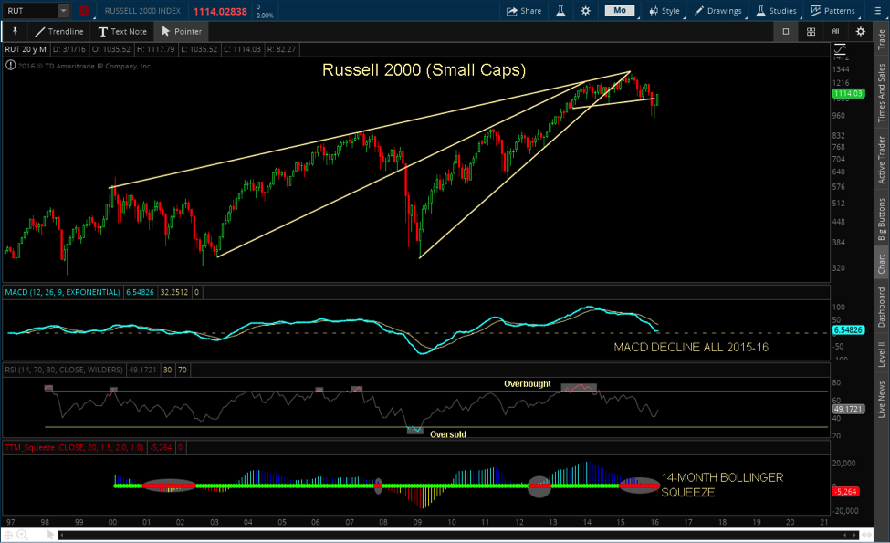
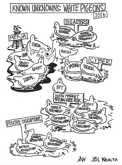
In discussing the Trillion Dollar Question chart, it is often said that there is no proximate cause on the horizon for a large stock market decline from the similar set up. I would say that there are more potential causes for the apple to fall to earth than in the previous downturns. I do not think the global debt explosion since the credit crisis, the deflationary effects and drag on global growth, nor central banks distortionary policies – taking more extreme measures now than at the height of the credit crisis (e.g., negative interest rate policy driving $5 trillion in global debt into negative yield territory) – should be ignored. Of course, Black Swans, or unkown unknowns, by definition are not seen ahead of time. And, there are a number of known unknowns, or white pigeons as I call them, to keep an eye on as well. Thanks for reading.
Disclaimer from the author:
JBL WEALTH ADVISORY IS A REGISTERED INVESTMENT ADVISER. INFORMATION PRESENTED IS FOR EDUCATONAL PURPOSES ONLY AND DOES NOT INTEND TO MAKE AN OFFER OR SOLICITATION FOR THE SALE OR PURCHASE OF ANY SPECIFIC SECURITIES, INVESTMENTS, OR INVESTMENT STRATEGIES. INVESTMENTS INVOLVE RISK AND UNLESS OTHERWISE STATED, ARE NOT GUARANTEED. BE SURE TO FIRSTCONSULT WITH A QUALIFIED FINANCIAL ADVISER AND/OR TAX PROFESSIONAL BEFORE IMPLEMENTING ANY STRATEGY DISCUSSED HEREIN. OPTIONS STRATEGIES ENTAIL DIFFERENT FORMS OF RISK. COVERED CALL WRITING MAY LIMIT THE UPSIDE POTENTIAL OF OUTRIGHT OWNERSHIP OF A SECURITY IN A GENERALLY RISING MARKET. SELLING PUTS COULD REQUIRE AN INVESTOR TO PURCHASE A STOCK AT A MUCH HIGHER PRICE THAN THE PREVAILING PRICE OF THE STOCK IN A MARKET SELLOFF. EXAMPLES PRESENTED ASSUME THE ABILITY TO CONSISTENTLY SELL OPTIONS AT A SPECIFIC PREMIUM AND MAINTAIN OWNERSHIP OF THE STOCK IN A COVERED CALL SCENARIO OR NOT HAVE TO PURCHASE STOCK IN A CASH SECURED SELL PUT SCENARIO. ALL RETURNS ARE NET OF MANAGEMENT FEES.
Past performance of Trend and Momentum models does not predict future performance. All returns shown are with dividends and distributions reinvested. Any benchmark chosen may or may not reflect the same markets or volatility of the back tested portfolio designed and may just be a representative benchmark of a large capitalized stock index. Index returns include dividend reinvestment. Graphs in and of themselves are not predictors of future price movements. All returns shown are net returns and reflect the deduction of the management fees of JBL Wealth Advisory. Back tested modeling has inherent limitations as models do not represent the results of actual trading using client assets but results are achieved by the use of a retroactive application of a back tested model that was designed with the benefit of hindsight. The results do not represent the returns that any investor achieved. Back testing allows the security selection methodology to be adjusted until past returns are maximized. Actual client performance may differ significantly from back tested performance.
Twitter: @JBL73
Any opinions expressed herein are solely those of the author, and do not in any way represent the views or opinions of any other person or entity.
: Cup (and Maybe Handle) Watch")
 Reaches Important Price Support")
