By Alex Rinaldi Last Friday on January 25, 2013, the S&P 500 had its first weekly closing price above 1,500 since 2007. This news made headlines all over the world, as investors cheered for a rally they could finally believe in. And to add to the media overload, almost every pundit on TV and in various writings is now arguing that you “must” buy stocks right now. Their reasoning goes something like this: 1) You cannot fight the Fed, 2) There is simply too much momentum in stocks, 3) The Great Reallocation out of bonds and into stocks, and 4) The return of growth, which is now supported by recent economic data. While I am a believer in the Great Reallocation out of bonds and into stocks, and I do believe 2013 will be a year that growth stabilizes across the globe, there is a vast difference between growth “ripping” and growth stabilizing. Additionally, the Great Reallocation does not tend to happen all in one move. And further, markets have a funny way of sucking bulls in near tops, just before a market correction. Furthermore, the “don’t fight the Fed” or “markets cannot correct because of the Fed” argument is a shortsighted and silly one. It is a clear sign of an overzealous self-confident investor. Markets have corrected repeatedly since the Fed first intervened in 2008… And currently, greed is prevailing over rationality, and the market has gotten ahead of itself. Prepare for a correction.
New bulls have largely missed the rally in 2013, which I believe is due in part to “Fiscal Cliff” fears. I argued on December 4, 2012 that this was an overblown media story – read: Bullish – Despite The “Fiscal Cliff”. In the article, I wrote that the “Fiscal Cliff” was more of a process than an event and lawmakers had no incentive not to get a deal done. At that time, “intermarket trends” were signaling the return of the cyclical trade and the return of inflation expectations within the market, which ultimately turned out to be true. The S&P 500 (SPX) is currently on pace to have its best January since 1997, when it was up 6.1%. The problem I have with the newfound argument of current bulls, is not only do investors love to chase past price, but more importantly, I ask, where were these “bulls” in December when it was the perfect time to buy stocks? If you continue to listen to broken sources, then you will continue to get broken returns.
The argument for “all-time highs” has now become a popular one, almost reminiscent of September 2012, when Bernanke unleashed QE3 (which thus far has not proved to be reflationary). Similar to today’s environment, almost every pundit on TV and in various writings was arguing, “don’t fight the Fed” and “buy the dips” because stocks are cheap! However, what these pundits continually fail to realize, is that “cheap” can get cheaper fast. Valuation is not a catalyst. When intermarket trends are signaling a deflation pulse in the market, it is best to be out of stocks, or short stocks, and into the safety of bonds. There is currently a countdown clock to “New Dow All-Time Highs,” also reminiscent of the so-called, “Fiscal Cliff Countdown,” as the Dow currently approaches 14,000.
Below I will utilize Intermarket Analysis to show why I believe that market is more likely to see Dow 13,000 before it sees new all-time highs.
Signs Point to Market Correction: “All-time Highs” on Hold
Understanding “Intermarket Analysis”
Highlights:
- SPX Defensive Sectors Leading (XLU & XLP)
- SPX Cyclical Sectors Lagging (IWM & XLI)
- Cyclical Emerging Market Deterioration (EEM & EMB)
- Velocity of Crude Oil Prices ($WTIC)
- Return of the VIX?
- Conclusion
What is Intermarket Analysis? Intermarket analysis examines the correlations between four major asset classes: stocks, bonds, commodities, and currencies. Understanding these relationships can help investors determine the stage of an investing cycle, select the best sectors, and avoid the worst performing sectors. Investors can use these relationships to identify the stage of the business cycle and improve their forecasting abilities. In conjunction with intermarket analysis, I will also use behavioral finance, and some recent economic data to fortify my conclusion.
It is important to note that this writing using intermarket analysis is focused on the correlation of multiple inflection points occurring simultaneously across multiple asset classes and sectors. It is also important to note that there is a misperception that indexes and absolute price lead markets. In reality, as supported repeatedly by academic research, it is sectors that lead the market and not the other way around. In a bull market with rising prices, cyclical stocks outperform the SPX, and in a bear markets with falling prices, defensive sectors outperform the SPX.
1. S&P 500 (SPX) Defensive Sectors Leading (XLU & XLP)
Below are two charts of the defensive sectors XLU & XLP that are leading the SPX. I find this to be troublesome for the market. Another defensive sector that is starting to lead is Healthcare (XLV). Note, however, that I did not include every chart for every sector, which is for brevity’s sake. I did make sure to include my thoughts, as well as the different cyclical sectors to follow in the next section.
For all of the relative price charts to follow, please remember that a rising ratio on the chart means that the numerator, which in the chart below is XLU (Utility SPDR ETF), is outperforming the denominator, which is IVV (S&P 500 iShares ETF). And inversely, a falling ratio on the chart means that the numerator (XLU) is underperforming the denominator (IVV).
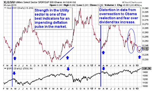
I intentionally chose to begin with defensive sectors that were leading the SPX over cyclical sectors that were lagging, because they provide a clear precedence of being a leading indicator for a market market correction. Consider the lowest beta sector in the market, the utilities sector, which provides a high dividend, a boring business, and minimal price appreciation. If utilities start to lead the market then investors can assume that money, either consciously or subconsciously, is starting to position itself defensively. When the utilities sector starts to consistently lead the SPX, it should be a time to start lowering gross exposure, tightening net exposure, and considering buying protection.
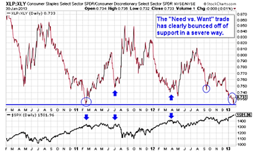
The (XLP:XLY) ratio, better known as the “Need vs. Want” trade, is the price ratio between consumer staples and consumer discretionary stocks; better said, things you need to buy versus things you want to buy. While this ratio is not against the SPX, it is still one of the more important intermarket trends to keep track of because it provides a clear look into the psychology of a trader. Notice how the inflection points on the ratio tend to correlate with the inflection points from (XLU:IVV) in deflationary periods before a major market correction in the SPX. Additionally, if you were to look at a price ratio of (XLP:IVV), you would not only notice similar inflection points, but also that the ratio is currently signaling possible deflation as well.
2. SPX Cyclical Sectors Lagging (IWM & XLI)
Below are two charts of cyclical sectors IWM & XLI that are lagging the SPX, which is also troublesome for the market. Keep in mind that the charts are merely in their early stages of a market correction, and it is more of a “process” than an “event.” Other cyclical sectors that are starting to lag are Transports (IYT), Aerospace & Defense (ITA), Metals (XME), and Materials (XLB). Sectors that are stalling are Financials (XLF), Consumer Discretionary (XLY), and Technology (QQEW). Note that I chose the QQEW for technology because the XLK gives an unfair overweighting to the current destruction of Apple. The QQEW gives an equal weighting to the top 100 Nasdaq companies, which properly shows that the sector has been strong. Cyclical sectors that are still showing considerable relative strength are Energy (XLE), Mid-caps (MIDD), and Housing (ITB). Make sure to look at all of them for yourself!

The Russell stocks are small-cap, high beta, cyclically sensitive stocks, which have more exposure to the US domestic economy than S&P 500 multi-national corporations. The outperformance of the Russell during December and the so-called, “Fiscal Cliff” was a strong part of the thesis for my article, Bullish – Despite The “Fiscal Cliff” and a classic example of investors ignoring the message of price. On Wednesday January 30, 2013, the US GDP report was released with an expected reading of +1% and missed with an actual reading of -0.1% for the 4Q of 2012. While the SPX was down merely -0.4% on the day, and many investors felt comfortable shrugging off the missed number, the Russell was down -1.15% and is a much better gauge of investor’s reaction who are the most sensitive to the number. The missed GDP number is just one possibility for a market correction, although it would not be the only reason (especially as data can be revised). But the Russell will certainly be an important trade to keep track of.
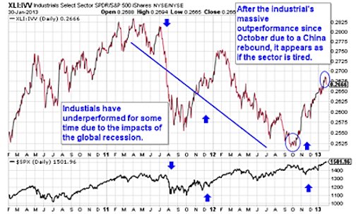 It is troublesome that industrials, which have been a strong outperformer since October (and even through the November market correction), have started to lag the market. This deterioration is likely correlated to the weakness we are seeing in the emerging market trade, which we are about to analyze in detail. More time is needed here to see if this trend continues or reverses.
3. Cyclical Emerging Market Deterioration (EEM & EMB)

As the old cliché goes, “You can’t know where you are going until you know where you have been.” First notice the downward sloping trend line that demonstrates the effects of the global recession on export economies, and therefore equity prices, in the emerging markets. I have also drawn an upward sloping tend line, which shows the initial stages of the undoing of that massive underperformance in emerging markets relative to the SPX since 2010. This recent outperformance, which noticeably and logically accelerated in December, due to our uniquely domestic “Fiscal Cliff” fears, has reversed in 2013. The return of the EM cyclical trade is an overall positive for 2013, as growth expectations reemerge. However, the recent underperformance of EEM in 2013, should give investors pause about the degree to which growth expectations and the cyclical trade has returned.
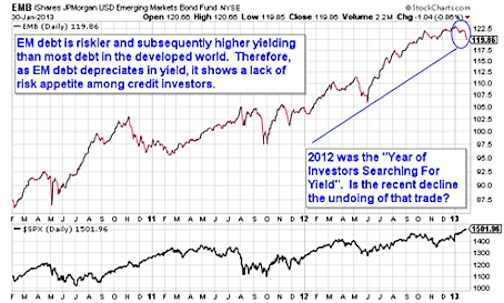 The chart above shows quite a parabolic move for a credit product. 2012 is known quite well as the year of investors searching for yield in both high dividend stocks and riskier debt. The negative narrative of a European collapse proved to be quite powerful, as most investors avoided equities, missing much of the +15% rally in the SPX and the +30% rally in the German DAX. 2012 could also be known as the year of reflation. Near-term this chart has bearish implications because it shows investors are getting out of riskier EM debt due to deflation expectations.
However, I believe for 2013, this is healthy because some reversion to the mean is needed; usually with one extreme comes another. This could mean that when the equity market correction is over, and worldwide equities begin to rebound again, investors could reallocate their previous capital from EM bonds into EM equities (EMB:EEM).
4. The Velocity of Crude Oil Prices ($WTIC & $BRENT)
Due to the “financialization” of commodity markets, most commodities, and especially oil, have a strong correlation to stocks. Consumers do not like to see rising oil prices because it directly affects their ability to spend. Consumer spending is about 70% of US GDP, and if oil prices rise too quickly, then it will severely affect US growth and consumption. However, what most consumers do not realize is that rising oil prices usually signifies that there are inflation expectations in the economy and, often times, rising stock prices. This is better than a deflationary environment with falling stock prices. The key to this relationship between hurting consumer spending and providing an inflationary environment is what is known as “cost-push inflation.” Cost-push inflation is the substantial increases in important goods or services where no suitable alternative is available. In the chart below, we can see the velocity in the spot price of crude oil has been “substantial” over the past 2 months.
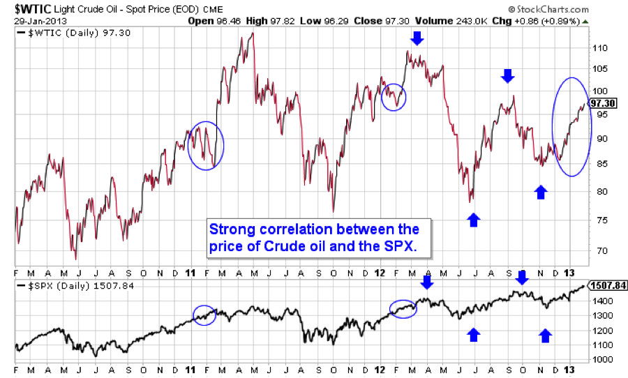
I have circled two extended periods of time when the correlation between crude oil and stocks was very negative, which both happened to be in February the past two years. If this February trend were to continue in 2013, then it would be a positive for equities in February, as the consumption headwind would be minimized. As it currently appears, the velocity of crude oil prices does not look to decelerate any time soon. Additionally, if you were to look at a chart of Brent crude oil from the past two weeks, you would see the price has increased by +5% in a straight line. This is one potential reason why the market could be sensing deflation. Higher oil prices means higher gas prices in the future, which is essentially an increased tax on top of the removal of the payroll tax holiday. Did the price of oil get ahead of global growth demand? Was there an overreaction to the amount of WTI available in North Dakota and Canada? Are there tensions building up in the Middle East worse than what we aware of now? For example, are the sanctions on Iran starting to cause geopolitical tensions and unrest within the country and the region? Is the situation between Syria and Israel going to escalate soon? These are just some possibilities. Markets have a funny way of keeping themselves in balance.
5. Return of the VIX?
I intentionally left the VIX for last because of a few different reasons: 1) The VIX has little predictive value; despite many who believe otherwise, I believe it sends out many false “signals.” 2) The VIX is a reactionary tool. The VIX usually gets bid up during a corrective period and not so much before it. 3) Traders buy VIX calls for protection when they are uncertain about the future. While all that may be true, it still does not change the fact that many investors, especially in the financial media, believe that the VIX has predictive capabilities. The financial media reported the “unusually/abnormally low VIX” all summer of 2012 and how it could not break 20… as if that is some type of crime.
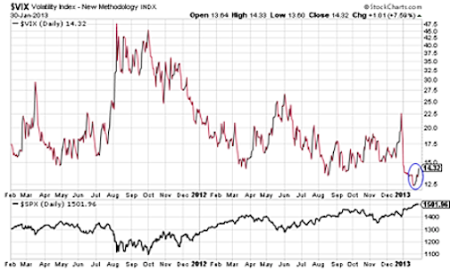
The reason I mention this is because it shows a clear behavioral bias and selective reporting. If you look at the chart above, clearly the VIX has made a substantial move that is worth mentioning. However, the relevant and catchy news story now is a market that won’t stop going up and one that could hit Dow 14,000 and all-time highs. This exact reporting just may be enough to prevent it from happening near-term. Last year as the SPX was in overbought territory most of the entire winter, the media was baffled, and kept pounding the European fear trade. It is common sense that any fact or news story, which is known by everyone, is no longer useful information once it becomes widespread knowledge. For example, the “Fiscal Cliff” could neverbe classified as a Black Swan event. According to Wikipedia, the definition of a Black Swan event “is a metaphor that describes an event that is a surprise (to the observer), has a major effect, and after the fact is often inappropriately rationalized with the benefit of hindsight.” It’s amazing to me how many people don’t understand this basic concept of the Black Swan; yet use the term so freely.
It will be inherently more difficult for the market to make all-time highs, as all the new bulls join the party late, and sit there and wait for it to happen. Who is going to be the next incremental buyer? Just like Apple, everyone owned it. And who was the next buyer? The fact that the VIX is being under reported, one of the financial media’s favorite tools, AKA “the fear gauge,” is very telling to me. It shows their bull bias and makes me feel more confident that they are going to be blindsided as usual. If there’s one entity in the world that has no clue on how to listen to price, it’s the financial media. That is precisely why I enjoy Twitter so much. You can find much better and more reliable information and investors. It seems like it’s just about time for markets to “refresh the fear” – as my friend Michael Gayed of Pension Partners likes to say.
6. Conclusion
Those bulls that want to point towards recent “improving economic data” as a reason for equity markets to continue to power higher are ignoring the most basic principle of markets. “Expectations set price.” Economic data does not set prices. Valuations do no set prices. EPS growth does not set prices. The recent SPX move in January was justified by the backward looking economic data that has been released. See, it’s the other way around new bulls. The market is a discounting mechanism that looks ahead. While housing is improving, while the jobs numbers are improving, while the PMI number is showing expansion – all of that data is OLD news. There is a lot of good news priced into markets. Current prices possibly signaling deflation, most likely will be justified in the future by either weak economic data, and/or future news events that we are currently unaware of at the moment. Again, the market is a discounting mechanism that looks ahead. If you wait to invest once the economic data is good, then you likely already missed the move higher.
One economic data point that I would like to touch upon briefly was the Spanish GDP number that came out on January 30, 2013 and the reaction in Europe. The Spanish GDP number was an expected -0.6% and was reported as an actual slightly worse than expected -0.7%. The problem with this report is that Draghi has not yet actually provided any liquidity to support European economies in recession mode. In August, he merely stated, “The governing council, within its mandate to maintain price stability over the medium term and in observance of its independence in determining monetary policy, may undertake outright open market operations of a size adequate to reach its objective,” and equities rallied on improved sentiment. This shows pundits how powerful words can be, as the German DAX finished the year +30%, the French CAC finished +15%, despite the fears of a Euro breakup. Additionally, the finance minister of Spain came out last month and said Spain no longer needed a bail out because of an improvement in market sentiment. PROVING that markets can drive economics and it’s not always the economics driving the markets. Very underrated aspect of markets, in my opinion. Markets are so big now; worldwide equity market capitalization of roughly $55-60 trillion dollars, that they themselves can help fuel economic growth. You can keep laughing at Bernanke and the “Wealth Effect,” but it kind of works… My ultimate point being that there is plenty of data that could possibly not be priced into this market. Consider Italian data for business and consumer confidence was finally reported as better than expected, but the Italian MIB was down -3% on the Spanish GDP news. A truly massive move, that similarly to the 3% pop China received the day it bottomed, could continue a free-fall for Italy. If Italian & Spanish bond yields start rising considerably, as they did last May 2012, expect another market correction. This is just one other possible catalyst for a market correction.
Also, if you look back at the history of the market, market corrections tend to happen when there is already a deflation pulse beating, just like the deflation pulse that is beginning to beat now. When will the market correction start? How long will the market correction last? How severe will the market correction be? No one knows the answers to these questions. However, what we cannot control are the results of the market, but rather the process that we use to analyze it and how we position ourselves. In my analysis, based on the deterioration of the relative cheapness of bond yields to dividend stocks, the velocity of the market correction could easily be worse than it was in November. Those who are arguing for the bond bubble to pop and rising yields as healthy for the market, first need to realize that if the Treasury yield steepens too quickly, the stock market will lose its backstop and participants will not like it. This would be the loss of the “Bear Paradox” – the idea that as investors panic and rush out of equities and into the perceived safety of Treasuries, the yield on the Treasury drops, while the dividend yield on stocks rises with falling equity prices, ultimately making stocks a better income play than Treasuries, and slowing down the speed of the market correction. The loss of the Bear Paradox would imply that we could see market corrections in 2013 that are much steeper than they were in 2012.
However at this juncture, I do not expect a decline worse than 100 SPX points, depending largely upon on how credit spreads (JNK:BND) react to the downward move in equities. (This is subject to change with further analysis in the future when more data is available).
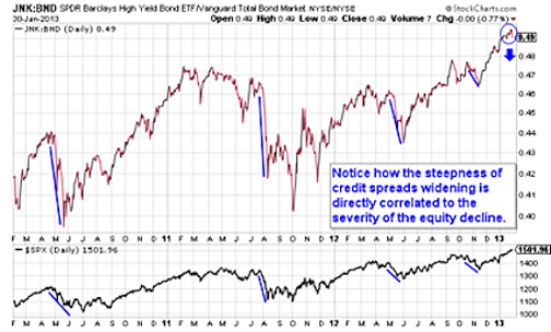
Consider the action in JNK bonds on January 30, 2013 -0.87%, almost giving up their entire gains for 2013 in one day. Again, this is a truly MASSIVE move for a credit product. Consider the overbought condition JNK debt is currently trading. If tight credit spreads were to widen too quickly, then the 100-point SPX drop I mentioned above, could easily turn into 200 SPX points with a liquidity freeze in the junk debt market. Again, while I do not see this as likely, no one knows for sure. I would expect a bigger market correction like the one I just described to happen later in 2013 when the junk bond bubble truly pops. And lastly, also consider the reaction of the 10-yr bouncing against the Fed’s targeted rate of 2% inflation. It is amazing that this is not being reported currently. Understanding the Fed has been the key to understanding how to trade these financial markets. It is about time inflation expectations reached the Fed’s targeted stated rate. However, I presume the market isn’t ready just yet to give Bernanke his wish.
Based on intermarket trends, I believe it is best to position defensively, as the new bulls ignore the message of price – and a market correction seems imminent.
Author note: Please keep in mind that the charts and analysis are in the very early stages of a market correction and there is still more time needed to fully confirm the data. However, I feel confident that the current trend of a market correction will continue due to the simultaneous deterioration of so many charts and from analyzing historical precedence. Keep in mind that market corrections require patience. There is a process before the event, as markets begin to sense deflation. What the exact catalyst will be for the market correction will not be truly known until after the fact. I tried to present some possibilities within this article. But know that Bulls will keep buying the dips, ignoring price, and screaming and shouting on the way down as the market makes lower highs and lower lows. But most importantly, they will keep getting punished with their hubris that the market cannot correct because of the Fed.
About Alexander Rinaldi: Alexander is a graduate of Lehigh University ’12 with a finance degree, an accounting concentration, and a history minor. He has had 2 summer internships at S.A.C. Capital in 2010 and 2011. He has a strong passion for investing and the markets and is currently looking for work in the financial arena. Alex is writing to gain exposure and stretch and demonstrate his analytical capabilities. He is currently in the interview process, and hopeful to land a job soon. Alex enjoys watching sports such as the NFL, NBA, MLB, and NHL. He is an avid golf and tennis player in the summer and lives in Connecticut. If you would like to contact Alex, please feel free to email him at RinaldiAlex2@gmail.com.
Twitter: @rinaldi224 @seeitmarket
No position in any of the securities mentioned at the time of publication.
Any opinions expressed herein are solely those of the author and do not in any way represent the views or opinions of any other person or entity.

: Showing Some Signs of Emerging Strength")
