click image to enlarge
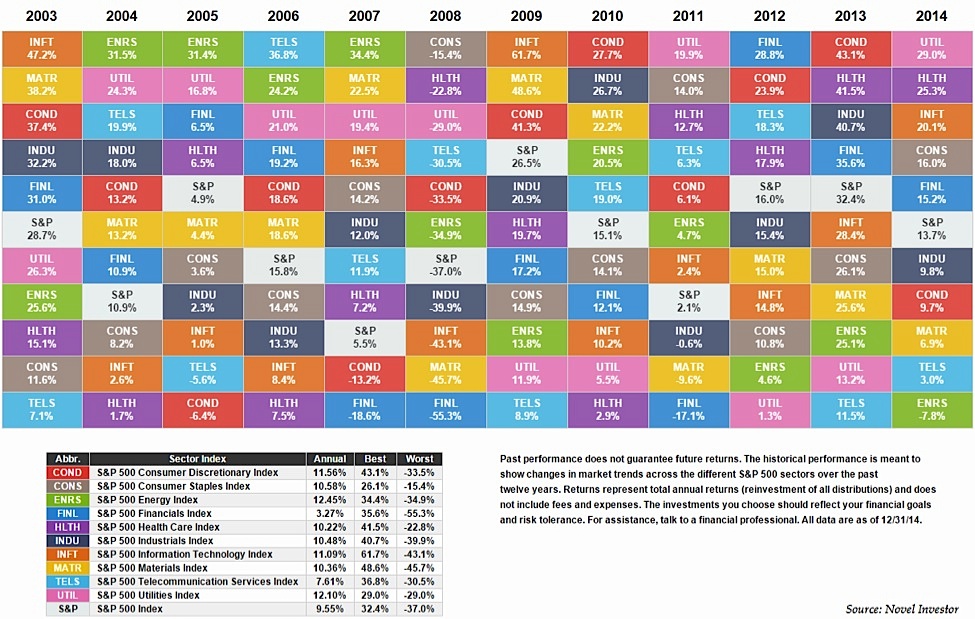
This chart courtesy of the Novel Investor blog shows the S&P 500 sector component returns, broken out annually to show the best and worst performers.
Like most asset allocation quilts, you can see that there is little rhyme or reason to the rankings of the best and worst performing sectors from year to year. But I still think that there are some lessons investors can take away from these sector performance results by digging a little deeper.
By far the least volatile sector over this twelve year period was Consumer Staples (SPDR ETF – XLP), with a standard deviation just under 10%, which is impressive considering the annual return over this period was 10.6% per year. That’s an outstanding risk-adjusted return for one of the most boring sectors in the market. The 15% loss in 2008 definitely helped.
The Lesson: Boring stocks and sectors are often overlooked by most investors as the flashy, headline grabbing stocks get the most attention.
The most volatile sector was also the worst performer – Financials (XLF) which earned just 3.3% per year despite annual volatility in returns of almost 26%. This is despite the fact that financials have more than doubled as a group over the past three years.
The Lesson: Sometimes you get paid for taking larger risks in the markets, while other times higher risks lead to disappointing results.
Even with a poor showing in 2014 from the startling crash in the price of oil, the Energy Sector (XLE) is still the top performer over the entire period since 2003 with an annual return in excess of 12% per year. This is worth thinking about for those that will be trying to bottom fish in the sector. Anyone trying to play a reversion to the mean in energy should take this fact into account.
The Lesson: While there certainly could be babies being thrown out with the bath water in the energy sector, energy names have been the top performers for a long time running now – tread carefully into the sector.
The second best performing sector is another boring one – Utilities (XLU). While utilities are generally thought to be interest rate sensitive, it’s worth noting that the Fed was raising rates from 2004 to 2007 and utilities as a sector were still up nearly 15% per year. At this point it really depends on how much of the recent gains have priced in the current low rate environment. Also from 2004-2014, utilities were either ranked in the top three based on annual performance or the bottom two.
The Lesson: Defensive sectors can lead to feast or famine results as investors go back and forth between a risk-on or a risk-off mindset.
The average return for the S&P 500 as a whole was 9.6% per year from 2003-2014, but you can see from these numbers that those returns were extremely back loaded in the past six years (click to enlarge):
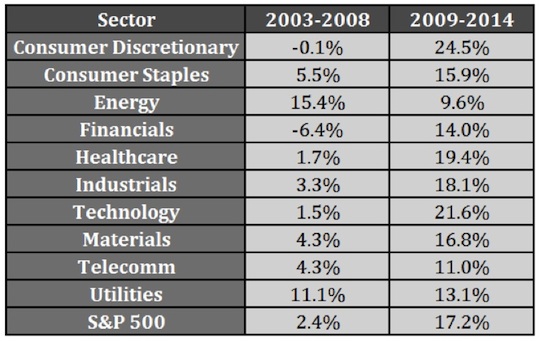
The Lesson: At times, investors have to be patient to earn even average market returns. There were only two sectors with double digit returns in the 2003-2008 period (which is skewed by the 2008 crash) while the performance since 2009 shows only one sector – energy – with annual returns just shy of double digit gains.
Now take a look at how the ranks shifted over time as mean reversion has come into play::
![]()
The top performer in the first column period went on to become the bottom performer in the ensuing period. Also, Consumer Discretionary (XLY) went from almost last to first, as they were one of the most hated sectors coming out of the Great Recession. Many of the best performers and worst performers traded places.
The Lesson: No market segment outperforms forever, just like the cellar dwellers are never completely down for the count. Any investment can become a good value at the right price or a poor value at the wrong price.
Although investors have been complaining during this extended bull market that there is low dispersion and high correlation between individual stocks, it hasn’t affected sector results. The average range between the top and bottom performing sectors was almost 37% from 2003-2014. The widest range was 53% in 2007 while the narrowest it got in this period was 25% between the high and low sector.
The Lesson: Your stock-picking skills might not matter if you happen to choose the wrong sector in any given year. While picking the best performing sector is no easy task from year to year, if you are able to broadly place your capital in the better performing sectors it might not matter which individual names you choose as the rising tide can lift all boats at times. In short, sector performance matter to your investing results.
Follow Ben on Twitter: @awealthofcs
Any opinions expressed herein are solely those of the author, and do not in any way represent the views or opinions of any other person or entity.


