Tech stocks have been on shaking ground over the past several weeks / few months.
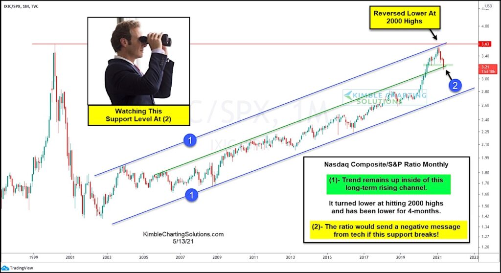
And this shows up clearly in today’s ratio chart, pitting the Nasdaq Composite versus the S&P 500 Index on a “monthly” basis.
This long-term chart really gets at the heart of the Nasdaq’s performance versus the broader market… and because it’s a “monthly” chart, it really highlights the macro trend.
As you can see, the Nasdaq’s out-performance propelled it to touch its 2000 highs before pulling back. The recent underperformance has seen the Nasdaq slide to a key trend-line support area.
Bulls want this area to hold and spur another rally attempt higher. But if this price support breaks down, then look for tech stocks to under-perform as the ratio heads to the lower end of its up-trend channel. Stay tuned!
Note that KimbleCharting is offering a 2 week Free trial to See It Market readers. Just send me an email to services@kimblechartingsolutions.com for details to get set up.
Twitter: @KimbleCharting
Any opinions expressed herein are solely those of the author, and do not in any way represent the views or opinions of any other person or entity.


