Tech stocks have played a major leadership role in the 12 year advance off the 2008-2009 stock market low.
But within that leadership silo, it has been large cap tech stocks that have been the real leaders.
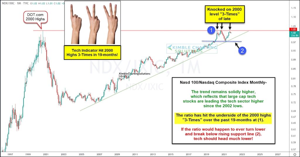
Today’s chart highlights this by showing the ratio of the Nasdaq 100 Index (100 largest tech stocks) versus the Nasdaq Composite. This ratio has been headed higher and remains solidly in an up-trend.
That said, the ratio is also testing its 2000 high… for the third time in the past 19 months at (1)! And pricing pressure is mounting as the up-trend squeezes price into resistance.
Breakout or breakdown coming?
If the ratio cannot breakout above resistance, then investors must turn their attention to the up-trend support line, followed by the prior low at (2). A breakdown through these two supports would be a major warning to tech investors. Stay tuned!
Note that KimbleCharting is offering a 2 week Free trial to See It Market readers. Just send me an email to services@kimblechartingsolutions.com for details to get set up.
Twitter: @KimbleCharting
Any opinions expressed herein are solely those of the author, and do not in any way represent the views or opinions of any other person or entity.


