2014 has seen the stock market grind higher, showing resiliency at each setback. And considering the 30 percent rally in the S&P 500 last year (and 38 percent rally in the Nasdaq Composite Index), one might even refer to this years market as relentless thus far. Scratching a bit below the surface, it’s clear that 2014 has been another banner year for large cap tech stocks and the NASDAQ 100.
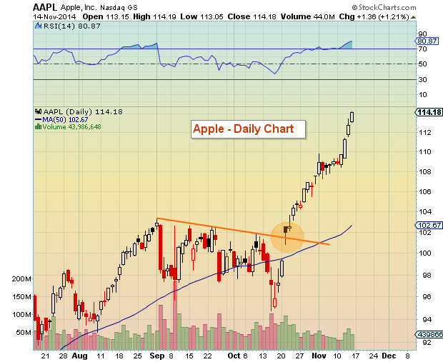
It has also marked the return of Apple (AAPL). And in a big way. Check out the chart below of Apple’s stock below – and pay attention to the big breakout over $100 that occurred in November.
Apple (AAPL) Daily Stock Chart
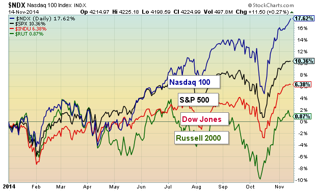
But Apple is just one of several names leading Tech stocks higher. Check out the the NASDAQ 100 outperformance of its fellow indexes in 2014. Wow. And considering Tech’s outperformance in 2013, this has to make tech fans wonder if the behemoth tech index is getting ready for some relative underperformance.
Stock Market Leadership 2014 – Major Stock Market Indexes
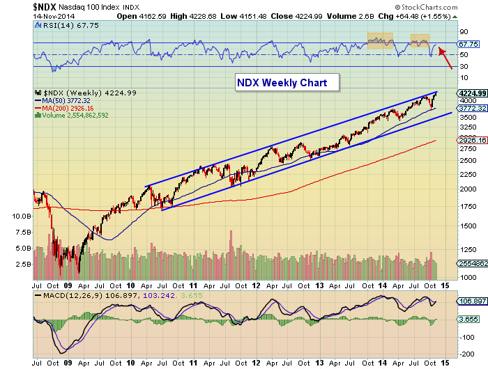
So what would be concerning here for Tech in general? Well, next let’s look at the weekly chart of the NASDAQ 100. The latest correction came from the top of the bullish trend channel dating back to 2010. Problem is (and it’s a good problem to have if you traded it right), the NASDAQ 100 is back to the top of the trend channel just 2 months later. And price is well above the September highs… and RSI is still sub-70 (a minor divergence). But probably of more concern is the redlining RSI over the past 18 months. It makes me wonder if this is sustainable… it has perked up my antennae and has me thinking about possible rotation in (or into) 2015.
NASDAQ 100 Weekly Chart
Now this doesn’t mean that the Tech sector is headed into a bear market. In fact, it doesn’t mean anything until it does. And it really depends on your investing style and indicators (balancing reactive and proactive).
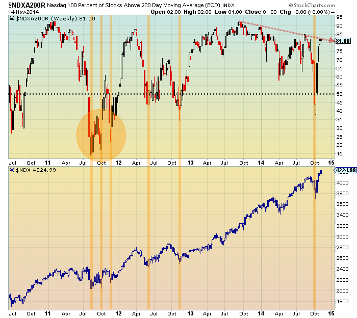
Below is one more chart showing the percent of NASDAQ 100 stocks above their 200 day moving average. There are two major takeaways:
1) Each time this indicator has dipped below 50 percent, it has lead to a lasting bottom (bullish). The October lows dipped below 40 percent, so this should give longer-term investors some comfort.
2) However, as the NASDAQ 100 has made new price highs, the participation has dipped (lower highs).
All of this is simply food for thought. It’s been a banner year for tech stocks. Stay disciplined.
Follow Andrew on Twitter: @andrewnyquist
No position in any of the mentioned securities at the time of publication. Any opinions expressed herein are solely those of the author, and do not in any way represent the views or opinions of any other person or entity.


