I spend a lot of time scouring the market for short-term tactical trading opportunities such as key reversal points, but it’s also very important to consider the big picture.
Sometimes I like to step back and try to figure out which general direction the wind is blowing in the market. In other words, what is the overall trend? Is the market cheap or expensive?
Some of my clients are “slow money investors.” They include 401(k) investors and buy-and-hold advisers who only make a few trades a year. My “big-picture” research is geared to them.
So, occasionally I do a deep dive into market valuations. Now, my experience is that broad measures of market valuation such as price-to-earnings (P/E) ratios don’t have much value for short-term, market-timing trades. After all, the market can remain “overvalued” for years at a time when investors are enthusiastic about stocks and keep bidding up valuations. Think the late 1990s.
However, looking at historic valuations can help long-term investors roughly gauge what they can expect the market to offer in the future. Of course, no one has a crystal ball. But the idea is to look at current market valuations to figure out whether the market seems expensive, cheap, or fairly valued, relative to history.
Check out the chart below put together by my friend Doug Short. The chart goes back to 1990 and combines four common market valuations measures into one line.
Click to enlarge:
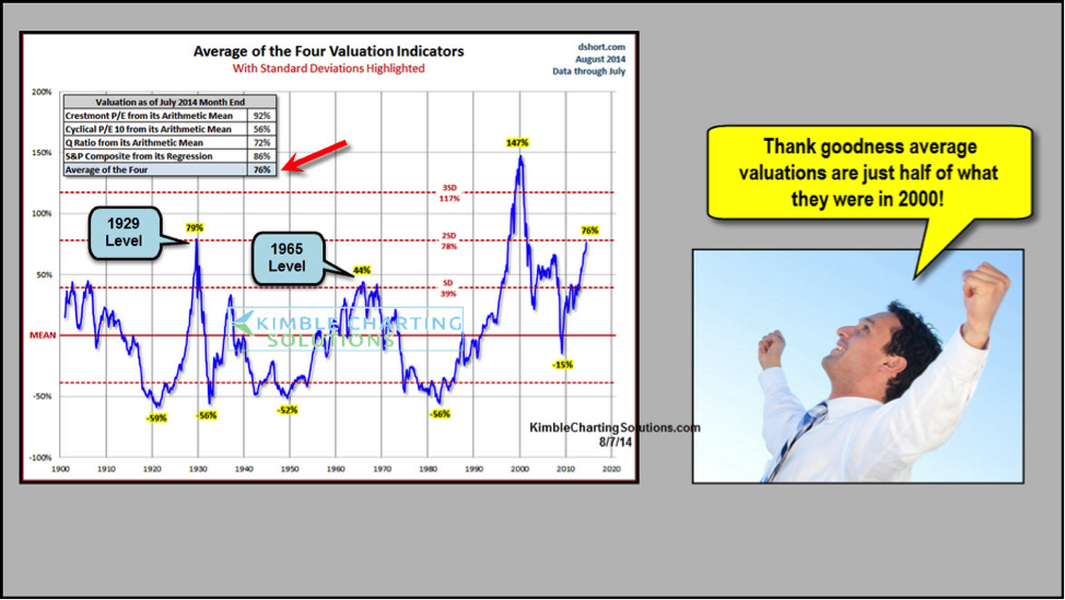
A few things jump out at me. According to this valuation yardstick, the market is similar to where it was just before the crash of 1929. It is also more expensive than it was in 2007 before the financial crisis, but by this measure, market valuations are just half of what they were in 2000 leading up to the dot-com crash.
Recently, the S&P 500 has hit a rough patch the past couple weeks on geopolitical concerns in Ukraine, Gaza and Iraq. Still, the index’s price level remains a stone’s throw from all-time highs.
Put it all together, and I’ve been telling my Premium Members that pulling back some “slow money” exposure to the market may not be a bad thing right here.
Can U.S. stocks rally more and become more “expensive?” Sure they can. But the fact remains that when you look at long-term valuations, this is rare territory.
So that’s the fundamental picture.
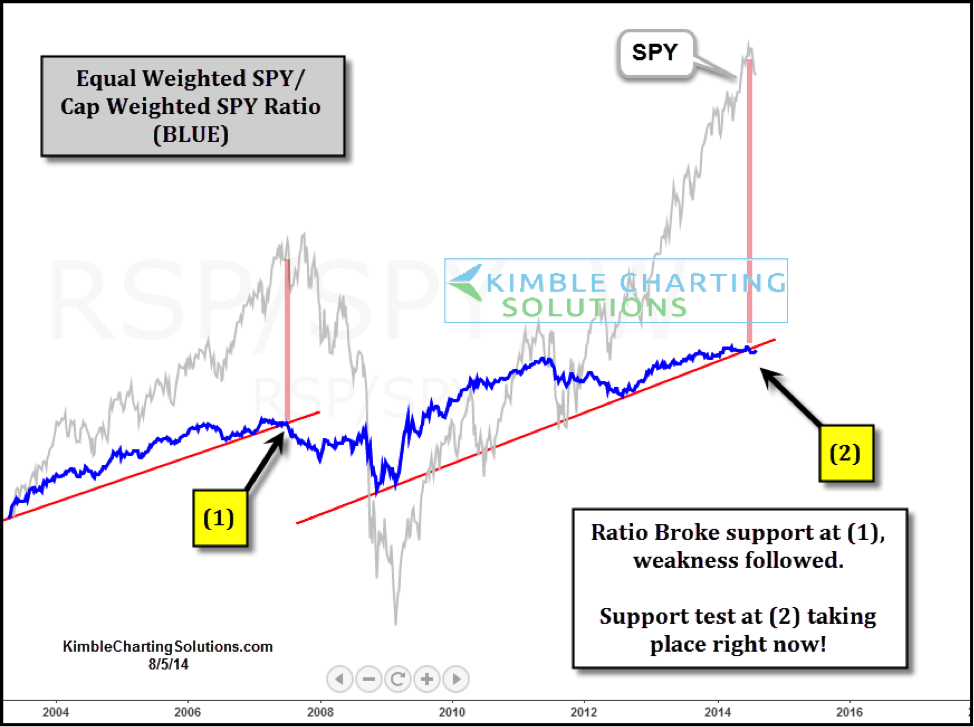
My technical research also suggests that discretion is the better part of valor in the current climate.
The chart below shows the performance of the S&P 500, on both a cap-weighed and equal-weighted basis. We’re seeing signs of weakness.
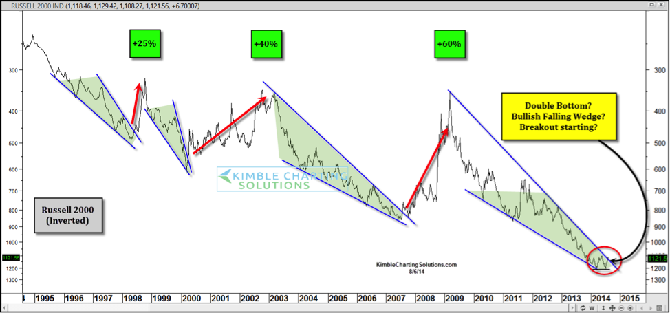
Finally, I also look at small-cap stocks to measure risk appetite. Below is an inverted (upside-down) chart of the Russell 2000. It could be carving out a pattern that may lead to trouble for small-cap stocks, which could then spill over into the S&P 500.
My idea here is NOT to scare investors. We’ve had a great run from the 2009 low and it has paid to buy every dip. The bears seem to have gone into hibernation.
Yet looking at all the evidence, I think now is the time to remain long and take a little off the table on the exposure front. Something we might want to ask and consider is…. how many long lasting buy and hold bull markets have started from these type of valuation levels in the past 100 years? So far none! Let’s see if it’s different this time.
Follow Chris on Twitter: @KimbleCharting
No position in any of the mentioned securities at the time of publication. Any opinions expressed herein are solely those of the author, and do not in any way represent the views or opinions of any other person or entity.


