So much focus has been on the stock market that many have lost sight of how crazy the treasury bond market is…
Consider that it’s trading at all-time highs and yields are coming in at lows not seen in modern historical terms.
Today’s post will simply focus on the chart image with a little bit of commentary.
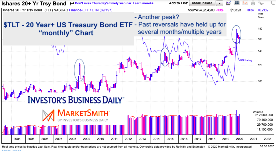
It think it’s nice to find solid charts that can speak loudly across their current time frame. In this case it’s a “monthly” price chart of the long-term US Treasury Bond ETF (TLT)… so clearly, this is a long-term investing chart and the implications are to be viewed in months / years out.
Note that the following MarketSmith charts are built with Investors Business Daily’s product suite.
I am an Investors Business Daily (IBD) partner and promote the use of their products. The entire platform offers a good mix of technical and fundamental data and education.
20 Year+ US Treasury Bonds ETF “monthly” Chart
Quite simply, the bearish reversal (long wick circled) that occurred in March was massive – similar to the one seen in the 08-09 financial crisis. In fact, March saw a high of 179.70 and a low of 139.01. Though it closed well off that low and TLT has rallied back to within 10 percent of the peak (the 6/30 close was 163.93), we remain below it and it will serve as heavy overhead resistance in the months ahead (lots of supply). So low interest rates remain, but it may be hard to crack the 2020 TLT price high (and inverse interest rates low).
Twitter: @andrewnyquist
The author may have a position in mentioned securities at the time of publication. Any opinions expressed herein are solely those of the author, and do not in any way represent the views or opinions of any other person or entity.

: Cup (and Maybe Handle) Watch")
 Trading Near Top Of Price Range")

