The U.S. economy and stock markets have been lead by technology companies (and stocks) for nearly 20 years.
And this dynamic is on full display in today’s chart.
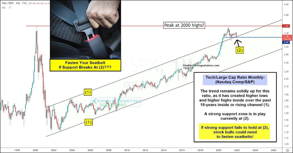
Below is a long-term “monthly” ratio chart of the Nasdaq Composite to S&P 500 Index. In short, if this ratio is heading higher, the Nasdaq (technology) is out-performing the broad large cap S&P 500 Index.
And that is exactly what we have seen for nearly two decades as the trend of this ratio has moved higher and higher. In fact, this price ratio traversed a rising channel marked by each (1) for 18 years before breaking out above it in 2020 and testing the 2000 high.
BUT… since that test, the ratio has moved sideways-to-lower and is testing a strong support zone marked by horizontal and rising channel support at (2).
If this support fails to hold, then stock bulls may need to fasten their seatbelts! Stay tuned!
Nasdaq Composite / S&P 500 Index “monthly” Chart
Note that KimbleCharting is offering a 2 week Free trial to See It Market readers. Just send me an email to services@kimblechartingsolutions.com for details to get set up.
Twitter: @KimbleCharting
Any opinions expressed herein are solely those of the author, and do not in any way represent the views or opinions of any other person or entity.


