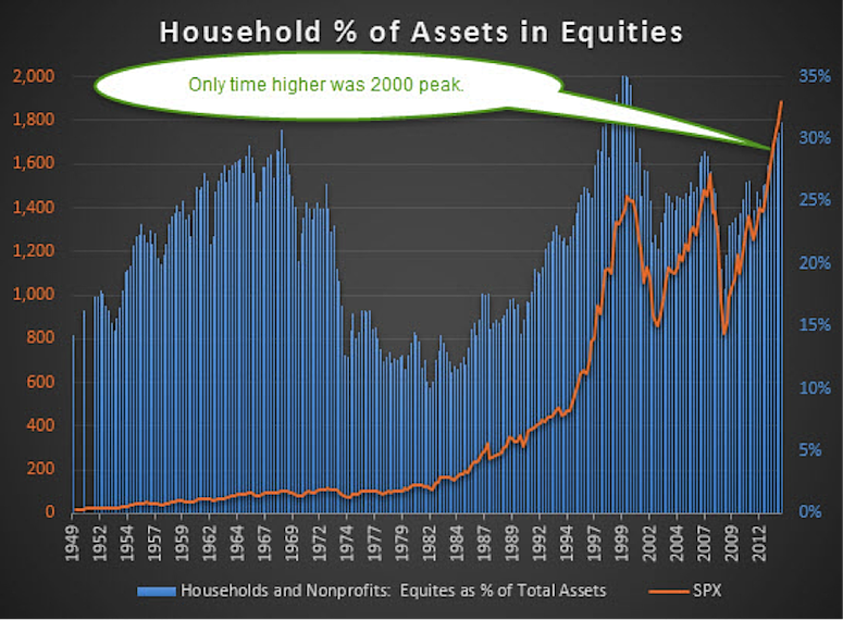
As many readers are aware, I’m a big follower of investor sentiment and household data. Below is one of my favorite bigger picture charts. This chart shows the percentage of households and nonprofits financial assets in stocks and similar holdings. For reference, you can get this data from our friends at the Federal Reserve.
As of the 2nd quarter, this ratio was up to 31.31%, the highest percentage reading in stocks since the bubble in 2000.
Households % of Assets in Equities Chart:
First things first, my pal Dana Lyons at J. Lyons Fund Management has done great work with this data over the years. You can read Dana’s latest thoughts here. Dana is one of the best out there, so be sure to read him regularly.
Now think about this for a second: The only other time in history households held a larger portion of their assets in stocks was at a major peak before a 50% drop in the S&P 500 (SPX) and related ETFs like SPDR S&P 500 (SPY). And that peak took nearly 13 years to clear again. The other major peak recently was 2007 when it got up close to 30% and we all know that was right before the Financial Crisis and another nice 50% haircut in equities. Before that the only other time this ratio cleared 30% was in late 1968. That one took about 12 years to firmly clear the peak the SPX made back then. In other words, when the ratio gets this high, buying stocks isn’t always the best play.
The flipside is the lowest this ratio ever got was 10.10% in early 1982. That was also the perfect time to buy ahead of an incredible 1,000% plus rally that lasted 18 years.
I’m a big fan of using sentiment in my analysis. Sentiment shows us what the masses could be thinking and history says when everyone agrees on something, you want to do the opposite. If everyone loves something they’ve probably already bought, meaning there could be no one left to buy. Or if everyone hates something, there could be no one left to sell.
As amazing as this might seem, a year ago at this time many were betting against the 2013 rally. The crowd hadn’t totally bought in year. This sentiment lead to a massive 10% rally in the fourth quarter and a 30% rally for the year as the masses finally joined in later in the year.
Looking at things now you have to say the fact this ratio is up over 30% is a major warning based on history. Here’s where things get interesting. I tweeted out this chart last night and the always awesome Howard Lindzon pointed out something I hadn’t thought of yet, a lot of people don’t own homes like they once did.
Luckily nobody owns a home – @RyanDetrick % of household assets in stocks at historic levels Only y2k higher https://stks.co/r0o0H $spy
— Howard Lindzon (@howardlindzon) Sep. 22 at 06:39 PM
Is the fact many people don’t own houses like they once did skewing this data? Trust me, I don’t like to plays games with data and there is some definite theory to this line of thinking, but could this fact be playing games with things? Maybe. Think about it, if someone had a lot of equity in their house wouldn’t the ratio of money in stocks be lower? If they don’t own homes like they once did, I’d agree this ratio could be artificially inflated.
The one other point I’ve used before regarding this is the S&P 500 (SPX) is up near 2,000. If someone simply did nothing with their stock investments, they’d have to have a larger percentage in stocks versus any other time because stocks are worth more. Given the SPX is currently 25% above the previous all-time high peak in 2007, I’d guess there’d be little doubt households would have more invested in stocks than any other time. But that isn’t quite the case yet and this is surprising when you think about it.
Here’s my reply to Howard.
@howardlindzon Ha. Also $SPX is about 25% higher than back then, so makes sense this is higher. Kind of amazing not highest really.
— Ryan Detrick (@RyanDetrick) Sep. 22 at 06:41 PM
You have to love social media, one tweet sparked my whole idea to write this article.
Bigger picture, I don’t think we can call this the most hated rally anymore. Most have started to buy into the fact we’re in a bull market. I started using that phrase back in 2010 and I think it made sense for a few years. I’d do videos on Yahoo Finance and the comments they’d write for being bullish were incredible. Usually when the masses disagree with you, you’re on to something. I was called some bad names is all I’ll say. Today you read message boards and the bears are accepting the fact we’re in a bull market, but it’ll end badly eventually. Fair enough.
But will it all end badly because households are heavily invested in stocks currently? I really don’t know the answer there. It is a concern, sure, but the two counter points Howard and I discussed make me think there still could be room for more money invested in stocks as a percentage of the total assets.
Write below in the comments and let me know what you think of this one. It is a fascinating debate and one that I’m grappling with every day.
Follow Ryan on Twitter: @RyanDetrick
No position in any of the mentioned securities at the time of publication. Any opinions expressed herein are solely those of the author, and do not in any way represent the views or opinions of any other person or entity.

: Showing Some Signs of Emerging Strength")

