One of the great things about being a technician is the ability to constantly explore new charts and look at markets from all angles. The Volatility Index (VIX) has gotten a lot of attention lately as it gets to historically low levels. Charlie Bilello, CMT pointed out that the VIX earlier this month was down 48% in the prior 5 weeks, marking the 2nd largest five-week decline in history.
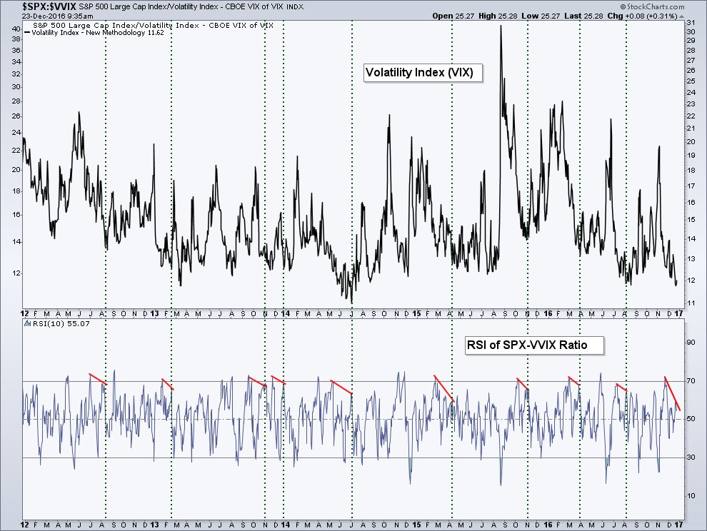
Today I want to look at, what I believe to be, a unique ratio chart – the S&P 500 and the VVIX (Volatility of the VIX… or VIX of the VIX).
What this ratio does is compare the relative performance of the S&P 500 (INDEXSP:.INX) equity market to the Volatility of the Volatility Index. What I’m most interested in is how momentum of this ratio acts and the timing of moves for the VIX itself. . And that’s exactly what I’m looking for in this ratio chart below. When the two-week Relative Strength Index (RSI) for the S&P 500-VVIX ratio as show in the bottom panel moves above 70 (becoming ‘overbought’) and then declines as the VIX itself is declining, has marked some interesting turning points for the Volatility Index and has often marked the eventual low (or close to it) for the VIX.
This is a setup that’s taking place right now as the VIX drops under 12. It’s possible we see the VIX go higher from here, but over what time frame we do not know. As of the time of this writing the VIX is up pre-market, we’ll see if that continues as we finish out the year.
S&P 5oo and VVIX Chart
Thanks for reading.
Twitter: @AndrewThrasher
Any opinions expressed herein are solely those of the author, and do not in any way represent the views or opinions of any other person or entity.

: Showing Some Signs of Emerging Strength")
