For much of the 1980’s and 1990’s the Dow Jones Industrial Average (DJIA) outperformed Gold, as equities soared higher. That period came to an end in 1999 as the tech bubble, 9-11, and the financial crisis hit the financial markets over a 12 year period. But since 2011, the Dow Jones has regained its advantage. The nearly 6 year old bull market in equities has investors feeling pretty good again, as the Dow Jones to Gold ratio is moving higher again.
As you can see from the chart below, the Dow Jones has returned to its outperforming ways. And equity bulls wouldn’t mind further confirmation of that. The Dow Jones to Gold ratio is currently testing resistance and if we see a breakout to new highs, it would likely confirm that trend. Note that the ratio uptrend channel also allots for some room for a correction if the ratio isn’t ready to breakout.
Dow Jones to Gold Ratio – 1982 to Present
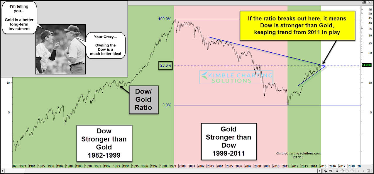
Will the ratio break out to new highs? Or is it due for another test?
From a macro perspective, it is clear that equities returned as a preferred asset class during this bull market run. Equities had another banner year in 2014 and are currently consolidating at all-time highs while Gold continues to try to find a price bottom. This dynamic is showing up in the chart above.
That said, this is merely another “macro” indicator and shouldn’t be used in isolation. Thanks for reading.
Follow Chris on Twitter: @KimbleCharting
Author may have positions in mentioned securities at the time of publication. Any opinions expressed herein are solely those of the author, and do not in any way represent the views or opinions of any other person or entity.


: Showing Some Signs of Emerging Strength")
