It was an amazing week in markets. Across the board we have records. Record sell-offs. Record downside momentum etc. Many statistical measures of last week’s market performance classified it with cyclical bear market lows and/or major market events/crises.
That’s the current state of the market.
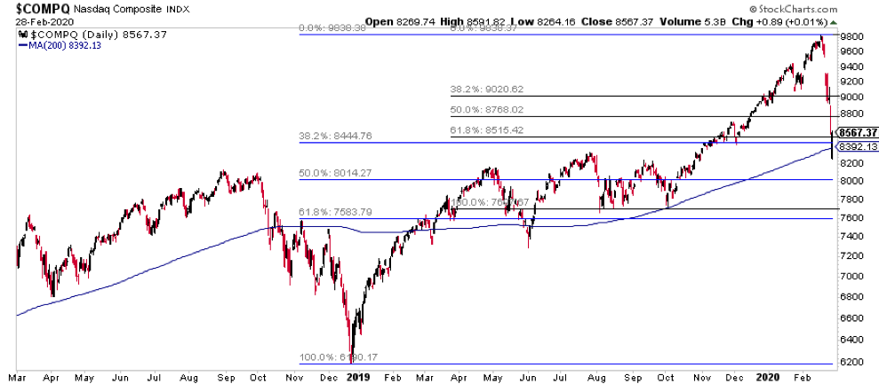
The Nasdaq Composite is the world’s leading stock market index. On Friday, it tested the 200 day moving average area and held.
Also note the fibonacci retrace confluence from both the December 2018 and summer 2019 lows that held on the close. This is the line of defense heading into the week. Below that area, all bets are off.
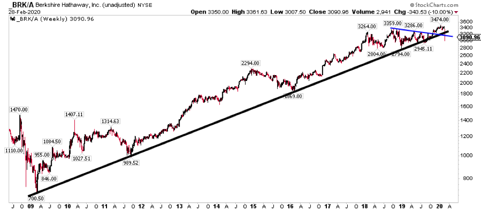
The most notable stock move this week was Berkshire Hathaway. It broke its uptrend from 2009. For now, the prior low area (2950/2800) hasn’t been taken out, so it’s still not a downtrend. One of the largest bellwethers in the U.S. breaking a decade long uptrend isn’t bullish, however you want to cut it.
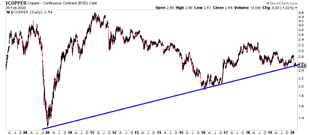
Although stocks are falling sharply, they are merely catching up to copper prices which are trading at summer/fall 2019 levels. Copper is still holding its trend from 2009 and hasn’t broken the January low. That’s a positive, if only for now.
Intermarket analysis is painting a very troublesome picture.
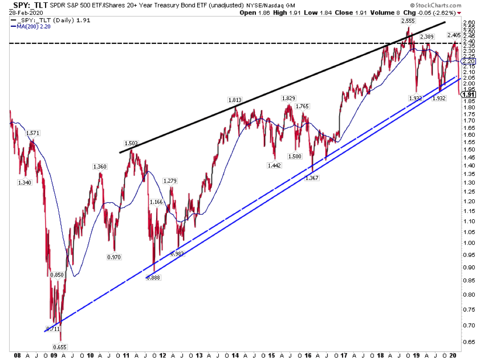
Stocks (via the S&P 500) relative to long term treasuries (via TLT) have just broken the uptrend from 2009 and intraday Friday took out the prior support area. A move lower from here would confirm the trend break
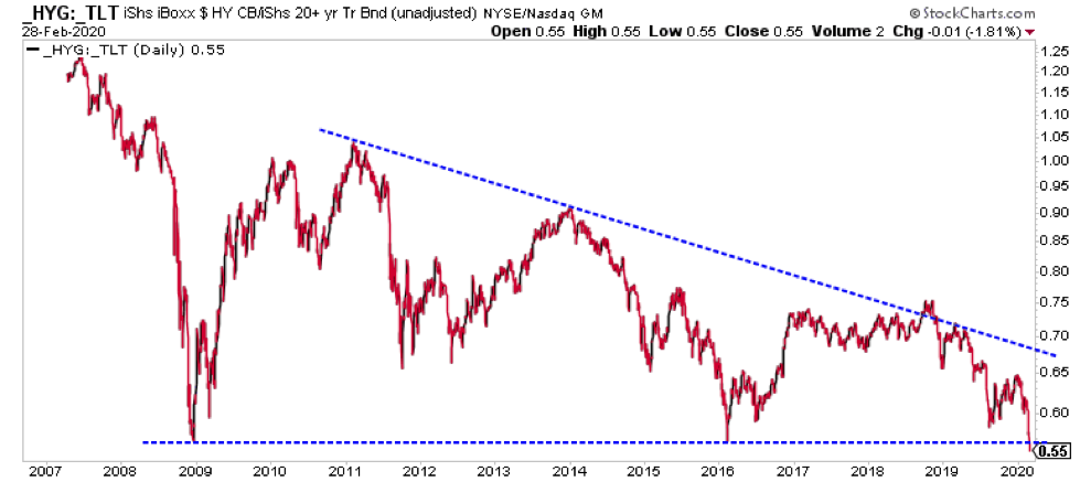
High yield bonds vs long term treasuries are breaking key lows from 2009 and 2016. The risk curve has been a warning for years, but the market just chose to ignore it. Fresh lows and an exogenous shock is the exact type of thing that gets people to realize it.
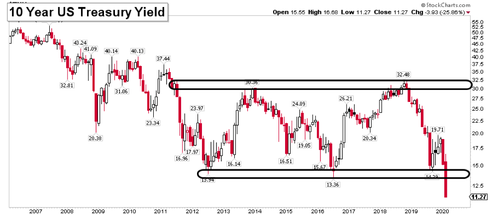
Meanwhile the ten year treasury yield just broke an 8 year range lower. Without a complete reversal, it looks like money will be flowing to treasuries for the foreseeable future.
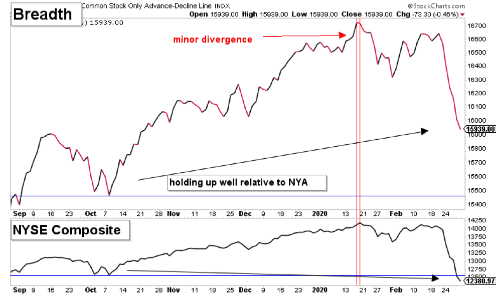
Breadth is sending mixed signals.
The NYSE stock-only advance decline line is holding up pretty well and diverging positively vs the index after flashing a minor divergence in January. This is probably the most bullish piece of data out there.
The NYSE McClellan Oscillator (breadth momentum) is reaching oversold levels that have often marked bottoms. However, much like put call ratios last fall, this indicator has formed a rare well defined breakdown.
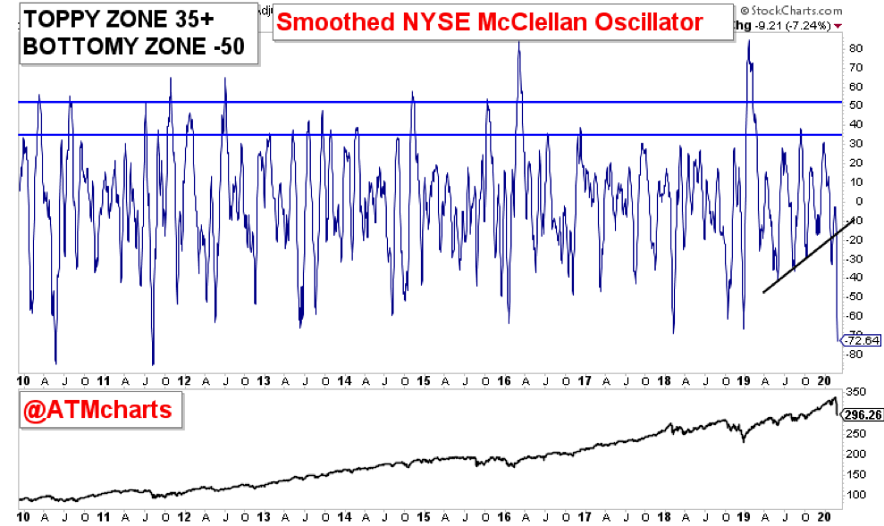
If you’re not familiar, put call data hit an extreme and remained extreme for quite some time. These build ups in the data could be a feature of the current environment. If you’re investing based on the market being oversold. you have to understand this could persist and become more extreme.
There’s no easy answer here. Markets have been hit hard. Hard enough for you to make a compelling statistical argument about especially a short term low. At the same time, it was hard enough to change key intermarket dynamics all of a sudden.
Luckily we have a nice confluence in the NASDAQ Composite as a point of reference heading into this week.
As always, the market will treat market participants prepared with trading/investing plans the best.
Thanks for reading. Trade ‘em well!
Twitter: @ATMcharts
Any opinions expressed herein are solely those of the author and do not in any way represent the views or opinions of any other person or entity.


