The stock market indexes have rallied nicely off the lows. However, I’m not getting into “the correction is over” or “bull market trend resumes” defensive sectors normalize. One of my favorites to watch is the Consumer Staples (XLP).
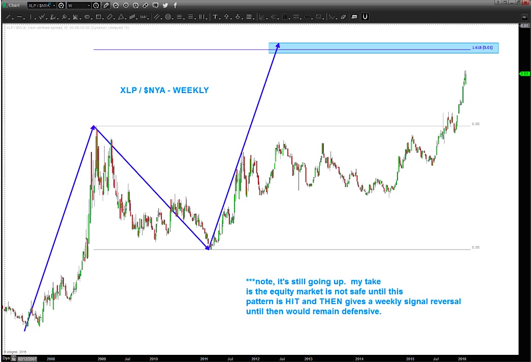
I’ll likely flip sides from cautious to bullish when consumer staples strength subsides. As you can see in the charts below, the Consumer Staples $XLP performance relative to the broader market (NYSE stock market index – $NYA) has been strong.
I’m waiting for the target shown in the chart below (updated) to be hit, followed by a weekly reversal candle.
Take note – when the overall stock market is going UP this ratio should be going down. And right now, it isn’t… in my world, that means consumer staples strength is still implying a defensive posturing in the market. And that should give investors caution.
The market appears to be giving us a road map and, if we get our “heads out of the airplane”, we can see it… One of the best ways to understand the broader markets is to through ratio analysis using pattern recognition.
Think of it this way: In times of “risk off” the institutions (“big boys”) have to go somewhere, right? They go defensive – that’s where consumer staples strength comes into play. And the NYSE Index is a really important gauge of the broader stock market.
So when the XLP starts to outperform on a relative basis, then the gig is up and the rotation is occurring. Here’s a more in depth blog about it.
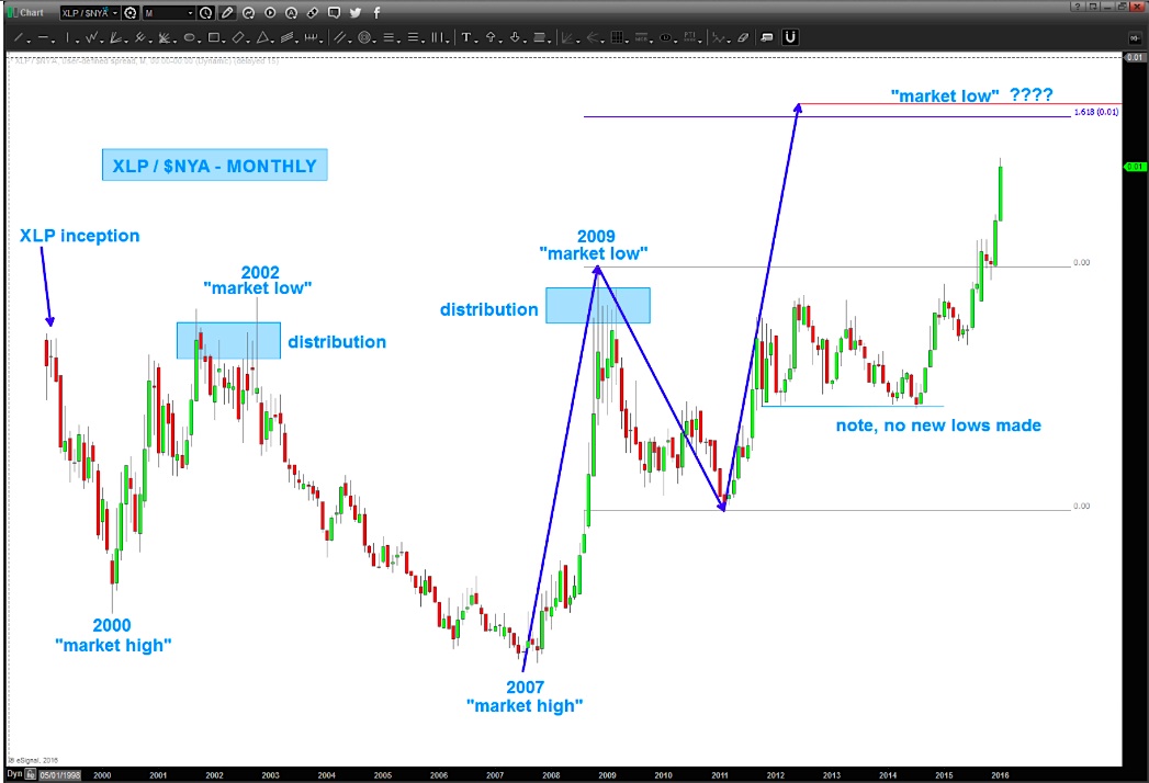
A few things to note:
- Note the pattern wants to go a little higher (likely means potential for more losses for stocks). That’s a really powerful SELL pattern which means Equities will go up after the target is hit.
- Note the pattern timed – almost exactly – EVERY high and low since 2000. I would suspect it would give us clues for longer periods BUT XLP inception was in 1998.
- Note at “market lows” there was a lot of accumulation occurring or, in the case of the chart “distribution” at the highs.
- One last point. As the market continued to push higher into the stratosphere one would have though that the RATIO should have been falling out of the sky right? But the market was trying to tell us something – we were weak internally AND the big boys weren’t really playing along like they should have been? If they were full risk on then this ratio would be going down like it did 2002-2007. It hasn’t… in fact NOT ONE SWING LOW HAS BEEN BROKEN since the 2007 ratio low. Think about that for a moment…
Unless your time frame is very short-term, it’s probably best to wait to get involved with equities until this pattern completes and consumer staples strength subsides. Thanks for reading.
Twitter: @BartsCharts
Author does not have a position in mentioned securities at the time of publication. Any opinions expressed herein are solely those of the author, and do not in any way represent the views or opinions of any other person or entity.


