As I paged through the S&P 500 charts during my normal weekend review, I started to identify some consistent patterns in the leadership sectors of Consumer Discretionary and Technology. Today I’ll share with you how I bucket these charts by their patterns, and why the SPDR Consumer Discretionary Sector ETF (XLY) is likely the most important chart to watch.
I found “lower high” charts, with Apple (AAPL) as perhaps the most obvious example and mirrored by the S&P 500 chart itself. These charts stand out as they have been unable to eclipse their highs from early September which could potentially mark the beginning of a Dow Theory downtrend of lower highs and then lower lows.
I also grouped together the “consistent resistance” charts such as Netflix (NFLX), marked by a steady resistance level from over the summer and numerous unsuccessful attempts to eclipse those previous highs.
Most importantly, I noticed how instead of making a lower high thus far in October, charts like the XLY had, in fact, already made a higher high. Even more notably, this higher high was accompanied by less momentum, suggesting that this latest push had less buying pressure associated with the move.
To rephrase, this is more characteristic of a bull trend near exhaustion, not one in its early stages.
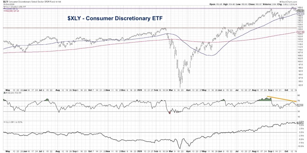
One important point on the XLY chart is to separate between an emerging pattern and a confirmed pattern.
What we see with the Consumer Discretionary sector is an emerging pattern, meaning the stage has been set for a potential breakdown. Price has moved higher along with a divergence, or non-confirmation, from the momentum indicator.
To become a confirmed pattern, and signal increased potential for further downside, the XLY would need to break below the swing low between the two recent peaks. This would suggest short-term support around the $140 level.
It is quite possible that we’ll see a brief pullback to around the $140 level as the price backs-and-fills in the $140-155 range in the coming weeks. That could indeed set the stage for a rally into new highs going into year end.
However, a break below $140 would confirm the overall topping pattern and should compel investors to take a deeper look at their risk assessment and downside protection.
What would tell me this bearish thesis is incorrect? A breakout above $155, along with increasing momentum that would invalidate the bearish divergence, would suggest an “all clear” on the chart and suggest further upside.
As we discussed earlier, perhaps the most important takeaway is that the XLY chart is not unusual here. Many individual stocks, groups and sectors are displaying potential topping patterns. Now is the time to review key “lines in the sand” to differentiate the garden variety pullback from something more sinister.
To see this article in video format, check out my YouTube channel!
Twitter: @DKellerCMT
The author may have a position in mentioned securities at the time of publication. Any opinions expressed herein are solely those of the author, and do not in any way represent the views or opinions of any other person or entity.


