Check out the S&P 500 (SPX – Quote) on almost any timeframe and you’ll notice one all-pervasive theme about recent market activity: defensive sectors have effortlessly outperformed their pro-cyclical brethren.
So just how handily have defensive sectors outclassed the rest of the S&P? Year-to-date, Consumer Staples (XLP), Utilities (XLU), Healthcare (XLV) and Telecoms (IYZ) are up nearly +17% on average.
In contrast, Materials (XLB), Financials (XLF), Industrials (XLI), Technology (XLK), and Consumer Discretionary (XLY) have installed a mean year-to-date advance of just +8%, or less than half.
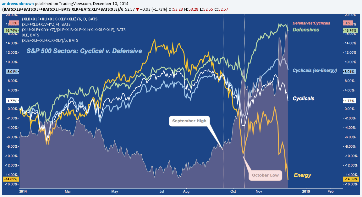
You might’ve noticed a noteworthy omission: Energy (XLE). Often the sector that leads at cyclical peaks, Energy is down almost as much as Defensives are up, off almost -15%. The chart below breaks Energy out separately, and also displays the Cyclical complex with and without the sector to isolate it’s outlier performance. That complex registers a staggering performance drop where Energy is averaged in, dropping from 8% to just 1.8% YTD.
The “defensive/cyclical” dichotomy isn’t entirely sound, though: when things are good enough, all sectors do well (studying relative strength simply ranks the field of winners), whereas in poor markets there’s no where to hide: only places that are more or less vulnerable. So, while defensive strength is important, arguably more important is cyclical weakness. This may sounds like an “either/or”, but as we’ve just described, the relationship isn’t zero-sum: this makes pegging cyclical turns based solely on a ratio helpful, yet incomplete.
But: what about when cyclicals begin to massively underperform on an absolute basis v. the S&P 500?
To answer that question, I reluctantly break the solemnly adjured vow made in this missive’s tittle and hereby convert this to “Charts of the Day” (after all: there can never be too many, right?).
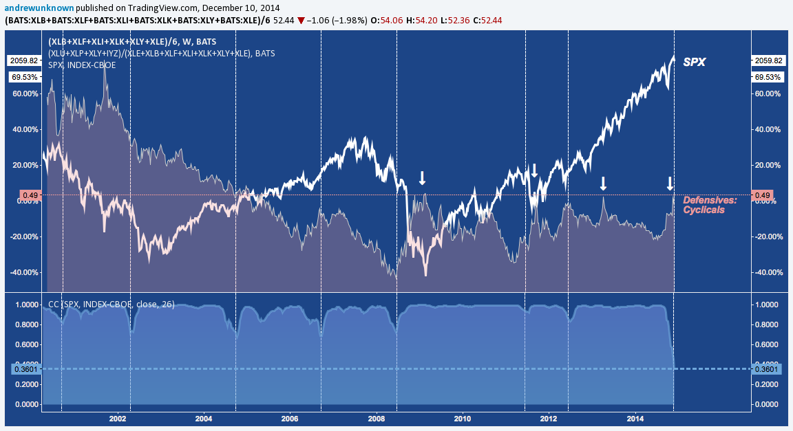
On a semi-annual lookback over the last 3 cycles (~14 years), the correlation of Cyclicals (including XLE here) to SPX performance is rarely disturbed, and never gets very far (say, <0.75) from it’s equilibrium of a flawless positive correlation. Everyone would agree it’s axiomatic that when stocks in general are moving up, pro-market cycle areas of the S&P are also moving up.
But there are times the exception proves the rule; and these are precisely the moments when the S&P 500’s longer-term upward trajectory takes major detours.
Over the period studied, the current exception is in a class all by itself. The Cyclical Complex-to-SPX correlation is only 0.36 (see bottom panel above), or less than half as correlation as either 2004 (10% correction) or 2008 (GFC). The breakdown in this relationship is egregious to the point of absurdity here.
This occurs at an intuitive spot, as Defensive strength pops to its upper post-crisis boundary versus Cyclicals at 0.5 (see orange area plotted above). In every previous case, this has been an adjunct development to the Cyclical:SPX correlation breakdown: until now – or at least, so far.
Twitter: @andrewunknown
Kassen holds no exposure to securities/instruments mentioned at the time of publication. Commentary provided above is for educational purposes only and in no way constitutes trading or investment advice.


