I find that novice technical analysts tend to oversimplify RSI, considering overbought to be “bad” and oversold to be “good”.
They will even color code the RSI 70 level to be red and the RSI 30 level to be green, suggesting those represent good opportunities to sell and buy, respectively.
As they say, an amateur knows the rules, but the expert knows the exceptions.
Apple’s Stock Price Rally, the S&P 500 Index, and the Good Overbought
RSI on its own is descriptive. It simply tells you what the price has done up to that moment. When the RSI is overbought (above 70) that tells you that the price has gone up. A lot.
On it’s own an RSI overbought condition doesn’t mean the chart will immediately reverse.
Take the S&P 500 Index over the summer, for example.
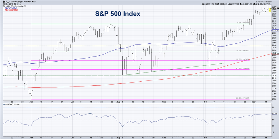
The RSI first touched the overbought range the third week in June, and it became overbought two more times through mid-July. Each one of these did indeed identify a short-term pullback, but in all three cases the primary trend remained bullish.
Only when we had a bearish divergence in late July, with lower RSI and higher price, did the indicator suggest an exhaustion of the bull phase.
As we enter the seasonally strongest part of the year (November to May), the RSI has once again become overbought for the S&P 500. This suggests 1) a short-term pullback should be expected, and 2) a continuation of the long-term uptrend is totally reasonable.
I like to check out the bellwether stocks to see how their patterns relate to the overall market picture. The chart of AAPL confirms this short-term game plan heading into year-end.
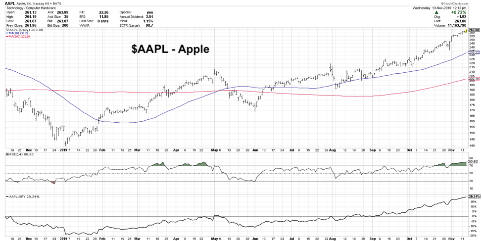
The RSI on AAPL has actually become extremely overbought, or what I would call “good overbought”. When the RSI goes above 80, this suggests that upside momentum is so strong that after a brief pullback the trend is most likely going to continue higher for at least one more leg.
Look back in March and you’ll see what I mean. The price broke above the 200-day moving average and the RSI eclipsed this key 80 level. After a short-term pullback, the trend continued higher through the beginning of May. Only after a bearish divergence between RSI and price did AAPL finally selloff in a meaningful way.
I think the chart of Apple represents a good way to think about the current market environment. Stocks are up. A lot. They deserve to pullback a bit. They most likely will. But the upside momentum is so positive leading into year-end that I would not be surprised to see further upside into January.
Twitter: @DKellerCMT
The author does not have a position in mentioned securities at the time of publication. Any opinions expressed herein are solely those of the author, and do not in any way represent the views or opinions of any other person or entity.


: Showing Some Signs of Emerging Strength")
