The onslaught of posts analyzing the past decade for investors is upon us.
In this post, I take a look across asset classes and show annualized market returns on both a nominal and real basis – that is before and after inflation.
Bloomberg recently ran a story about how the Sharpe Ratio (risk-adjusted returns) for US equity returns during the 2010s was exceptionally high given the strong nominal return and somewhat low standard deviation relative to prior decades.
The 2010s did not have a stock market drawdown of more than about 20%.
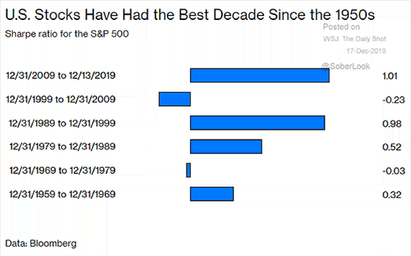
Recall prior decades – the Great Financial Crisis 55% drawdown, a 50% haircut during the Dot Com Bust the Asian Contagion 25% correction, the recession of the early 1990s. The list goes on.
The recent decade has been quite stable in comparison.
There is some cool data out there that Dr. Robert Shiller provides on a funny named website, “MoneyChimp”, where you can pop in various dates then view Holding Period Returns over that timeframe. It allows you to view returns with or without dividends and including or not including inflation.
https://www.moneychimp.com/features/market_cagr.htm
I like to see returns including dividends and after inflation to get a true sense of returns. Of course, taxes should also be part of the equation, but that is more difficult to estimate.
Below are the “Real” returns by decade of the S&P 500 using Dr. Schiller’s data and the latest 2019 values from PortfolioVisualizer.com.
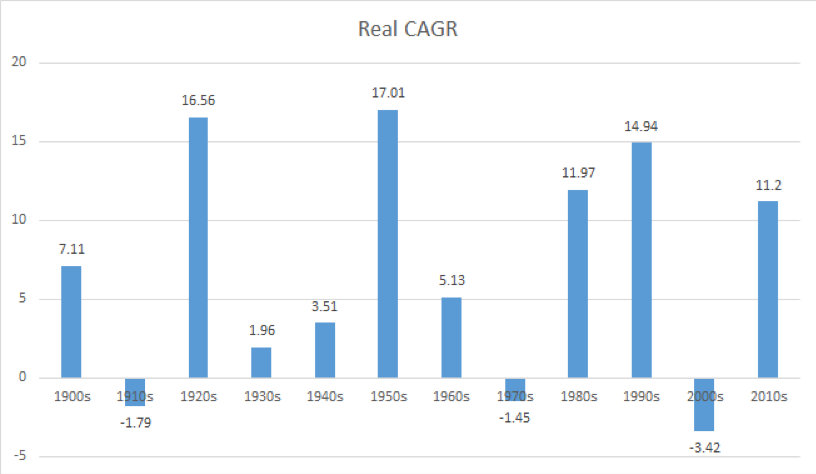
The 2010s were certainly fantastic for US large cap investors, but the decade only ranks 5th out of the last 12 at 11.2% real annualized returns. But I’ll take it.
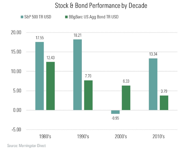
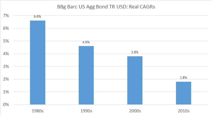
Looking at fixed income, the Barclays Aggregate Bond Index is the main US bond market proxy. Morningstar recently ran an article looking at returns on the “Agg” since the 1980s.
I took it a step further and put my ‘real returns’ spin on it below. After inflation, it has been a stair-step lower by decade for bond investors. Many pundits believe it will continue to dwindle to near 0.0% since the best predictor of future bond yields is its current yield. Also, that inflation may average about 2% in the coming decade.
I am a Chartered Financial Analyst (CFA) and Chartered Market Technician (CMT). I have passed the coursework for the Certified Financial Planner (CFP) program. I look to leverage my skills in an hourly-fee consultant role for financial advisors – that could be portfolio analysis, planning, writing etc. Please reach out to me at mikeczaccardi@gmail.com for more information. Connect on Linkedin.
Twitter: @MikeZaccardi
The author may hold positions in mentioned securities. Any opinions expressed herein are solely those of the author, and do not in any way represent the views or opinions of any other person or entity.


 Ready To Break Out?")


 Ready To Break Out?")