Solar stocks have been lagged the broader stock market with Tesla (TSLA) headlining the under-performer list.
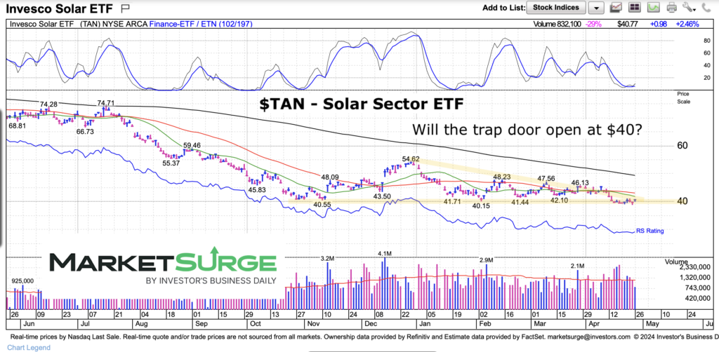
Taken together, this all shows up in the price performance chart of the Solar Sector ETF (TAN).
After a big decline, price has been compressing into an elongated triangle that is nearing an inflection point.
What happens next will set the tone of the next trading swing (lower or higher).
Note that the following MarketSurge charts are built with Investors Business Daily’s product suite.
I am an Investors Business Daily (IBD) partner and promote the use of their products. The entire platform offers a good mix of tools, education, and technical and fundamental data.
$TAN Solar Sector ETF Price Chart
To be clear, the price action has been very bearish for the Solar ETF (TAN). And the current triangle pattern is construed as bearish (due to trend) until proven otherwise. A move lower that sticks would be the start of another leg lower.
However, there are 2 things to consider. The triangle is basically a pattern of price compression… and in this case, a long one. This can create enough volatility for a false move (i.e. a couple of days one direction followed by a stronger move in the opposite direction). And finally, a move higher could turn this pattern into a “base” that would neutralize selling. Just food for thought. Otherwise Solar is still bearish.
Twitter: @andrewnyquist
The author may have a position in mentioned securities at the time of publication. Any opinions expressed herein are solely those of the author, and do not in any way represent the views or opinions of any other person or entity.

 Set For Revival?")


 Set For Revival?")