Higher commodity prices have seeped into every day costs (food and energy), and at the same time, interest rates have also been rising.
That’s a bad combination for everyday America.
But perhaps there is some relief on the the horizon… at least in the form of lower interest rates.
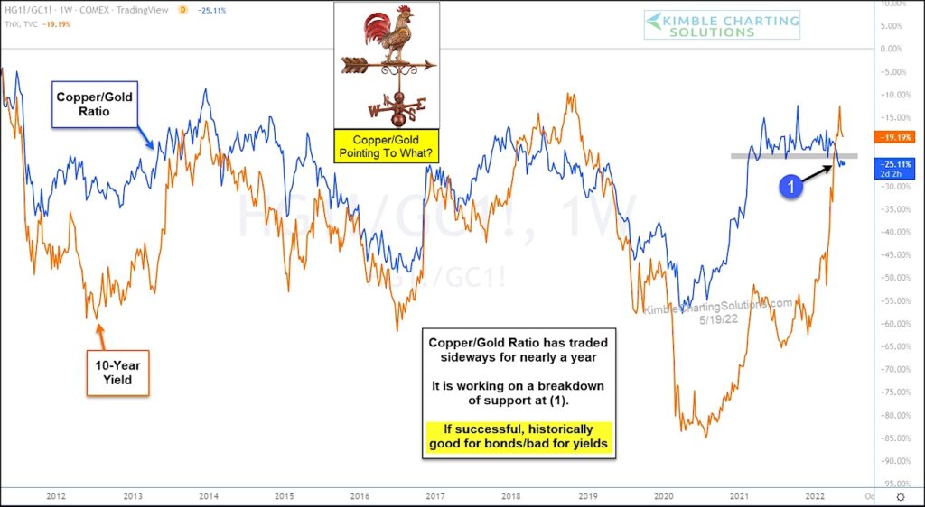
Today’s chart takes a look at the Copper/Gold price ratio graphed against the 10-year treasury bond yield. As you can see, they tend to follow each other directionally.
The Copper/Gold ratio has trading sideways for the past year, but looks to be working on a breakdown below support. If this occurs, there is a good chance that bond yields (interest rates) will head lower as well.
Historically speaking, a decline in the Copper/Gold ratio should be good news for bonds and bad for yields (even if short-term). Stay tuned!
Copper/Gold Ratio versus 10-Year Treasury Bond Yield Chart
Note that KimbleCharting is offering a 2 week Free trial to See It Market readers. Just send me an email to services@kimblechartingsolutions.com for details to get set up.
Twitter: @KimbleCharting
Any opinions expressed herein are solely those of the author, and do not in any way represent the views or opinions of any other person or entity.

: Where’s the Deflation in This?")


: Where’s the Deflation in This?")
