It was another tough week for the stock market. Volatility continued as the markets did a bunch of bouncing within ranges. Let’s try to assess the market by looking at some market health indicators.
Below are a series of charts that caught my eye and some broad market commentary. I hope you are enjoying the long weekend.
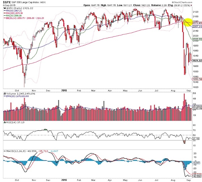
The 200 day moving average in the S&P 500 is now pointing lower. Call it official downtrend territory.
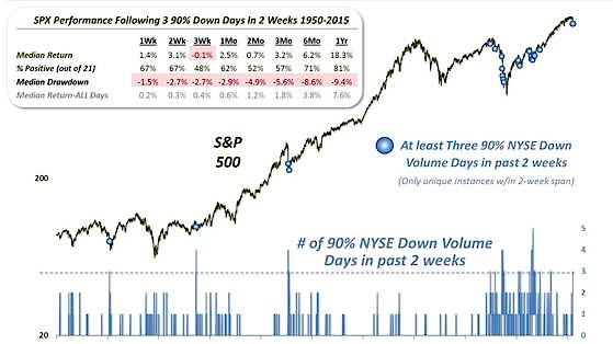
Dana Lyons noted that we’ve seen three 90% volume down days in the last two weeks. That immense selling pressure tends to suggest relief in the short term. However, we could have said the same thing after the second 90% down day. It’s an incredible stat, but I’m not sure how much value we can derive from it.
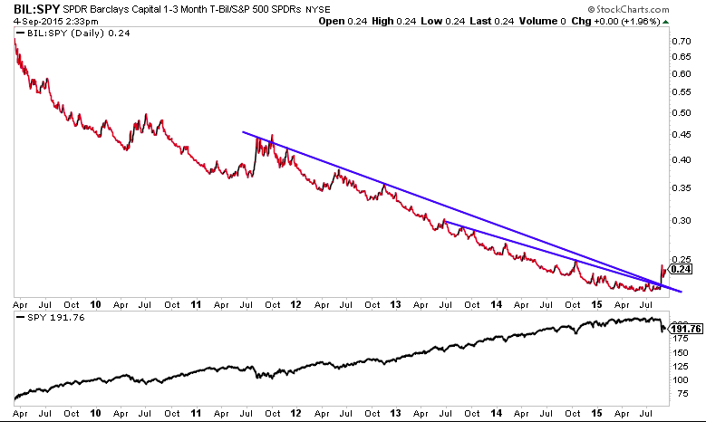
Cash relative to the S&P 500 has broken a multi year downtrend. What’s a bigger sign of a bear market than this ‘ill’ market health indicator?
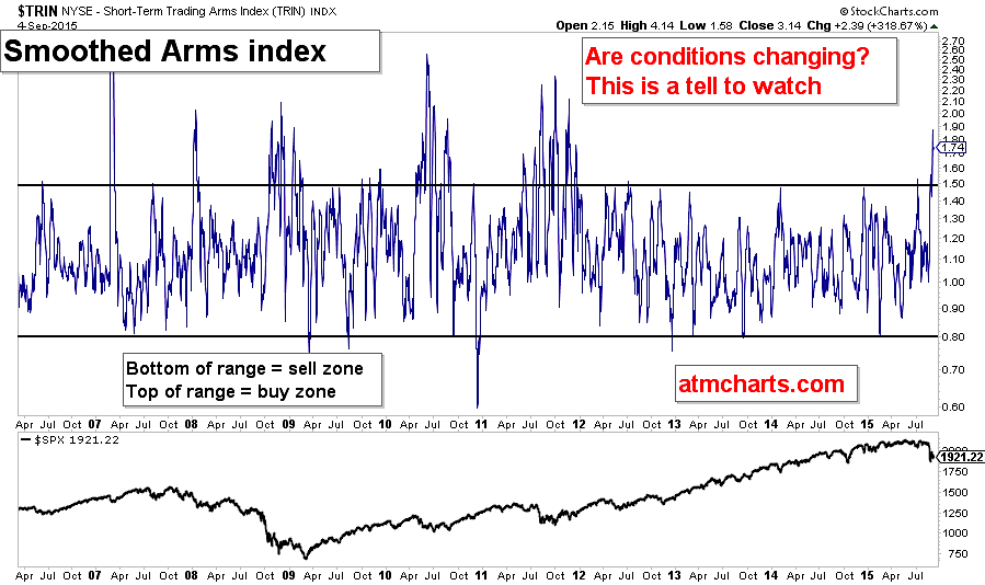
The Smoothed Arms index has broken to highs not seen since the last bear market in 2011. It’s more confirmation that market conditions have changed.
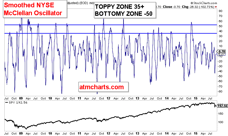
The NYMO market breadth Oscillator (smoothed) has reached the 0 bound. If a fresh wave of selling occurs next week, it could be VERY strong.
What’s leading? What’s lagging? Another great resource is Ryan Detrick’s excellent Market Scorecard (he tweets it out daily). So what stood out on Friday? The Weakness in the housing sector vs the relative strength in the airlines.
Thanks for reading.
Twitter: @ATMcharts
Any opinions expressed herein are solely those of the author, and do not in any way represent the views or opinions of any other person or entity.


