In this post I will focus on pure PATTERNS and discuss NOTHING that has to do with the Global Macro fundamental outlook on the US economy, the EURO-ZONE ugliness, the UK keeping/losing Scotland or the 29.1 trillion that Sovereign Investors are running thru the private markets. Nope, just patterns and what they are saying. And we will keep our analysis limited to the 1o Year Treasury Yield (TNX).
So what’s going on with interest rates?
Well, back on April 15, I wrote a post about the emerging pattern on the 10 Year Treasury Yield. The chart from that post is included below:
10 Year Treasury Yield – Daily Chart (from April 15)
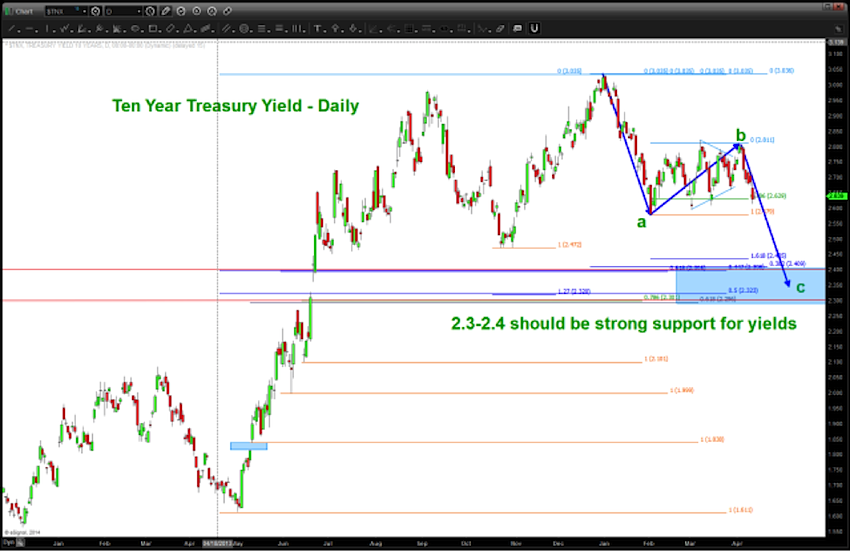
Again, simply based on patterns and other technical factors it certainly looked like 2.3-2.4 would be support for the 10 Year Treasury Yield (TNX). That target has been hit and the chart, as of today, is included below:
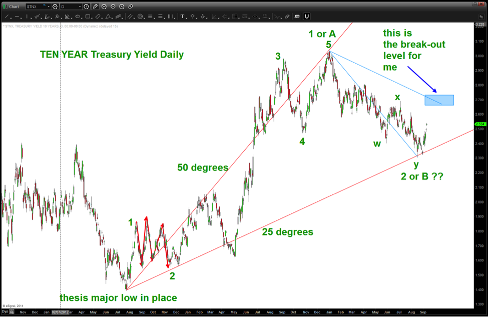
As you can see above, 5 waves to the upside are seen followed by a year-long correction that ultimately worked it’s self into a “double three.” You can also see that I’ve labeled these inflection points EITHER “1 or A” and “2 or B.” Either way we look at it, 5 waves up SHOULD mean, after a corrective period, another 5 wave advance will follow… we’ll see.
The other thing I want to call your attention to is the red and light blue trend lines drawn. This technique was shown to me by one of my mentors in the business, Mike Jenkins. It takes into account the move up in both PRICE and TIME. In the case of the red trend line, we are going from the all time low to the first high and the measuring the angle of ascent. In this case it’s 50 degrees…now, we take 50% of that ascent and then get 25 degrees and draw that angle from the low as shown. Where did the market go? Right to our level depicted back in April and the exact trend line taken from the initial ascent. There is more going on here but I’ll leave that for later… feel free to try it sometime. As technicians we are often simply connecting highs and lows and drawing lines. While that does work, the true method is to make sure we draw trend lines from the PRICE AND TIME ascent or descent from major inflection points.
So, “standard trend lines” will provide resistance a little higher. However, for me, using the natural plane of the light blue trend line a “true” breakout will occur when the blue rectangle is defeated. Enough said.
So, is the thesis that a major low in interest rates is at hand correct? Unfortunately, the answer is “we don’t have enough information, yet.” Please see the chart below:
10 Year Treasury Yield Weekly Chart
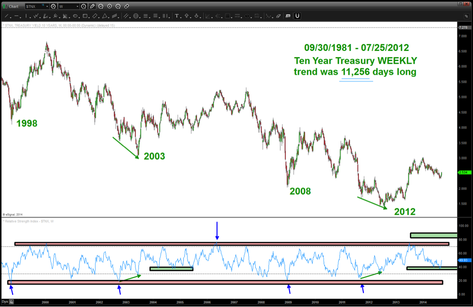
This is a WEEKLY chart of the 1o Year Treasury Yield and, as you shown in the top right we are dealing with a trend that has existed into the July 25, 2012 low for 11,256 days. Folks, that’s a long time. So, in order to get an idea of where are going we use the basic trend identification that Constance Brown discussed in her seminal work “Technical Analysis for the Trading Professional.” Shown in the chart above is the very clear BEARISH RSI ZONE that has held throughout this entire trend. Here area few more chart notes:
- The 70 level has held as BEARISH RESISTANCE.
- At the major areas of support the BEARISH SUPPORT has held around 20
- When bullish divergence is present at the major areas of support, the market goes up and corrects to the BULLISH SUPPORT ZONE and the proceeds higher. This is exactly what is happening right now with the Yields.
My conclusion based on the PATTERNS is that interest rates “should” be going higher and attack the RSI zone in the 70 level. IF WE HAVE HAD A GENERATIONAL SHIFT IN INTEREST RATES THEN THE 70 LEVEL OF THE RSI WILL GIVE AWAY AND IT WILL SURGE INTO THE UPPER BULLISH RESISTANCE AREA OF 80-90. From that point, any correction will find support in the 40 zone and should “never” go back into the “red zone” again. There were a couple of “IFS” in there, so be sure to follow the patterns.
No position in any of the mentioned securities at the time of publication. Any opinions expressed herein are solely those of the author, and do not in any way represent the views or opinions of any other person or entity.


