In part III of the CMT program we spent a significant amount of time studying intermarket analysis and sector rotation.
For me, it was the most powerful and rewarding aspect of the program. Part of the required reading, when I studied for the exam, was John Murphy’s seminal work “Intermarket Technical Analysis – Trading Strategies for the Global Stock, Bond, Commodity and Currency Markets.” We were required to understand sector rotation, intermarket technical analysis and ratio analysis.
So, I thought it would be good to incorporate some of this into a current market analysis: A closer look at the Energy Select Sector (XLE).
In this post, I will discuss sector rotation and ratio analysis in regards to the Energy Sector, as a means for determining where the market is in in its current cycle.
But first, let’s discuss sector rotation. The sector rotation model below is extremely helpful in understanding the flow of funds in the US equity market and, by using/incorporating PATTERNS, one can understand where we might be with regard to the cycle and how to monitor/position a portfolio accordingly.
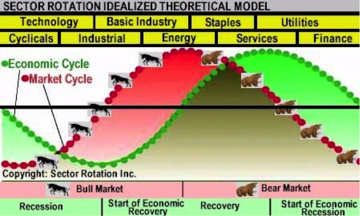
Source: Sector Rotation Inc.
Note at the end of a bull market and the beginning of a bear market, the Energy Sector (XLE) is the sector of the market where money is flowing. If this is the case, then using ratio analysis, we can monitor the relative strength of XLE versus other sectors of the S&P 500. If we are nearing the end of a BULL market then XLE should be outperforming the larger sectors of the S&P.
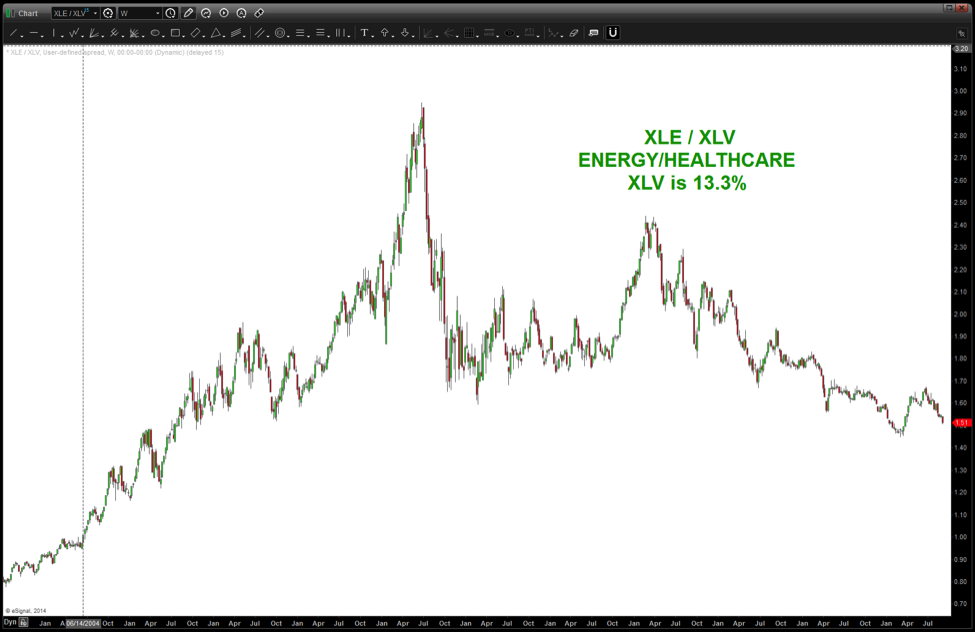
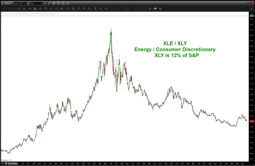
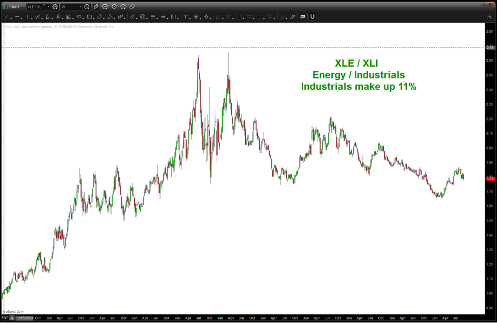
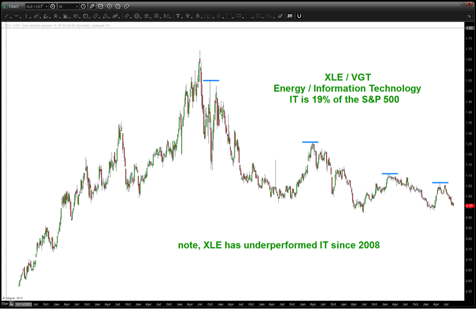
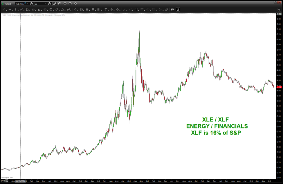
The next set of charts is simply the ratio of (XLE / sectors making up >10% of the S&P 500.) Here’s the conclusion – while the ratio has bounced off of support nicely over the past couple weeks it’s either 1) way too early to state XLE is the strongest sector or 2) it isn’t outperforming at all.
Take a look at the charts. Don’t immediately draw your eye to the “current” price but go back in time and notice the STEEP ASCENT into the overall S&P 500 market highs of 2007-2008. That is the picture of a sector showing strength and institutional rotation. The ratio was strong and showing, with conviction, that EVERGY was leading.
Where are we now? Well, it has been straight down from a relative strength perspective and XLE has not been strong at all. In order for the market pundits of the GREAT correction to be right the ratio, across the board, needs to hold the most recent weekly swing lows. But, either way, XLE isn’t showing massive strength against the big sectors of the S&P 500. While a near term correction is needed and likely coming (I believe) there is nothing from the charts below telling me this BULL MARKET is close to being done.
XLE/XLV (Healthcare Select Sector) Ratio Chart
XLE/XLY (Consumer Discretionary Select Sector) Ratio Chart
XLE/XLI (Industrials Select Sector) Ratio Chart
XLE/VGT (Vanguard Information Technology) Ratio Chart
XLE/XLF (Financials Select Sector) Ratio Chart
The Bottom line: if we are coming close to ending the Bull Market that began in 2009 then the swing lows of support of XLE/>10% S&P sectors should not be broken. If they are, this puppy has more room to run. Stay tuned as very important support will be coming in the next couple days/weeks.
Follow James on Twitter: @BartsCharts
No position in any of the mentioned securities at the time of publication. Any opinions expressed herein are solely those of the author, and do not in any way represent the views or opinions of any other person or entity.


