 Looks like we dodged a huge bullet, as that scary 1929 crash chart that was all over the place back in February hasn’t played out like the bears would have hoped. My pal Steve Russolillo at the Wall Street Journal quoted me in an article this week titled “Time to Officially Stick a Fork in That 1929 Chart.”
I must agree, it was fun to talk about, but it couldn’t have been more wrong.
In case you forgot or by some miracle you didn’t see it, here’s the 1929 crash chart that earlier this year was everywhere.
1929 Crash vs 2014 Setup (through February)
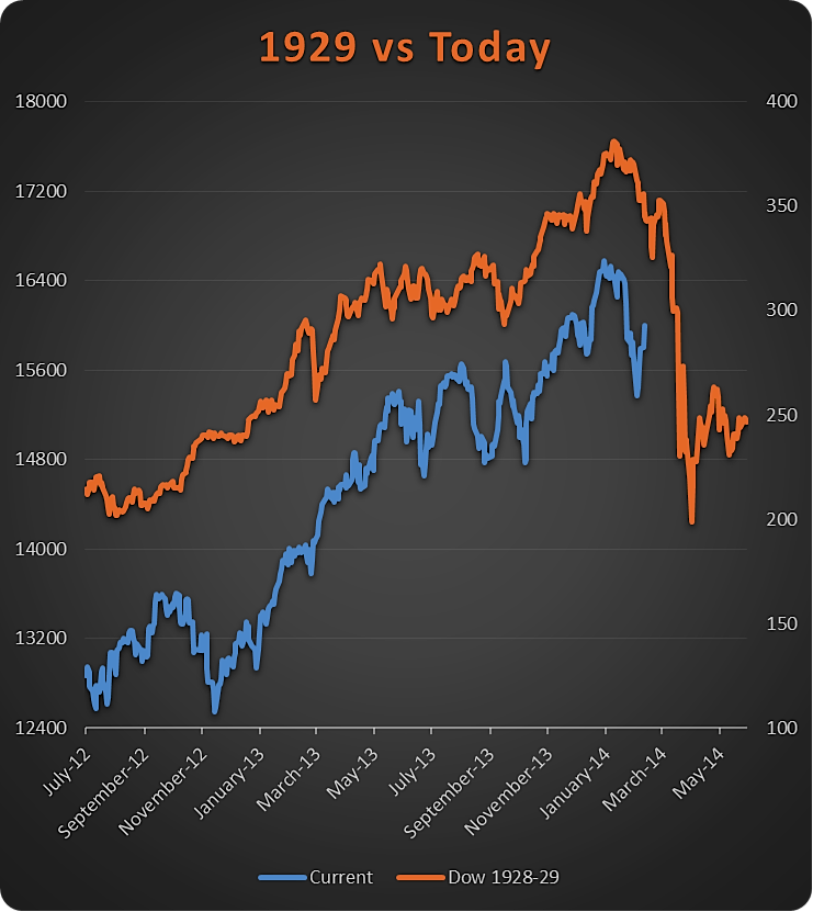
No question there were some real similarities with the path of the recent market with that of the chart right before the 1929 crash. A funny thing happened though: it didn’t happen.
1929 Crash Chart vs Today
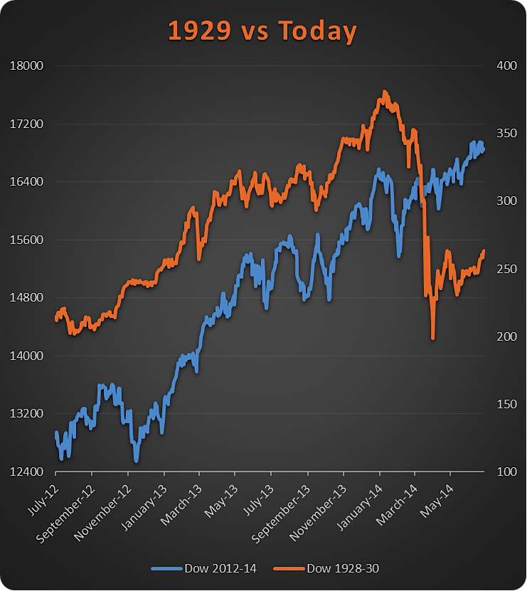
Yep, all the Dow Jones Industrial Average (DJIA) has done is move on to new highs, making this chart more a fun trivia fact in the amazing bull market that keeps going and going. I’ve talked about this chart many times the past few months and even got a chance to discuss it on CNBC in late January. The other guest said a 15% pullback was coming due to the pattern, fortunately I didn’t agree and remained bullish.
Lastly, it is worth revisiting one of the main ‘flaws’ with everyone getting all beared up over that 1929 crash chart pattern. If you look at pure price, sure they were similar. But if you looked at the overall percentage changes, you’d find a much different picture. It is clear that the late ‘20s had a very extended market versus what we had today. This of course opened up the door for that massive snapback correction.
1929 vs Today — % Change Performance Chart
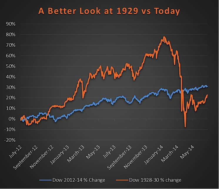
Taking this different approach reminded me of the famous Winston Churchill quote, ““The farther backward you can look, the farther forward you are likely to see.” I’m all for using past price action to get a feel for what might happen, but it pays to dig a little bit deeper sometimes.
I’ll leave you with this, it is what I’ve been saying about those that followed and even those that touted this pattern as a reason to worry. My take is the same now as it was five months ago. Basing your outlook for today’s market purely on a chart from the ’20s is irresponsible and ridiculous. There are so many other factors at play, and those that used the charts above simply created undue fear and once again caused the masses to miss higher prices.
Follow Ryan on Twitter: @RyanDetrick.
Any opinions expressed herein are solely those of the author, and do not in any way represent the views or opinions of any other person or entity.


")
")
 Rolling Over At Key Fibonacci Level?")

