 This Is Not A Forecast
What does it mean when traders follow price? They pay attention to what is happening, which is quite a bit different than forecasting or anticipating what will happen next. The charts below “say what they say until they don’t say it anymore”. When the message from the markets and the charts changes (from bullish stocks to bearish stocks or vice versa), one of the keys to success is remaining flexible enough to make defensive adjustments.
All Investing Involves Opportunity Costs
According to Wikipedia, the opportunity cost of a choice is “the value of the best alternative forgone, in a situation in which a choice needs to be made between several mutually exclusive alternatives given limited resources.” In the investing world, we all have limited resources. We all need to make choices in terms of allocating those limited resources; would we rather be long or short stocks? Would we rather be in stocks or in bonds?
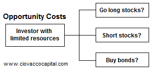
Would I rather be in bonds or stocks?
The aggregate supply and demand balance of all investors around the globe sets asset prices. An important element built into the previous sentence is personal opinions have very little impact on asset prices. Since that concept is vital to understanding the usefulness of the charts below, the Facebook example in this article, You Will Never Look At The Markets The Same Way Again, is worth your time if you have not seen it. Being bullish stocks or bearish stocks is more than an opinion.
If you are looking for market leaders, reviewing ETFs relative to the S&P 500 is a good place to start. It aligns with common sense when demand for conservative Treasuries (TLT) is greater than the demand for growth-oriented equities, investors are concerned about the economy, earnings, systemic risk, etc. The chart below shows the performance of TLT relative to the S&P 500 (SPY). When the demand for defensive TLT is greater than the demand for SPY, the ratio rises.
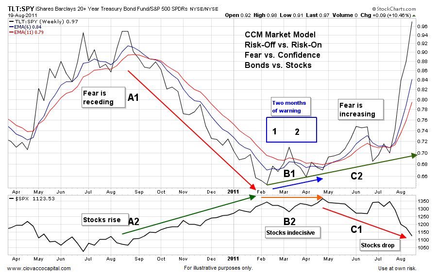
2011: Real World Example
The bottom of the weekly chart from 2011 below shows the S&P 500; the top is the TLT:SPY ratio. Near A1 the demand for TLT is weak relative to SPY, which indicated receding economic fear; stocks did well (see A2). In February, two months before the S&P 500 peaked, fear started to increase (see B1); stocks were indecisive (B2). As fear continue to increase, it waved warning flags for those in stocks (C2); stocks eventually tanked (C1).
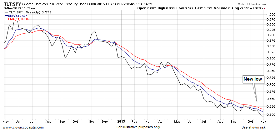
Economic Fear: Then And Now
How does the same ratio look on November 6, 2013? The chart below looks much better than it did in 2011, which tells us something about the market’s current tolerance for risk. Remember in 2011, the ratio was rising for two months before the real ugly stuff started in the equity market. Rather than waving yellow flags in 2013, the ratio below is making a new weekly low. The new low “confirms” the weak demand for defensive TLT relative to “I am confident” SPY.
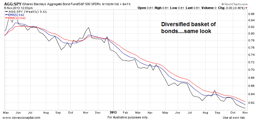
A fair argument is the Fed has skewed the Treasury market with their money printing and bond buying program, known as QE. The demand for a diversified basket of bonds (AGG) paints a similar picture, which aligns with “risk-on”.
Taking Skewed Bonds Out Of The Equation
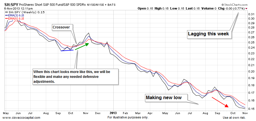
Some may still counter with “the Fed has skewed the entire bond market”, which is hard to argue against. The chart below, showing the performance of shorts (SH) relative to longs (S&P 500), is immune to “the Fed has altered the bond market” rebuttal. When the aggregate opinion of investors flips to risk-off, it is a mathematical certainty that the chart below will respond with a rising ratio, which is not what we have as of Wednesday, November 6, 2013. If the ratio below morphs from what is clearly a bullish economic bias to a bearish bias, our market model will call for defensive adjustments in line with the magnitude of the shift.
Deflation vs. Inflation
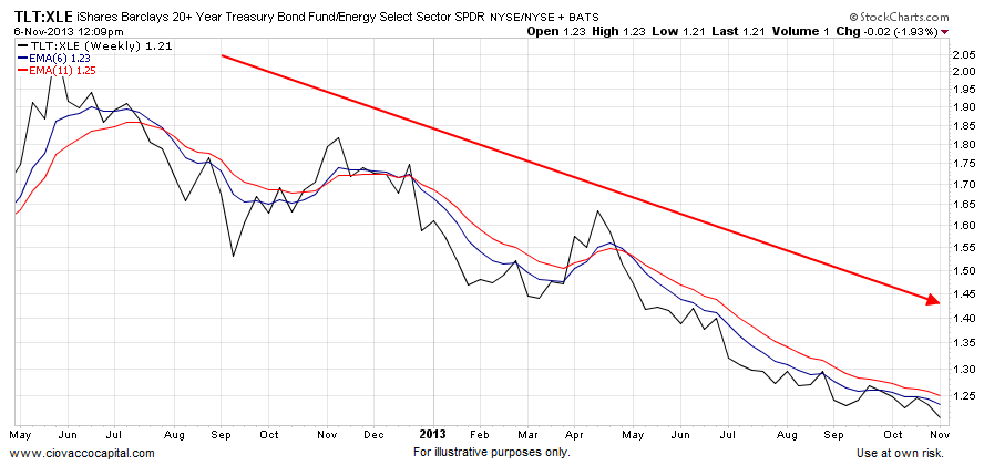
When prices start to drop, consumers tend to sit on their wallets waiting for a better deal. The previous sentence describes the basic concepts behind a central banker’s worst nightmare – a deflationary spiral. All things being equal when investors are more concerned about deflation relative to inflation, it is a bearish sign for the economy, earnings and stocks. Conversely, when inflation expectations are backed by more conviction than those backing deflation, it is a bullish sign for the economy, earnings and stocks. In a deflationary environment, fixed income becomes attractive since it is easy to “stay ahead of inflation” from a purchasing power perspective. In an environment where concerns are rising about future inflation, investors demand protection in the form of growth/commodity-related investments, such as energy stocks (XLE). Therefore, if bonds benefit in a deflationary environment and energy stocks benefit during periods of inflation, we can monitor deflation vs. inflation expectations by tracking the demand for bonds (TLT) relative to XLE. The ratio continues to show a clear bias toward inflation and stocks, rather than deflation and bonds.
Tech vs. Fixed Income
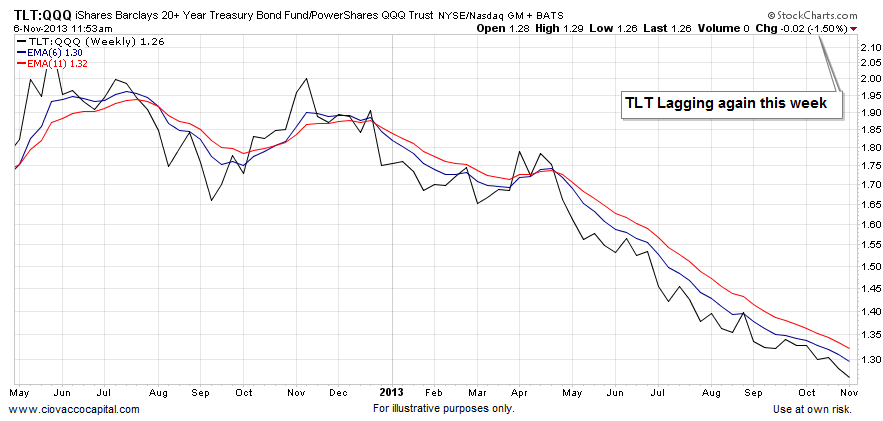
In general terms, it is a good sign for the stock market when tech stocks are healthy. It stands to reason that investors concerned about deflationary economic weakness would prefer to be in “I can sleep at night” bonds rather than higher-beta tech stocks (QQQ). As shown in the TLT vs. QQQ chart below, investor demand for TLT is weak relative to demand for QQQ, which aligns with a case that is bullish stocks.
Small Caps Still Beating Bonds
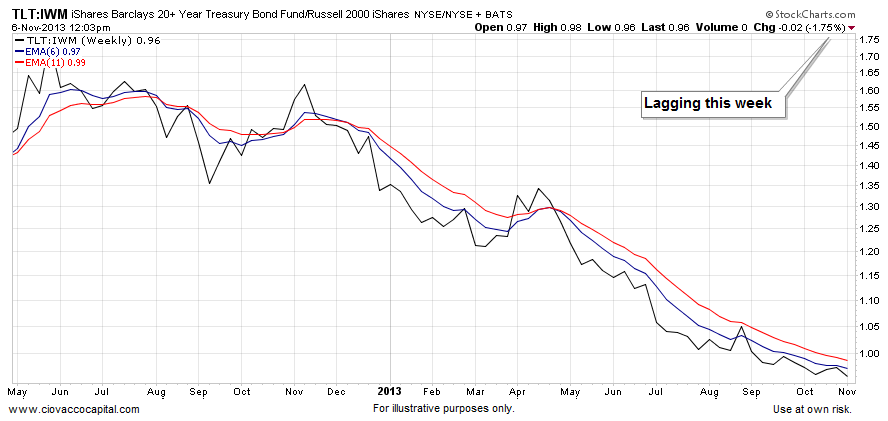
Small caps have been all over the “reasons to be concerned about stocks” radar in recent weeks. It is 100% accurate that leadership in small caps is a sign of a healthy advance in equities, but it is not on the “must have” list. If investors were preparing for weak markets and a weak economy, we would expect to see the chart below have a rising trend. The current look of the chart shows the demand for TLT is weaker than the demand for IWM.
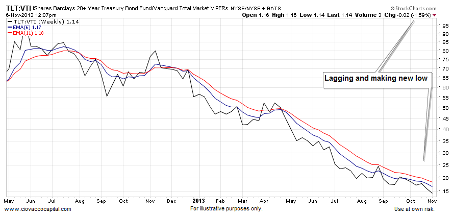
Wide Angle Lens
How about the broader stock market? TLT is losing the battle with VTI as well. Can the charts shown in this article change? Sure they can; it may begin this week, but until the evidence changes, the feedback from the market’s pricing mechanism is bullish and inflationary, rather than bearish and deflationary.
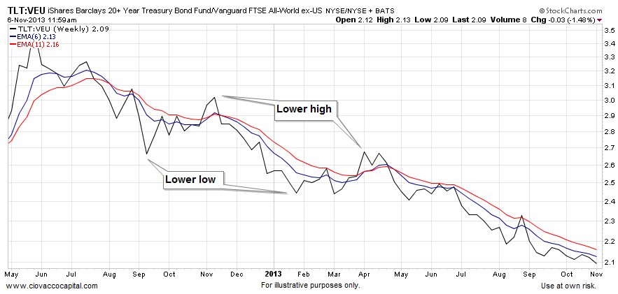
Leaving The Country
How about the rest of the globe? VEU is the global stock market sans the United States. The pattern remains the same. The chart below has a risk-on, rather than risk-off look.
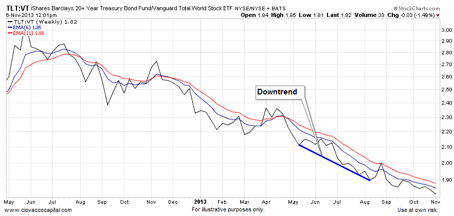
The World Is Flat
Let’s take an even broader brush stroke – VT has exposure to the global stock market, including the United States. The blue line below has a negative or bearish slope. Remember, the slope of similar charts started to turn up two months before the U.S. downgrade risk-off period in August 2011. Something has to change on these charts to boost the bearish case for stocks.
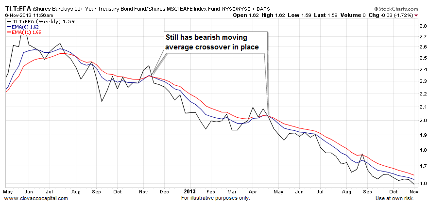
Europe Can Print Too
Expectations are for more money printing from the Fed’s European twin, the ECB. The present look of the chart below aligns with “I’d rather be in EFA than TLT”.
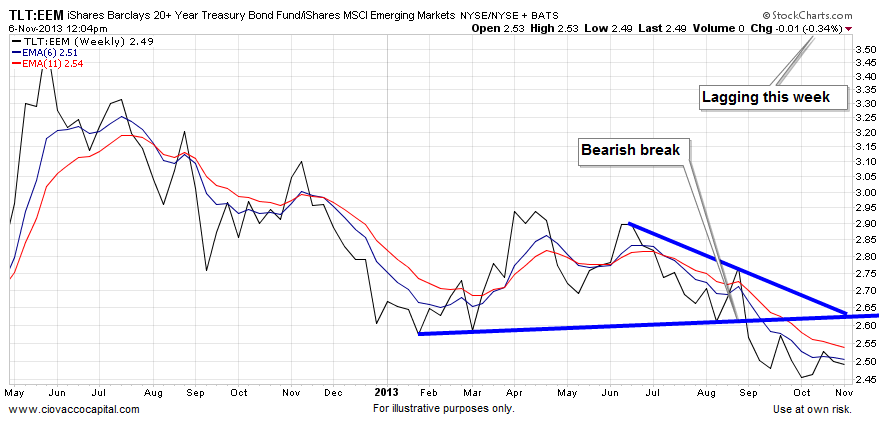
Dollar Has An Impact
Emerging markets have struggled in recent weeks as the demand for U.S. greenbacks picked up significantly. Bonds must be beating emerging markets (EEM), right?
Professional Gamblers Win Less Than 60% Of The Time
We use technical analysis to monitor the market’s current profile. When the market’s profile is bullish stocks, we allocate in a growth-oriented manner. When the profile deteriorates, we make defensive adjustments as needed. This video clip compares betting on a football game to attempting to forecast where stocks are headed next. It helps highlight the value of following price rather than trying to forecast future prices.
Charts Helpful Only If We Are Flexible
The trend is up until it isn’t. As human beings, we want to know what will happen next. As investors, it is important to focus on what is happening now. The current bias in the charts above continues to lean toward the bullish stocks camp. How long will that last? Not sure, you will have to ask the millions of investors around the globe that impact asset prices…or you could just pay attention to the charts.
Follow CCM on Twitter: @CiovaccoCapital.
Author holds long positions in SPY, VTI, VT, VEU, XLF, XLE, EEM, IWM at time of publication.
Any opinions expressed herein are solely those of the author, and do not in any way represent the views or opinions of any other person or entity.
")


 Rolling Over At Key Fibonacci Level?")

")