Many traders, especially when first starting out, focus on the individual chart of whatever they are trading. If you’re trading the S&P 500, watch the SPY chart. They add indicators (which are largely derived from price) to inform their buying and selling.
While this is a natural place to start, it doesn’t provide the trader with a comprehensive view of the market. External metrics, such as equity-only put/call ratios, sentiment measurements, BAML fund manager holdings and COT data (commitment of traders) data can help to round out a trader’s macro market perspective. Even for those trading individual equity names, much of the stock’s movement can be attributed to overall market and sector performance.
Beyond the broader market metrics, developing a familiarity with market ratios can provide further insights about performance and be tuned to your individual trading approach. While there are no “right” set of market ratios to use in your trading, here are a few of my favorites that offer a glimpse into the leanings of the broader market:
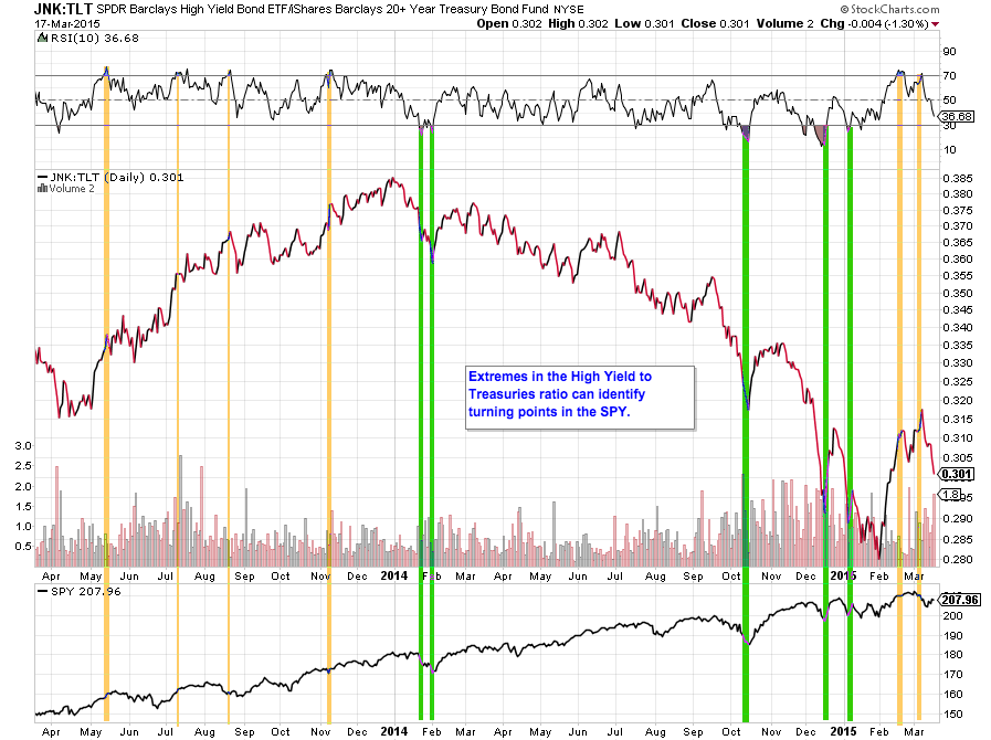
High Yield (JNK) to Treasuries (TLT)
A widely followed measure of the market’s appetite for risk, this ratio compares the price action in High Yield Corporate bonds (affectionately referred to as “junk”) to long-dated US Treasuries. When markets are in “risk-off” mode, they typically flock to the safety of Treasuries while shedding their exposure to riskier corporate bonds. Given the massive size of the bond market relative to equities, many traders look to the bond market as a tell for future equity movement. Market ratios such as this one are often mapped to the S&P 500 chart with an eye out for turning points in the ratio.
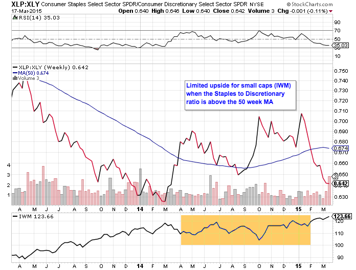
Consumer Staples (XLP) to Consumer Discretionary (XLY)
Using a similar logic to the bond ratio, traders can watch for increased buying of consumer discretionary names as a “risk-on” indicator. This suggests that the economy is healthy, expanding and being driven by consumer spending (which contributes approximately 70% to the US GDP). While the economy and the markets are clearly not the same, market ratios like this one can provide some boundaries to your trading.
As an example in the below chart, we show that the ratio’s relationship to the 50 week moving average can suggest under or over performance of an index like the Russell 2000 (via the IWM ETF).
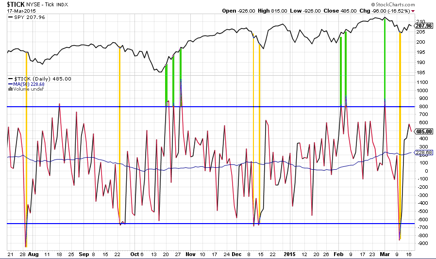
Tick Chart
Beyond popular ETF ratios, internal market measures such as the A/D line or the Tick can serve as both a market health measure as well as an input for a short-term mechanical trading system. Like the aforementioned market ratios, measures such as the Tick (shown below) are best used when extreme levels are reached or when divergences between the metric and the price action in a related index occur.
How to use these ratios
Like any other tool, market ratios should be used in combination with other methods. All of the data in the charts above is freely available to use, download and test. Whether you build a mechanical system using these ratios, incorporate them into a market health dashboard or simply check in on them every month, you will likely find that they deserve a place in your trading toolkit.
Thanks for reading and have a great weekend.
Any opinions expressed herein are solely those of the author, and do not in any way represent the views or opinions of any other person or entity.


