 Yesterday we examined the medium and long-term outlook of the major US equity indices, laying out the thesis that the nascent weakness in the Russell 2000 (RUT) and NASDAQ 100 (NDX) is not only indicative of a defensive posture in the market; but – paired with the prevalence of culminating multi-year bearish patterns on deteriorating participation – poses a mounting argument that points to a significant correction just around the corner. But how do we reconcile this with an S&P 500 (SPX) just off all-time highs?
Though the S&P almost always outperforms it’s smaller peers in the event of a substantive market sell off (i.e. greater than -10%) it can only remain aloft and immune for so long. With Small Caps and Tech lagging, then, this begs the question: what clues is the S&P giving, if any, to suggest the probability of a correction is heightened here?
One major signal the S&P is giving off stems from the rudimentary concept of sector rotation. This isn’t the same “rotation” invoked every day on Twitter and Stocktwits to describe the twitchy, ephemeral momentum an industry or sector enjoys for a few hours. Instead, the basic premise is that defensive sectors (perhaps a function of the broader business cycle, though this is difficult to see in real-time) will see capital inflows and displace more sensitive, pro-cyclical sectors during periods of risk aversion or following the apogee of the business cycle (show at right at right).
Over the last year, the S&P 500 has been anything but defensive, exhibiting an order favoring Industrials (XLI), Materials (XLB), Technology (XLK), connoting a mid-to-late stage Bull Market according to the red wave above. Healthcare’s (XLV) relative strength is an example of a sector rotation anomaly that makes the clean narrative progression outlined above somewhat challenging to to apply in practice: at least until you consider the bulk of Healthcare’s upward momentum stems from the massive outperformance in Biotech and Pharmaceuticals last year.
Here’s the relative sector performance for the past year, noting the beginning of 2014 (solid white line) and the important rotation inflection in early March (dashed white line):
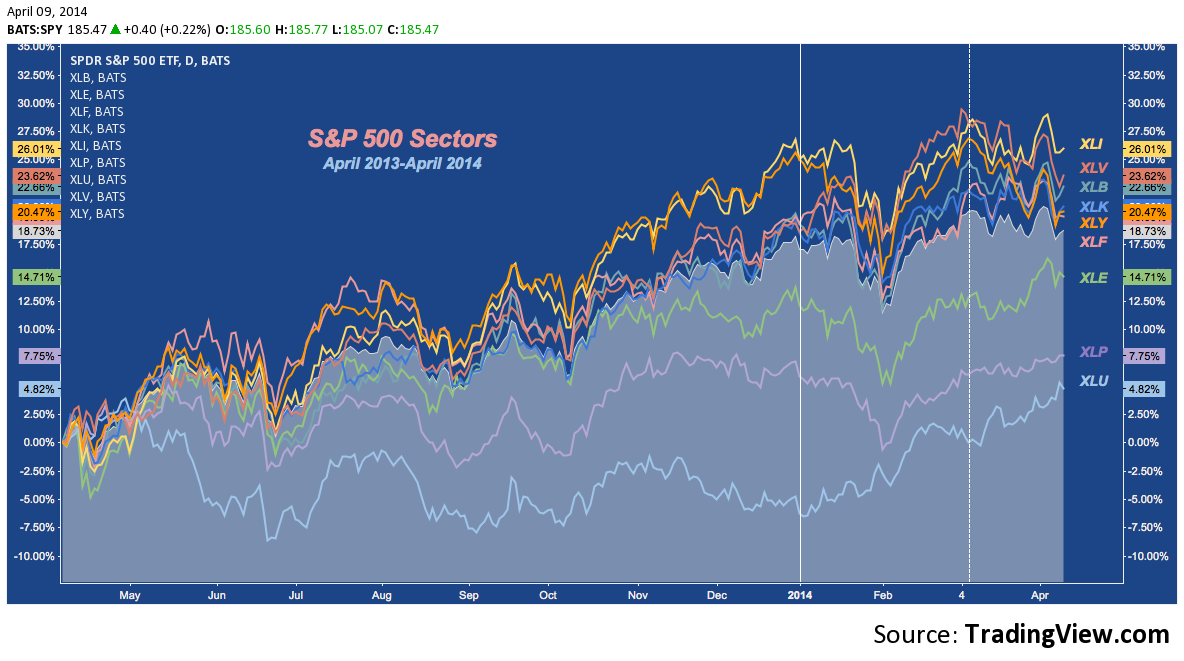
Over the last 5 weeks (i.e. since that dashed white line), sector leadership has dramatically shifted. The prevailing relative strength order hasn’t cleanly inverted, but the laggards (XLU and XLP, specifically) have assumed 1st and 2nd place with pokey old Utilities – long held out-of-favor – blowing the doors off the rest of the S&P 500. Healthcare remains an anomaly: this time because Biotech (IBB, with which XLV is perfectly correlated over a 5-year weekly lookback) has suffered a steep correction since late February.
This is the hint provided by SPX: Defensive sectors are handily outperforming since early March: in fact, XLU, XLP and XLE (which usually manifests relative strength at major tops) are all up since early March. When this happens, it isn’t guarantee of a top; but it is a sobering development. Whatever the reason the S&P 500 has transitioned to exhibiting a defensive posture, it isn’t something to cast aside. Whether that means opening shorts, hedges, or shifting to overweight a defensive long allocation is a matter of method and mandate for each individual investor, the S&P’s change-up is something to consider emulating.
“This sounds good in theory; but didn’t you just eschew the use of sector rotation on the basis of anomalies? So why should this signal a defensive and vulnerable market now?” A good point. As I’ve said, this flip to a defensive regime doesn’t make a top inevitable. But, there’s strong historical precedent recommending caution. For example, check out the the correction in Q2 2012:
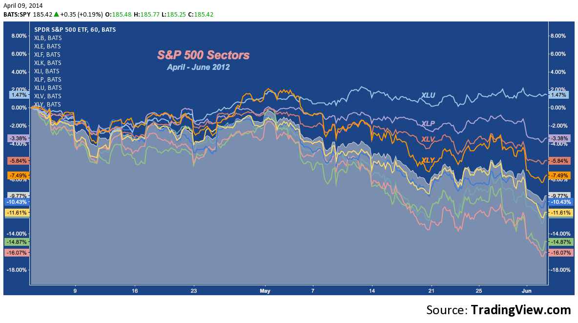
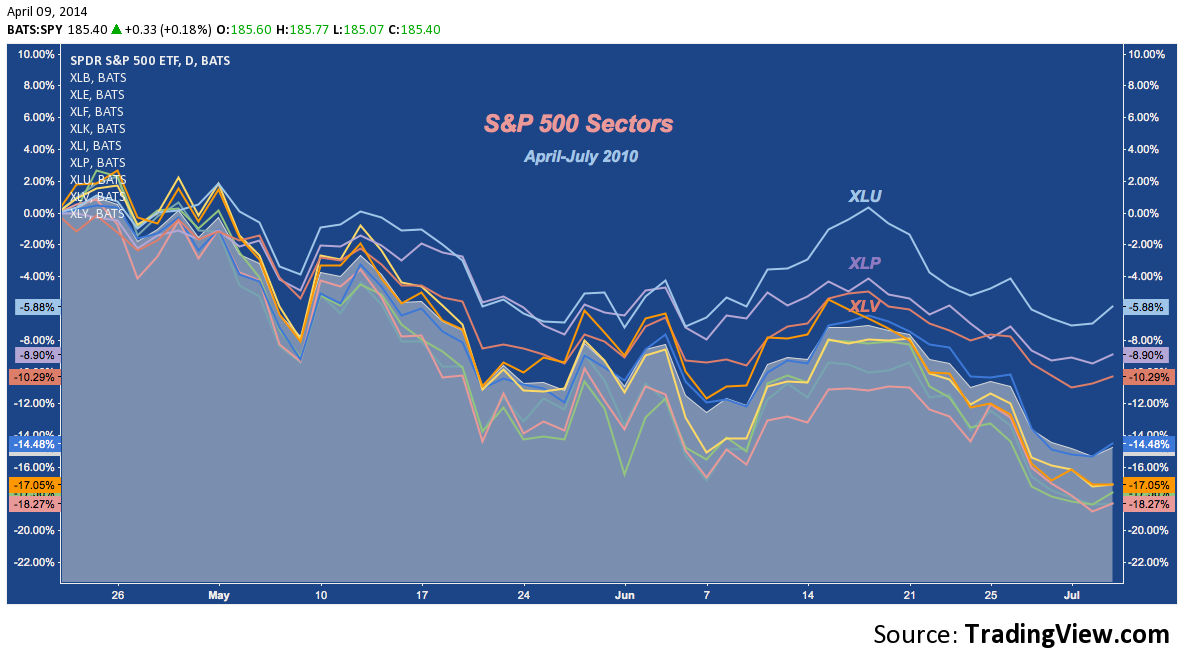
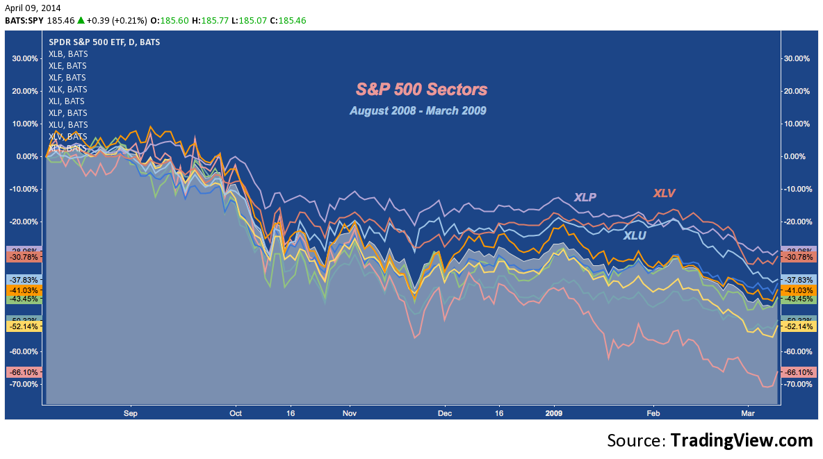
See the reordering there and what comes out on top as returns become diffuse (i.e. defensive relative strength and pro-cyclical weakness become augmented) over the correction?
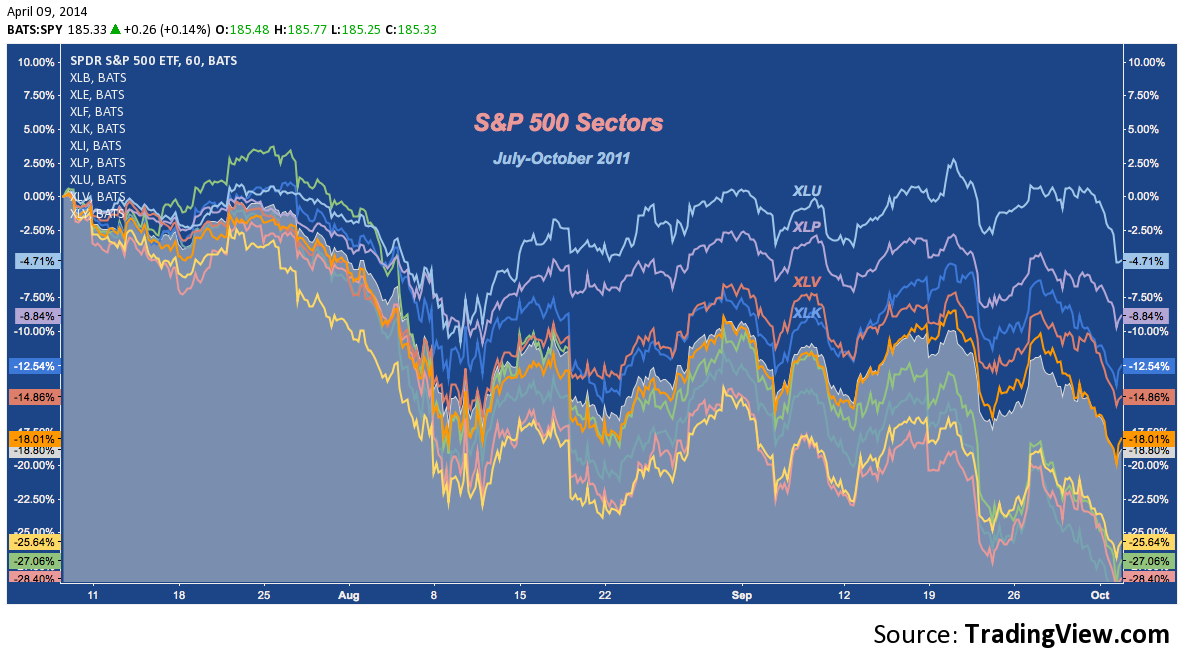
Now look at Q3 2011:
And Q2 2010:
And Q3 2008-Q1 2009:
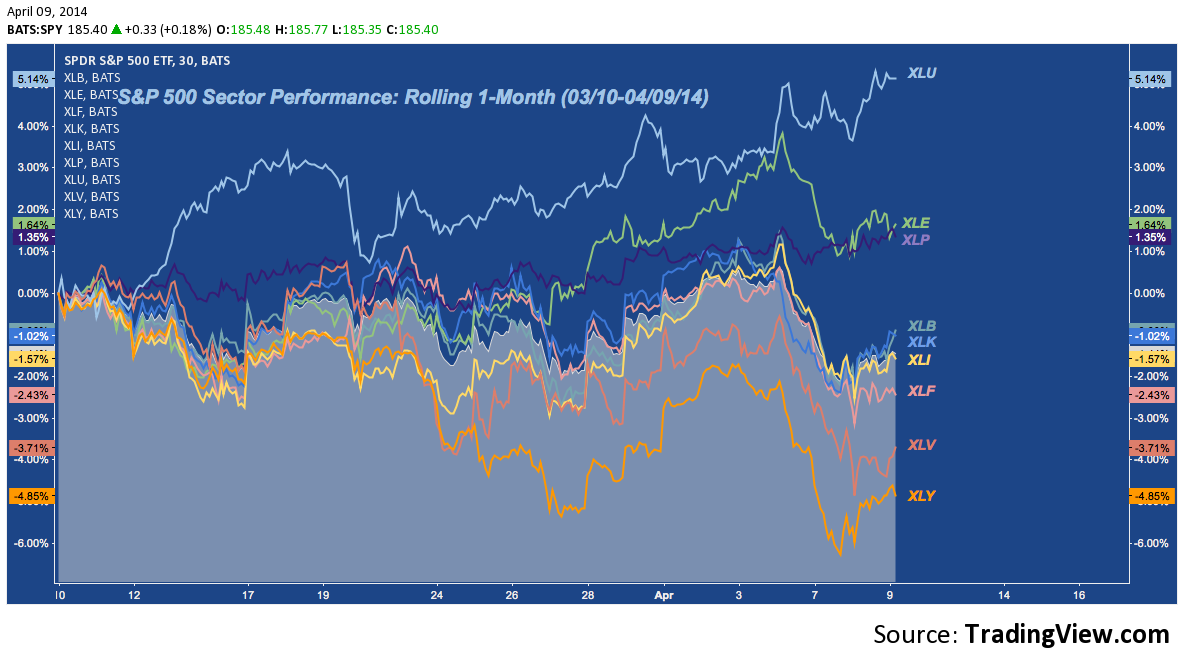
Here’s the last month again:
S&P 500 Sector Review
With that in mind, here’s a run-through of the nine S&P 500 Sectors looking at the Weekly or Monthly and then Daily time frame on each.
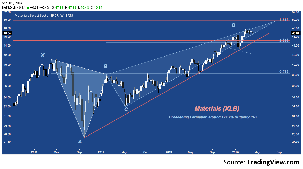
Materials (XLB)
Materials continues to consolidate between Bearish Butterfly Potential Reversal Zones (PRZ) in a Broadening Formation. How this pattern resolves will in turn determine the ultimate resolution of this 3-year harmonic pattern:
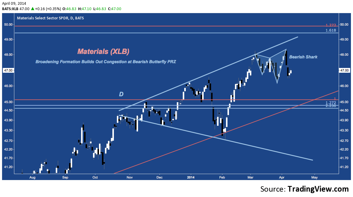
XLB‘s Daily chart is dominated by the Broadening Formation (or Megaphone) that characterized it’s mostly sideways movement over the last 6 months. The last 6 weeks have been spent in a tighter consolidation, creating a small Bearish Sharkharmonic pattern. Support lies below where rising trend line support meets the 127.2% extension Buttefly PRZ near $45 . Below there buy still inside the Broadening Formation horizontal support kicks in near $43.
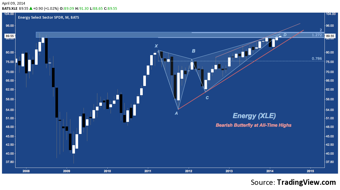
Energy (XLE)
Like Materials, Energy is struggling through a prolonged skirmishing at a Butterfly PRZ of its own. Here, though, it is a decisive battle for rejection from our a breakout over Summer 2008’s all-time high just above $91.
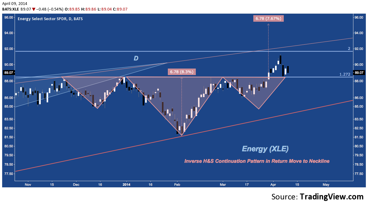
A closer view of congestion shows how this may resolve positively for XLE with an Inverse H&S Continuation pattern projecting a measured move to over $95. Last week’s early breakout pushed Energy right up to it’s record, but beginning with Friday’s sell off the sector has faded in a return move back to the neckline near $88, posing the question of whether the sector will bounce or fail from here.
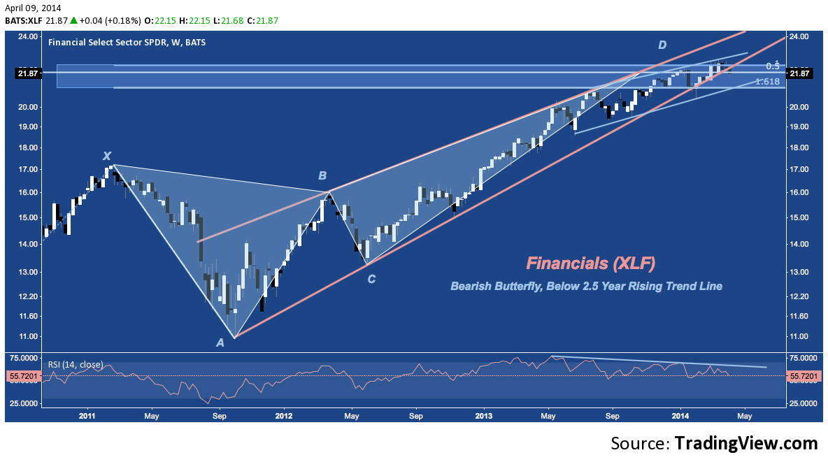
Financials (XLF)
Another multi-year Bearish Butterfly harmonic pattern, XLF continues to struggle between 21-23. Last year, in particular, left many potential support rungs with it’s orderly succession of shallow pullbacks. That said, a downside breakout will have many opportunities to gain its footing, but the Butterfly pattern itself doesn’t see a major floor until X near $17.
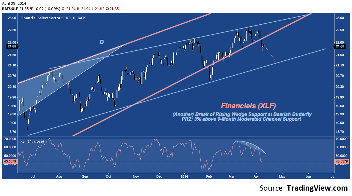
Financials have now broken below the rising trend line emanating from the Q3 2011 bottom for a second time year-to-date. Whether the trend will be recovered (as it was in February) is undecided; but assuming a move lower following this break, XLF‘s smaller, 9-month channel support comes in near $21.
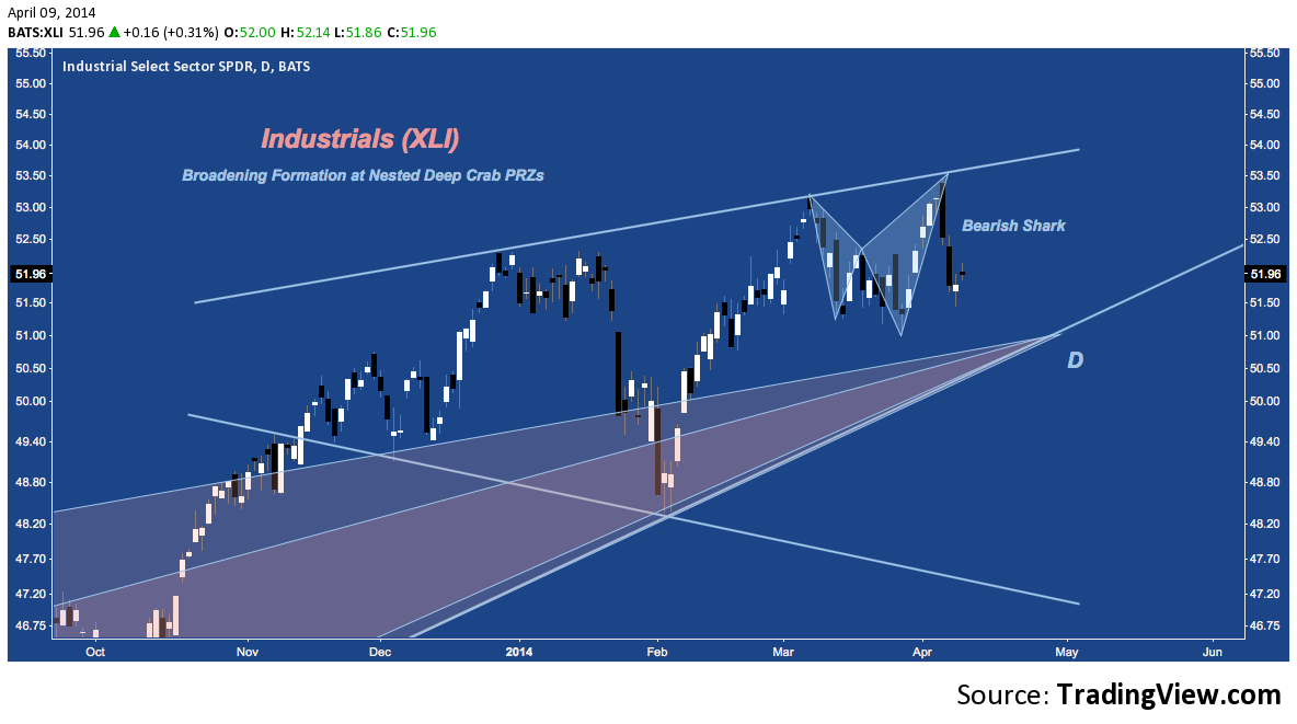
Industrials (XLI)
Zooming out, XLI is actually fighting through the Potential Reversal Zone (PRZ) of two Deep Crab harmonic patterns in Right Angle Descending Broadening Formation just above 5-year rising trend line support near $51.
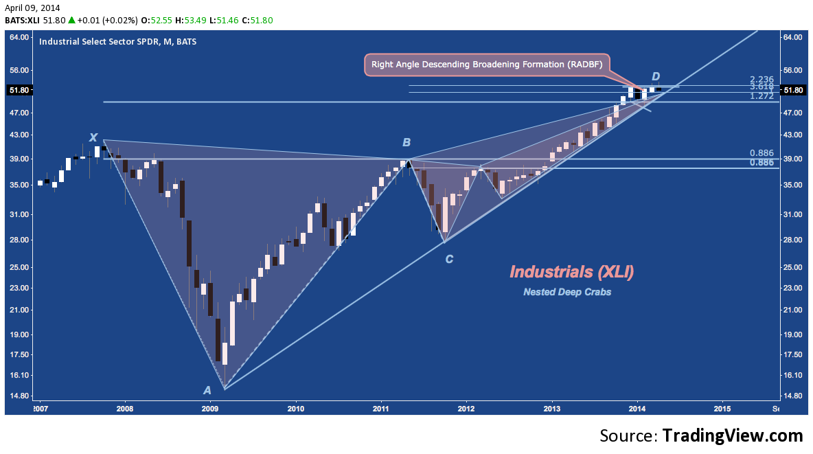
XLI‘s Daily dials in the RADBF above as another Broadening Formation, complete with Bearish Shark just like XLB. Cyclical trend line support comes in at $51, followed by horizontal support at $49.50 and then February’s swing low near $48.25. The more modest bearish implications of these levels belies the major significance a break under $51 would have here: Deep Crab support doesn’t come in until X near $42.
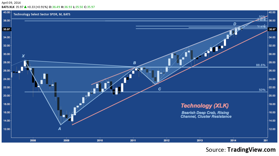
Technology (XLK)
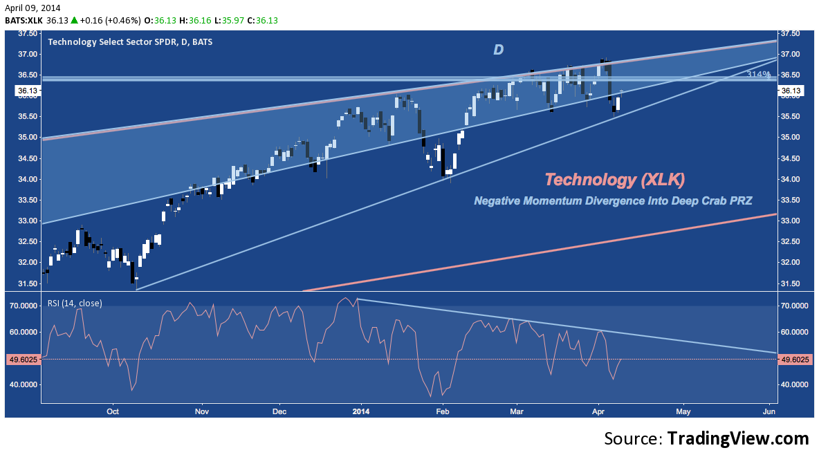
XLK‘s last 6.5 years all culminate here at its own Bearish Deep Crab PRZ Near $36-37, with cluster Resistance extending through $38.25. 5-year rising channel support comes in below near $34, with the Deep Crab’s point X at 2007’s high near $28.50.
The back-and-forth on XLK at its Deep Crab PRZ, like most of its peers, is accompanied by a multi-month bearish momentum divergence (here on the RSI, lower panel). Is this indicative of a deterioration yet to take hold, or is momentum simply pausing for breath? Technology’s overarching bearish pattern suggests the former, but price complemented by a slowdown in momentum – not a slowdown in momentum alone – will ultimately dictate the outcome.
Consumer Staples (XLP)
One of the defensive sectors current in favor, XLP doesn’t have a major 5-point harmonic pattern like the aforementioned sectors. Instead, it’s cyclical bull market story is told through a uniform rising channel that is structured by two major ABCD patterns both culminaing around $42. XLP is fighting through cluster resistance here in an almost lateral channel or rectangle:
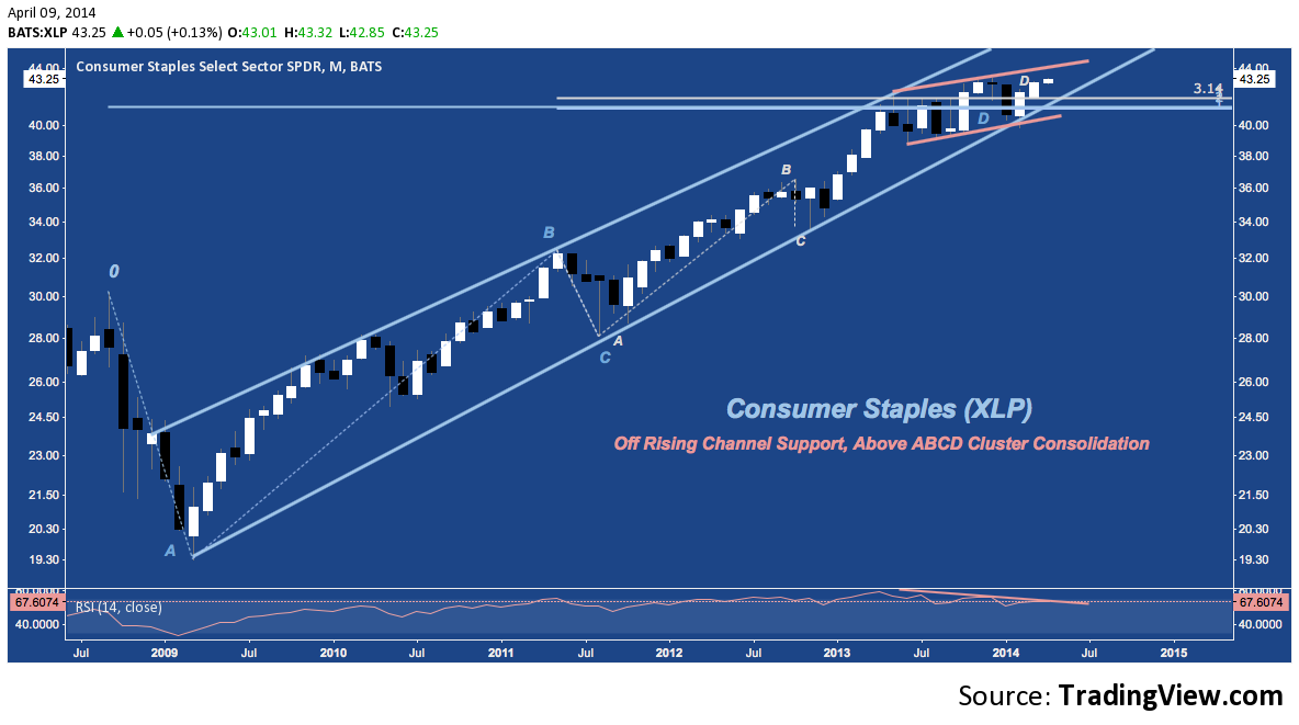
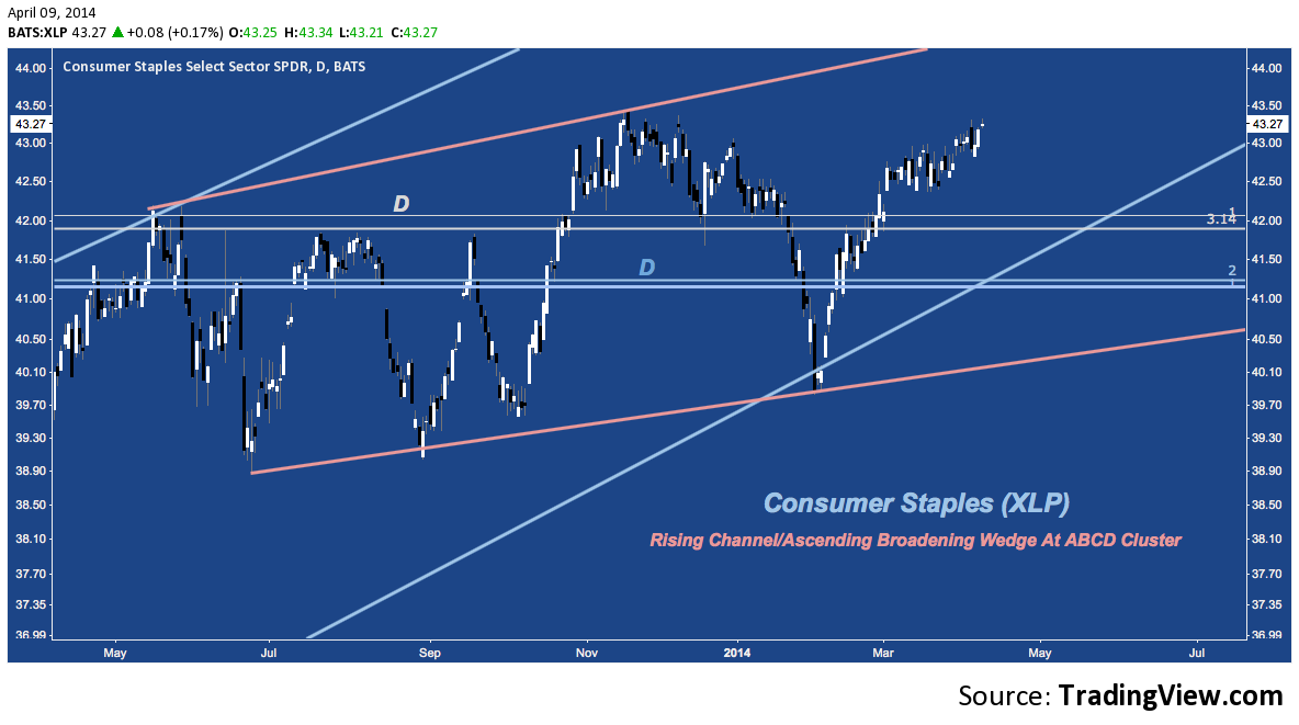
Compare this Daily chart to those above: the contrast in relative strength since the beginning of March is stark. XLP rallied along with the rest of the S&P in early March and then completely decoupled to march higher in a chopping wedge as most of its peers dropped.
Utilities (XLU)
There’s no more concise expression of how different 2014 is under the surface and at the sector level than this: “Utilities are outperforming every other sector year-to-date; and by a significant margin”. Still, XLU is part of the market, and has been slowly setting up a major Bearish Bat pattern for over 6 years with a PRZ around $42:
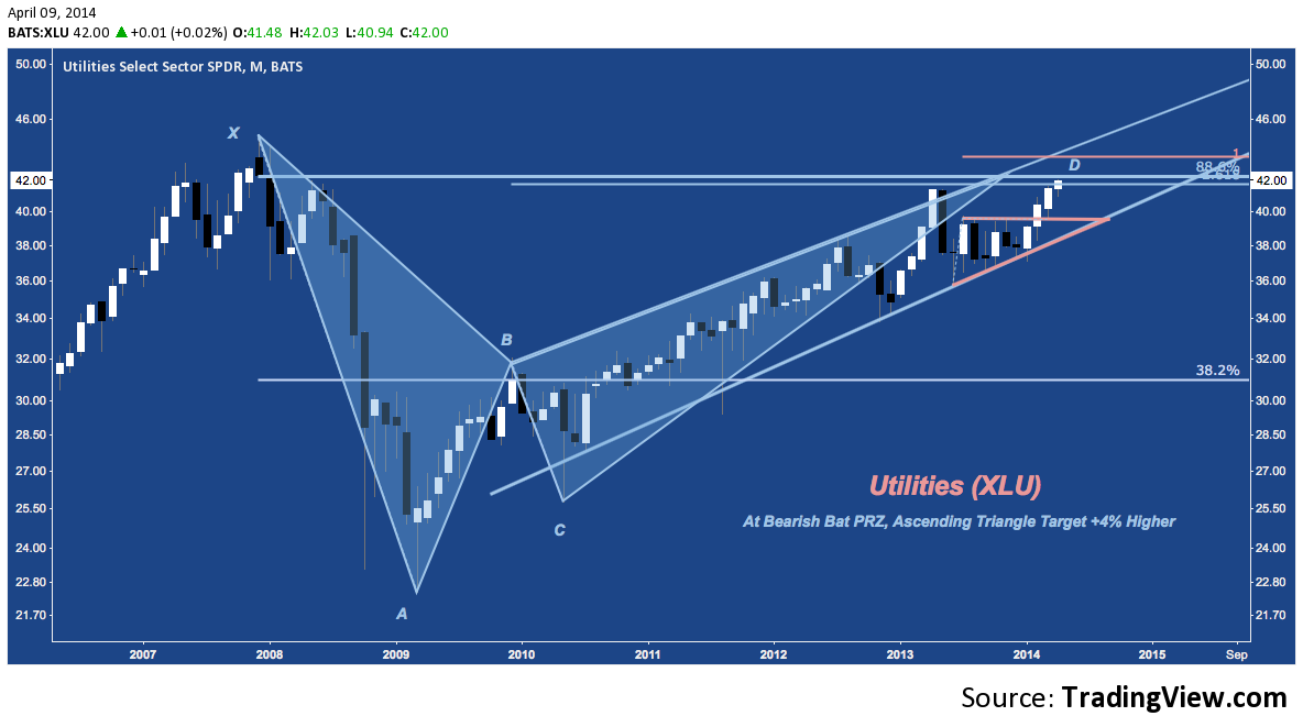
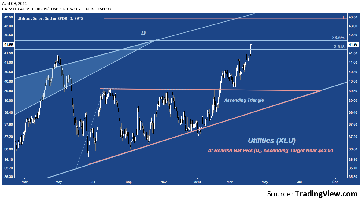
The ETF has streaked higher from Q3 2013-January 2014’s ascending triangle (in orange). Targeting $43.50, the immediate question is whether the Bearish Bat’s PRZ will hem in XLU‘s advance. If so, the first rung of support lower is back at the site of the triangle breakout near $39.50. Like XLP, notice how indifferent (and even supported by) Utilities has been to the drop experienced by it’s pro-cyclical counterparts:
Healthcare (XLV)
A few weeks ago I remarked that Healthcare’s recent outperformance (it was neck-and-neck with Consumer Discretionary as the strongest S&P sector for 2013) is indistinguishable and almost entirely reliant upon the speculative fervor surrounding Biotech. As a result, the sector’s near-term future will be disproportionately impacted – for better or worse – by the leveraged beta momentum chasing still underway in that industry. There’s has been a modest average unwind (not to mask the fate of some momentum leaders, suffering selloff’s of of more than 20%) since the end of February, occuring at ABCD and Cluster Resistance between $58-$60 and at the top rail of the Andrew’s Pitchfork stretching across 2009-2014:
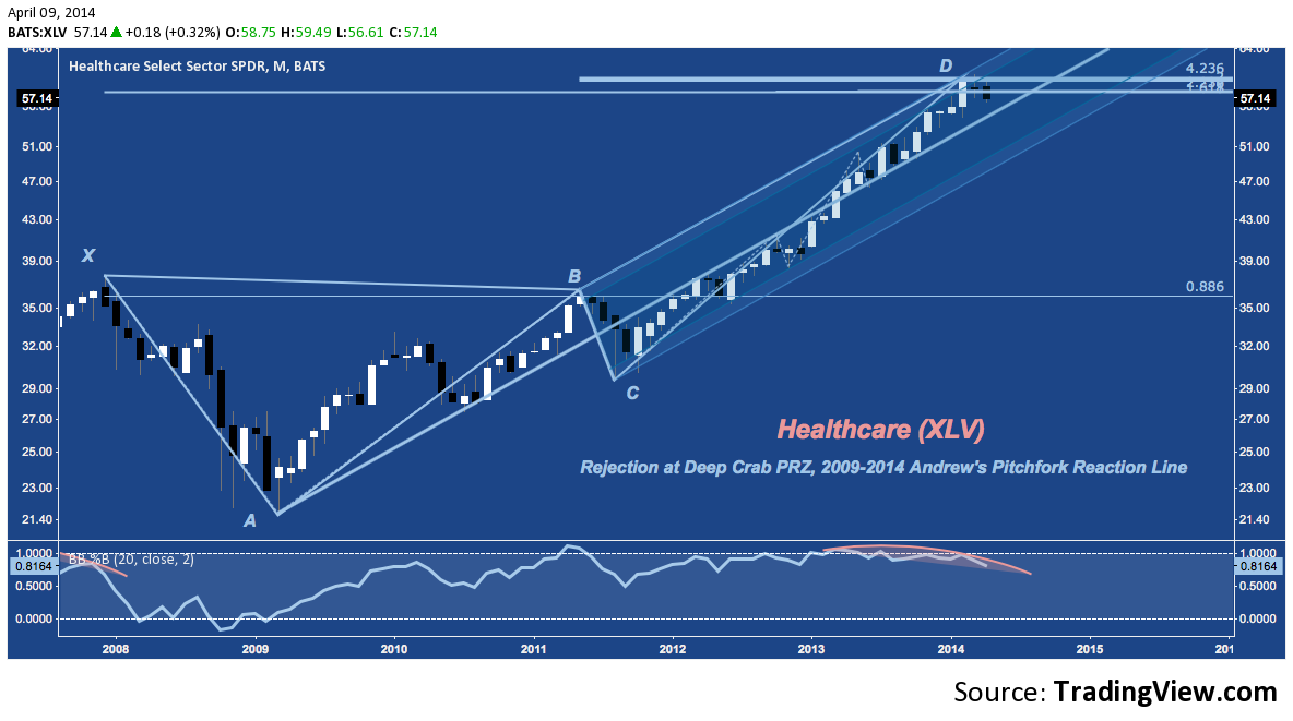
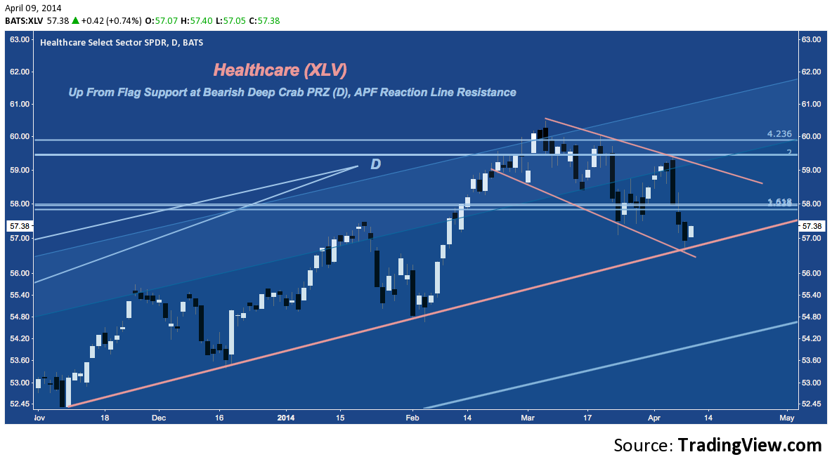
The monthly chart features a tall up candle in February, a bearish harami star in March, and a Bearish Engulfing so far for April. That sounds entirely bearish; but the daily action since the beginning of march has produce an orderly flag (some would even call it a bull flag). A bounce isn’t out of the question here as long as 6-month trend line support (in orange) holds; but it’s worth keeping in mind the bearish implications of XLV‘s Deep Crab PRZ between $58-$60 remain to be addressed.
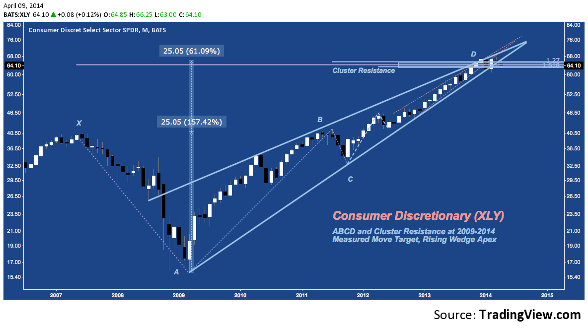
Consumer Discretionary (XLY)
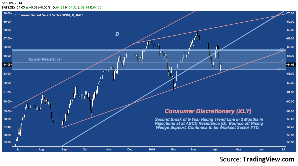
XLY – the worst performing sector year-to-date – is also scuffling through a multi-month consolidation at ABCD and Cluster resistance. Price has broken down from the 5-year rising wedge over the past several days of trading and though the sector is still oscillating through congestion around $65, there’s no way to construe this as a bullish development. XLY fared better than any other sector in 2013, leaving very little technical density: modest horizontal support at $57-$58; and then open air until Spring 2012’s swing high near $46.
XLY‘s Daily shows the break down (it’s second year-to-date, like XLF) below 5-year wedge support and it’s bounce at 6-month trend line support (like XLV).
As I read them, the unified testimony of these charts is that the broader market look highly vulnerable, with large cap defensive stocks decisively outperforming over the last few weeks. Compelling signs that this change-up is a prelude to a real correction are here, though ultimately price remains our guide and confirming moves have yet to occur.
Twitter: @andrewunknown and @seeitmarket
Author holds no exposure to instruments mentioned at the time of publication. Commentary provided is for educational purposes only and in no way constitutes trading or investment advice.
Any opinions expressed herein are solely those of the author, and do not in any way represent the views or opinions of any other person or entity.


")


 Ready To Break Out?")
