By Andrew Kassen “The rally is ending here.” Whether it’s the most despised market rally in history or not, calls for the market top have been our constant companion since March 2009: even as we stand on the broad shoulders of an S&P 500 (SPX) +128% off-the-low at the threshold of this cyclical bull market’s fifth year.
Fifth year? Up 128%? 854 points and 47 months on from the cusp of imminent cataclysm, the S&P 500 (along with the Dow) is within closing distance of fresh all-time highs.
One can by turns deride the advance with liquidity-fueled, QE-addicted, Primary-Dealer-asymmetrically-advantaged, HFT-afflicted bromides; or impute credibility to it by citing improving unemployment, sentiment, PMI, GDP, modest index P/E’s and subdued CPI metrics. Such arguments have been and will presumably continue to be made with persuasive force. This is nothing peculiar to the last 4 years: though the propositions and points-of-view change, a social scientist might plausibly sum up the entire history of financial markets as a structured medium of sustained argument.
But whatever the questions over the moral efficacy of a “Fed-manipulated” rally on the one hand, or the constructive macro fundamental density undergirding our still-building economic recovery on the other, the conclusion of these arguments is simple, elegant, indisputable and available at any given moment: price.
At its most basic, Dow Theory postulates that prices trend: further, trends ought to be given the benefit of the doubt. Put in the nomenclature of argument, price is a streaming succession of conclusions to arguments that stack in a direction, or trend. The more they stack and stand against counter-argument, the more compelling their momentum becomes. Eventually the rising tide of anti-trend eclipses this momentum, and the trend changes.
As the practitioners of an agnostic technical approach we actively endeavor to keep the content of these arguments out of our analytical process, preferring to build price-based theses about those instruments we trade. Wherever that process eventually leads, it begins with two simple, complementary lines of inquiry:
- “Where has price been, and where is it now?
- “What, if anything, is a plausible objection to the thesis set forth in (1)?”
So, just how does a – provocative, but the more ill-founded for it – declaration like “The rally is ending here” square up?
A cursory look-in on the S&P 500 should satisfy our first question. See the chart below – click to enlarge.
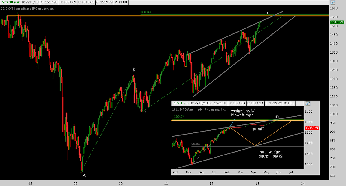
This narrative is now so familiar it bears no repetition. US equities have been in an almost indefatigable up trend since the throws-of-crisis nadir at A. Now up some 854 points, Friday’s close at 1520 is 3% shy of printing an all-time closing high (orange/yellow horizontal line). Our favored, and perhaps simplest technical theme that describes this cyclical bull is the harmonic price pattern AB=CD featured in the chart below, with intermediate leg BC retracing 38.2% of leg AB in Spring/Summer 2010. Leg CD comprises the entire post-Jackson Hole 2010 era, with a full measured move duplicating point D around 1560: in line with index’s October 2007 high.
This AB=CD also has implications for our second question: the prevailing trend is undoubtedly up and there is nothing coincident with this chart to suggest it will not complete. A fortiori, the first substantive objection to the base “up trend” thesis is that leg CD – the 100% projection that is culmination of the last 4 years, and certainly the QE2-and-after era – will complete precisely at all-time-high resistance.
Expanding on the AB=CD harmonic price pattern theme to better inform the answer to Question 1, here’s a closer look at its structure. Click to enlarge.
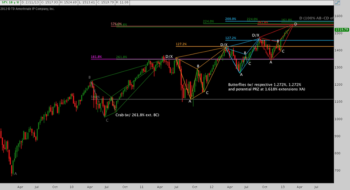
Looking far to the left, Line AB (QE1-era) is composed of its own constituent AB=CD with 100% and 161.8% projections that have had far-reaching technical implications. Note how the mid-November 2012 post-election bottom bounced at this 161.8%, projected in July 2009.
Closer on, lines BC and CD are comprises of four multi-month harmonic price patterns: 1) a crab, followed by a 2) succession of three butterflies. Each of these harmonic price patterns connotes a bearish conclusion; and each of them have composed and culminated in the noteworthy corrections of the past three years.
This gives us an additional input to the base “price: uptrend” thesis and answer to Question 1: yes, price was unmistakably up, but not ceaselessly; and we have harmonic price pattern constructions that do this explanatory work.
Similarly, the kernel of an objection that is the AB=CD completing is now more nuanced. The leg of this uptrend now underway (CD) is made up of three butterflies (2a, 2b, and 2c). Click to enlarge.
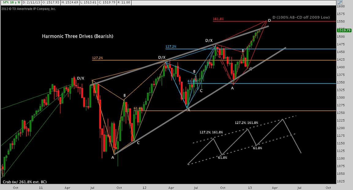
The third butterfly (remember, these are bearish patterns) hits its potential reversal zone at its 161.8% projection near 1555. By itself this is suggestive of a correction, consistent with the patterns that have preceded it.
On top of this, these butterflies act in concert to make a Three Drives pattern (note the textbook figure in the lower-left) out of leg CD, implying a correction of yet greater magnitude.
Had enough about small, exotically-appendaged animals yet? To stave off analytical myopia, let’s change up the objection we’ve been building. The chart below peels back the harmonic price pattern to look at the basic fractal structure of the measured moves that have constituted the rally. Click to enlarge.
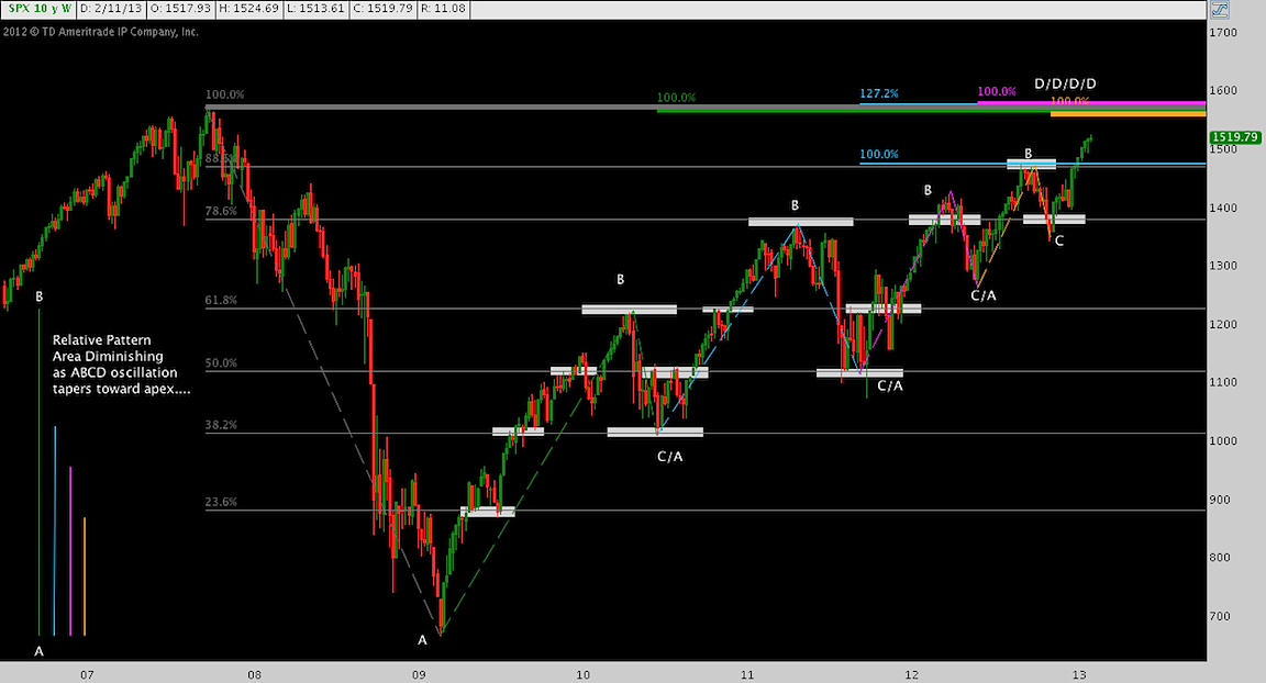
Thus far, I have spoken at length about “the rally” which alludes to a crucial point: until a nominal all-time high on the S&P 500 prints, the index remains in a corrective rally and secondary trend. Great bullish staying power has provided an abiding bid since March 2009, but the index has not installed a new high-water mark for almost 5 ½ years.
What’s in store at the previous high-water mark? According to this cyclical bulls harmonic structure, quite a lot: in fact (astute observers know this is the culminating point of all the preceding charts), every pattern with tangible technical import on a daily, weekly or monthly timeframe points to 1540-1580 (note the colorful pileup there) as a projection/target and/or possible reversal point. Strikingly, each of these moves (note the figure in the lower left) is significantly smaller, if no less feeble then the last.
Now for some well-foreshadowed disappointment: none of this suggests, “the rally is ending here.” The base assumption that holds everywhere and at all times is equally relevant here: the trend will continue until price overwhelmingly objects. Our assessment is there is no definitive objection to, but instead a mounting counterargument against the prevailing trend here that will play out around the SPX’s historic high. Whether this passes away into a momentum break to new highs, signals a shallow correction or presages a catastrophic drop is unknowable, even a distraction. Until the turn comes, maintain vigilance by managing risk and measuring objections.
Twitter: @andrewunknown and @seeitmarket
No position in any of the mentioned securities at the time of publication.
Any opinions expressed herein are solely those of the author, and do not in any way represent the views or opinions of any other person or entity.
 Rolling Over At Key Fibonacci Level?")


 Rolling Over At Key Fibonacci Level?")
