Useful charts, models, and trading systems should be based on “that makes sense to me” concepts supported by the laws of supply and demand. If you want to build a robust risk-management system, start with economic concepts and then backtest and refine them. If you start with market data and optimization software, that is a recipe for disappointing results known as “curve fitting”.
Charts Help Us Monitor Risk Tolerance And Manage Risk
Since the aggregate opinion of all market participants sets asset prices, rather than personal opinions, charts are an efficient way to monitor risk and the market’s overall risk tolerance. In a previous SIM article, we outlined the three steps needed for a basic trend change and provided historical examples of both bullish and bearish trend flips. Trends help us keep an eye on aggregate opinions, and thus, risk in the financial markets.
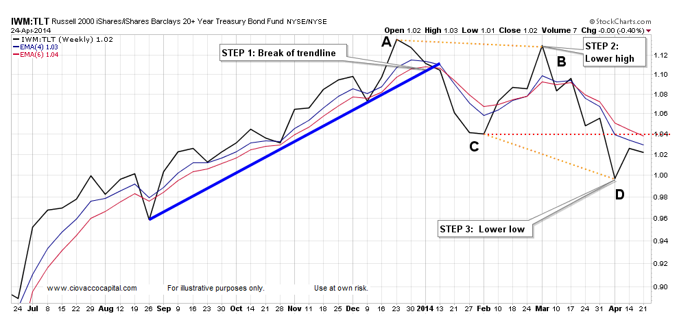
A Flip From Risk-On To Risk-Off
We can all agree that conceptually when investors are confident about the economy, earnings, and the general stability of the global financial system, they would prefer to own stocks rather than bonds. When confidence about future economic outcomes is high, investors tend to migrate toward smaller companies with greater upside potential (a.k.a. small caps). Therefore, the ratio of small caps Russell 2000 iShares (IWM) to defensive bonds iShares Barclays 20+ Year Treasury Bond (TLT) provides us with valuable insight into the aggregate opinion of all market participants. Remember, that aggregate opinion determines the value of our investments, which is the rationale for keeping tabs on it. The left side of the chart has a “risk-on” look or one that a constructive, higher risk tolerance for stocks. Over the past four months, the ratio has completed the three steps for a bearish trend change, meaning the bias is now one of “risk-off”. In the chart below, a lower high has been printed (B is lower than A) and a lower low has been made (D is lower than C). Click charts to enlarge.
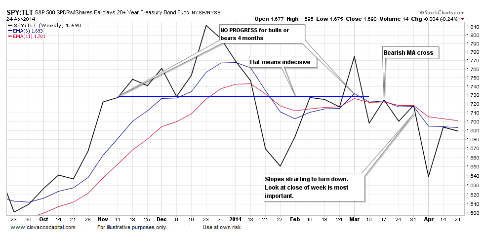
Indecisive Market Tilting Toward Defensive Mindset
The same concepts apply to the ratio of stocks S&P 500 SPDR (SPY) to bonds (TLT). The blue horizontal line tells us no progress was made in the battle between stocks and bonds for roughly four months. The sideways action in the ratio is indicative of increasing concerns about the economy, earnings relative to valuations, and Fed tapering. Notice how the ratio seems to be trending away from and below the blue horizontal line; it tells us things are getting worse, not better, in terms of risk tolerance.
The charts presented here are weekly charts. The “look” at the close on Friday is much more important that the look intraweek. These charts are as of Thursday’s close.
Think In Probabilities
Flexibility may be the most important ingredient for investment and trading success. One of the best ways to remain flexible is to think in probabilities, a concept that was outlined in more detail in Four Ways To Improve Your Game. Flexibility requires that we remain open to change when the charts above begin to send more bullish signals.
Follow CCM on Twitter: @CiovaccoCapital.
Any opinions expressed herein are solely those of the author, and do not in any way represent the views or opinions of any other person or entity.


")
")


