Below, I walk through some of my thoughts from the last year and how things are playing out as we begin 2016. Note that this was originally published a few weeks back on JBL Wealth.
Be sure to read my latest post which was published here on See It Market: “Central Banks To The World: Respect Our Stimuli!”
Last April, I published the first of what became monthly iterations of the Trillion Dollar Question. Below is the close up of the 2009-2015 section of the chart. The events that followed coincided with a transition into a stock market price discovery phase (which we are still in).
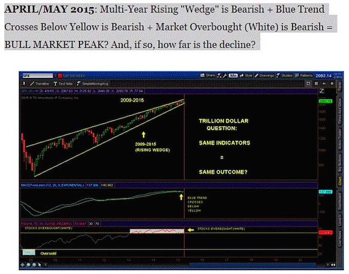
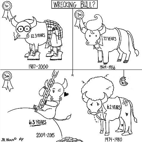
Five days following publication (on May 5th, 2015), the 2009-2015 bull market became the third longest bull market on record. And, just over two weeks later, on May 21st ,the S&P 500 set its last record high (2130.82), what appears now to be the bull market peak. On May 24th, I echoed some of my concerns in Prize Winner: Wrecking Bull?
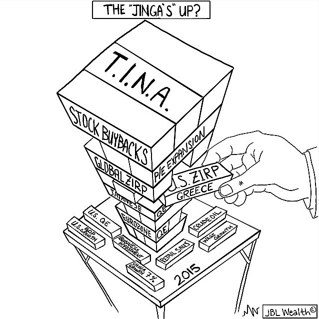
Over the Summer 2015, my tactical models became the least bullish since 2009. Given the Trillion Dollar Question chart indicators were aligned for a bearish change, the Federal Reserve’s potential removal of Zero Interest Rate (ZIRP) policy after the end of QE Fed balance expansion, along with the tenuous nature of some of the “building blocks” of the bull market had me wondering if The Jinga’s Up?
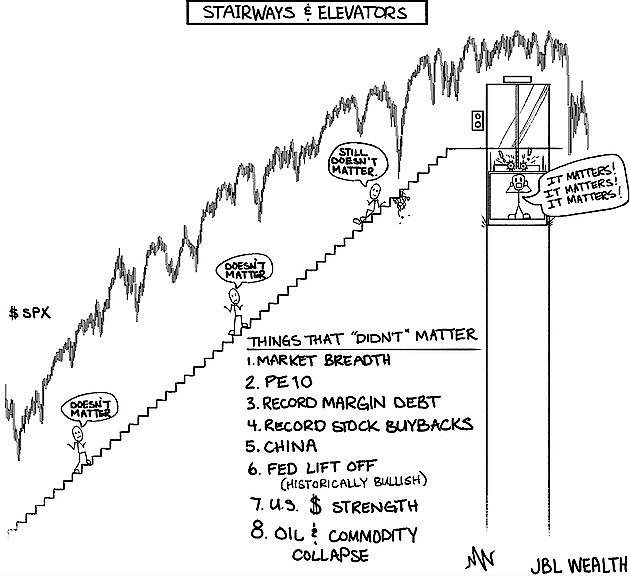
Suddenly, things that did not matter (valuations, few stocks leading, etc.) did – Stairways and Elevators as they say. And the transition into stock market price discovery was underway.
Everything was not Awesome, but then just as fast as it fell, the market held its lows and market pundits started taking to 2011 market analogies, where the market was shaken by the U.S. debt downgrade and Euro Zone worries but shook it off after several months to resume its march higher.
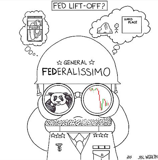
In September, the market bounced between 1870 and 2020 as the Federal Reserve waffled on Fed Lift Off (raising rates for the first time in 9 years) due to market volatility and China growth and stock worries. The Federal generals were perceived as weak. My tactical models still signaled conservative positions (heavy cash).
Beginning in October, markets staged a grand reflexive rally on the back of central bank posturing leaving one thinking “How Many More Times?” are central bankers going to treat the markets like a master marionette.
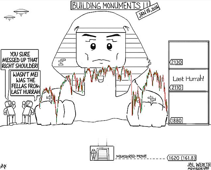
In mid-October I published Building Monuments, stating, “One “structure” I am watching is the 1+ year old potential bearish head and shoulders pattern in the S&P 500…the measured or implied move…should it play out, is to around 1620-1630. That level is 20% down from here, and calculated as difference between the May 2015 high close of 2130 and the August low close of 1880 in the image, or around 250 points. The 1630 level corresponds roughly with the 161.8 Fibonacci retracement level from the October 2014 lows to the May 2015 highs.” (see original image at the beginning of this article).
continue reading on the next page…
")


")
