The past two months have seen several developments take shape that remind me of the February sell-off. I’m not saying that this pullback will unfold the same way, but I do think that issues with small caps and emerging markets (a good risk gauge), coupled with poor market breadth have once again played a role in taking the S&P 500 (SPX) lower. How much lower? No one knows for sure, which is why we follow price and how it behaves in an around key technical support areas. With that in mind, let’s take a look at what’s happening with my favorite index and highlight some key S&P 500 technical support levels I’m watching.
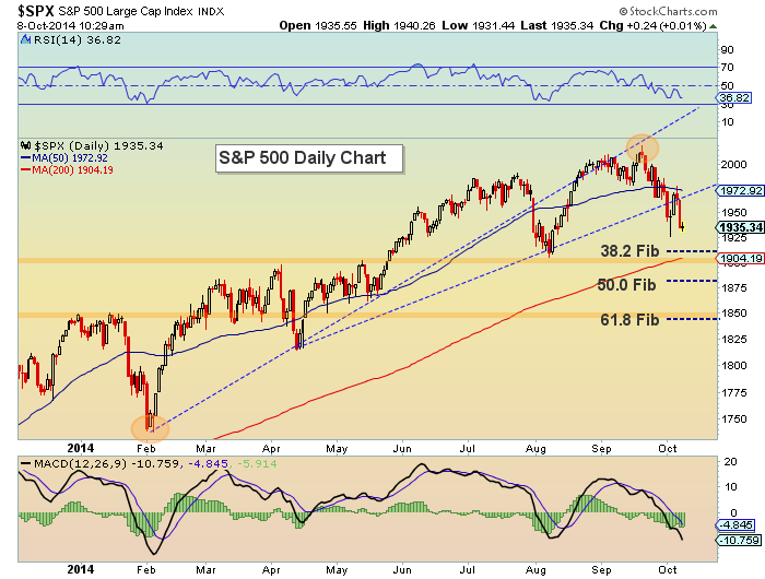
Focusing on the daily chart below, let’s work our way from the top down highlighting some warning signs and technical support levels to watch.
Warning Signs:
- RSI began to diverge from price in July. This lead to the initial uptrend line breaking down for a retest of the 1900 breakout level. After a successful retest, the SPX marched to new highs (lacking RSI confirmation) and backtesting the initial extended uptrend line.
- The S&P 500 fell through its 50 day moving average. And when it rallied to briefly retake it, it failed to hold.
And we are now testing last weeks lows. This area looks pretty tenuous, and should it break, here are some S&P 500 technical support levels that traders should be aware of:
- 1895 to 1911 – I know, this sound like a wide support zone, but when certain support levels converge, it’s important not to narrow your focus. 1911 is the 38.2 Fibonacci retracement support level (of the February to September move higher). As well, 1895-1905 represents the May breakout level and August lows, along with the 200 day moving average.
- 1878 – The 50 percent Fibonacci support level
- 1845 to 1850 – Lateral support/resistance level in early 2014 and 61.8 Fibonacci retracement support level.
S&P 500 Daily Chart
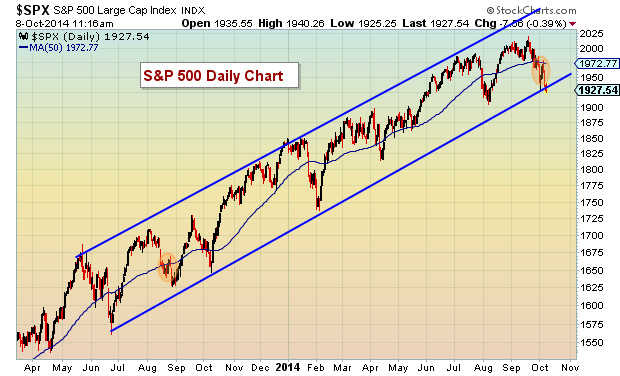
Another way to look at the S&P 500 (and identify another support level) is by looking at its trend channel. Below is a a daily chart for the S&P 500 dating back to May of 2013. A quick puncture isn’t out of the ordinary, but a decisive break would set up lower levels.
S&P 500 Trend Channel Chart
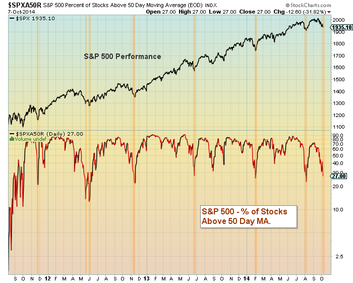
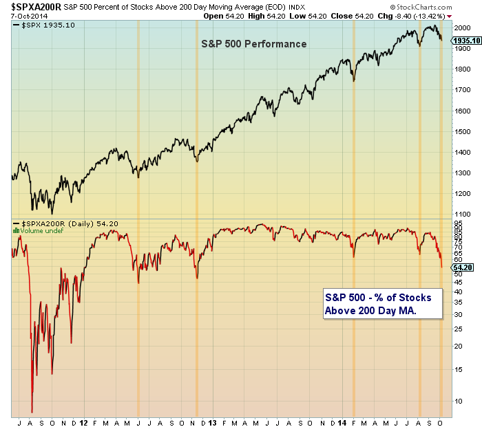
Finally, I’d like to share a couple more charts that provide some further insight into market breadth. Aaron Jackson put out an excellent piece on market breadth last week so be sure to check that out. In this instance, I want to share two charts showing the percent of stocks in the S&P 500 above there 50 day moving average and 200 day moving average going back to 2011.
As they say, the market takes the steps up and elevator down. Note that the percent of stocks above their respective 50 and 200 day moving averages is still falling.
S&P 500 %Stocks Above 50 Day Moving Average
S&P 500 %Stocks Above 200 Day Moving Average
Thanks for reading.
Follow Andrew on Twitter: @andrewnyquist
The author holds a trading position in the S&P 500 (SPY) at the time of publication. Any opinions expressed herein are solely those of the author, and do not in any way represent the views or opinions of any other person or entity.


