Back on April 1, I posted a series of charts looking at the overall health of the markets in terms of the S&P 500 and market breadth. The article was entitled “Running To Stand Still”, a tribute to a great U2 song that seemed to define the trading environment we are in.
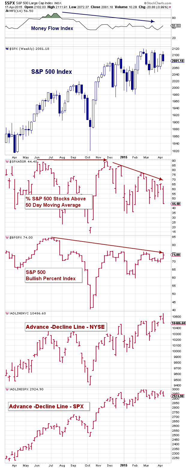
I thought I’d provide a quick update to that chart post while expanding the metrics. Using the chart below as reference, it appears that we are still caught in market limbo. While indicators like the Money Flow Index and Bullish Percent Index have ticked higher recently, the percent of S&P 500 stocks above their 50 day moving average has moved lower (it now rests at 44 percent).
To get a better gauge on broad market breadth, I added the NYSE and S&P 500 Advance-Decline Lines to the charts. These indicators are very broad and provide some color on the health of the markets. The oft-used NYSE market breadth indicator shows a market that is still in good health, while the S&P 500 market breadth indicator has flattened out. Taking the two together, we see a market that has slowed but hasn’t rolled over… yet.
Will market breadth and momentum reverse higher and lead to a breakout? Or will conditions deteriorate further, leading to a pullback? A clean breakout higher or lower would be nice, as investors could use a little direction.
Read my recent S&P 500 Technical Update for more color on support and resistance levels to watch. Thanks for reading.
Twitter: @andrewnyquist
Author has long and short positions related to S&P 500 at the time of publication. Any opinions expressed herein are solely those of the author, and do not in any way represent the views or opinions of any other person or entity.
 Rolling Over At Key Fibonacci Level?")


