The correlation between financial stocks (via $XLF here) and the 2 year Treasury yield is tight. The latter tends to be sensitive to Fed action.
In recent months in particular, the 2 year treasury yield has been on a roller-coaster ride trying to keep up with FOMC members’ constantly shifting bias toward interest rates’ future path… which has alternated between hawkish and dovish. The SPDR Financial Sector ETF (XLF) follows along.
Simplistically, banks borrow short and lend long, meaning their assets are of longer average maturities than their liabilities. The steeper the yield curve, the better it is for them. Ordinarily, if the Fed feels confident to raise short-term rates, the economy has to be in good shape, which then tends to put upward pressure on longer-term yields.
That is the premise behind the green and red lines in Chart 1 (below) moving together.
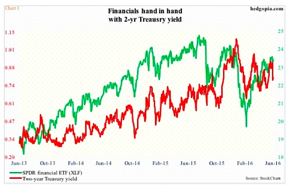
But this does not always work out this way. Of late, short rates have rallied more than their longer-term cousins, resulting in a flatter yield curve.
Regardless, XLF (and financial stocks) continues to maintain a tight relationship with the two-year yield.
Last Friday, they both took a hit.
The non-farm payroll in May was a huge disappointment, up only 38,000, with downward revisions to the tune of 59,000 in March and April.
For at least a couple of weeks prior to the jobs print, several regional Federal Reserve presidents, some voting some non-voting, were strongly advocating for higher rates. Even Janet Yellen, Fed chair, in a May 20th interview at Harvard University, said an interest rate hike would probably be “appropriate” in the coming months. Fed funds futures were beginning to place higher odds on future interest-rate hikes.
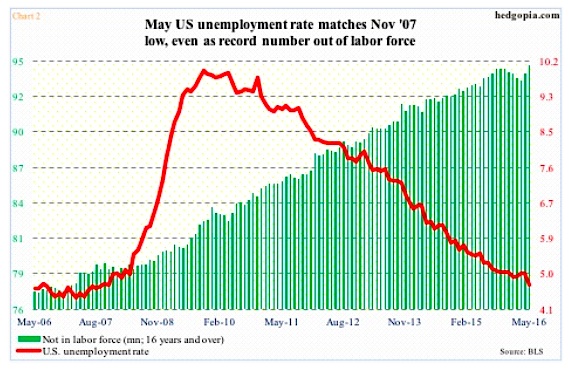
Then came the dismal May report. At the same time, the unemployment rate dipped to 4.7 percent, matching the low in November 2007. Just focusing on the unemployment rate, it looks like the economy is operating at full employment. But a record 94.7 million people are not in the labor force (Chart 2 below).
The jobs picture is muddy at best, and has been that way for a while. Momentum in non-farm payroll has been in deceleration. The monthly average in the first five months this year is 150,000, versus an average of 229,000 in all of 2015 and 251,000 in 2014.
With this as a background, the recent uptick in hawkish tone particularly among regional Federal Reserve presidents is atypical. There is a palpable change in sentiment.
Post-jobs report last Friday, Loretta Mester, Cleveland Federal Reserve president, said gradual rate hikes remain appropriate. Come Monday, Eric Rosengren, Boston Federal Reserve president, described the May report as “disappointing” but still expected sufficient economic growth to justify a gradual removal of accommodation. Also on Monday, Ms. Yellen, although at her non-committal best, said the jobs report was concerning, but potential rate hikes would be gradual and would happen “over time.”
In some measure, it makes sense for the Fed to be trying to fill its empty monetary quiver with arrows.
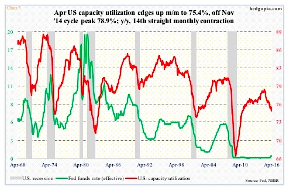
The unemployment rate may not have dipped below five percent for all the right reasons, but is indicative of a tight labor market. The recovery itself will soon complete seven years. Several data points, such as corporate profits and capacity utilization, have peaked cyclically.
In fact, it is rare for the Federal Reserve to start tightening when capacity utilization already made a cycle peak and is in decline. Yet, this is what occurred last December, when for the first time in nearly 10 years the fed funds rate was increased by 25 basis points. Utilization peaked at 78.9 percent in November 2014, with April at 75.4 percent (Chart 3 below).
continue reading on the next page…
")


 Rolling Over At Key Fibonacci Level?")

