After a rough 2014 that carried over into early 2015, the Emerging Markets ETF (EEM) have finally begun to show some strong relative strength to the S&P 500 (SPX). But there are several reasons to watch this relationship beyond the two ticker symbols mentioned here.
Before I dig into the relationship between the S&P 500 ETF (SPY) and the Emerging Markets ETF (and other implications), perhaps we should briefly recap Ratio Analysis, Pattern Recognition, and Intermarket Circle of Life
Ratio Analysis: Comparing one security over another. X/Y. If the chart is going up “X” is outperforming and if the chart is going down then “Y” is outperforming. Simple. Correct?
Pattern Recognition: There are patterns in the market with the underlying root structure based on simple geometric forms and ratio’s that govern all of life.
Intermarket Technical Analysis: Using charts to understand the global flow of funds and the intermarket circle of life – fixed income, global equities, currencies and commodities – and their relationship to each other.
Okay, to begin our study of the Emerging Markets relationship to the S&P 500, let’s start by taking a chart from this blog post in December 2014.
S&P 500 (SPY) vs Emerging Markets (EEM) Ratio – December 2014
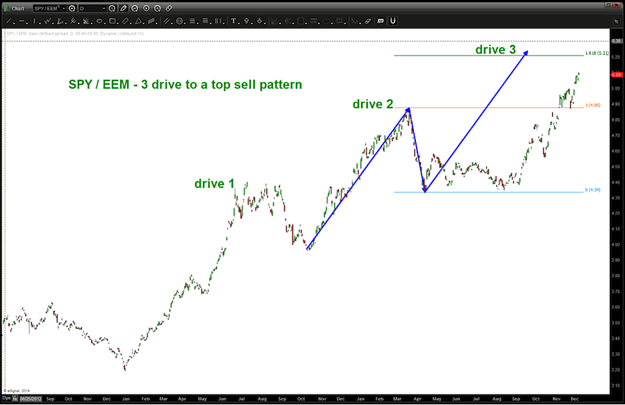
In the chart above, PATTERN RECOGNTION simply implies the upcoming levels above are SELL patterns and they should be respected. As you can see below, the target was surpassed by just a little but has since sold off as the Emerging Markets have outperformed the SPY for all of 2015.
SPY/EEM Ratio Chart – 2015
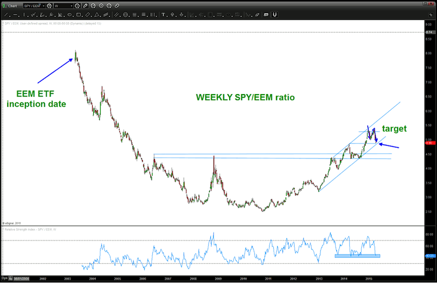
Clearly SPY has weakened versus EEM. Therefore, it’s important to note that we are at an important juncture for the Emerging Markets (EEM).
SPY/EEM Ratio – Zoom Chart
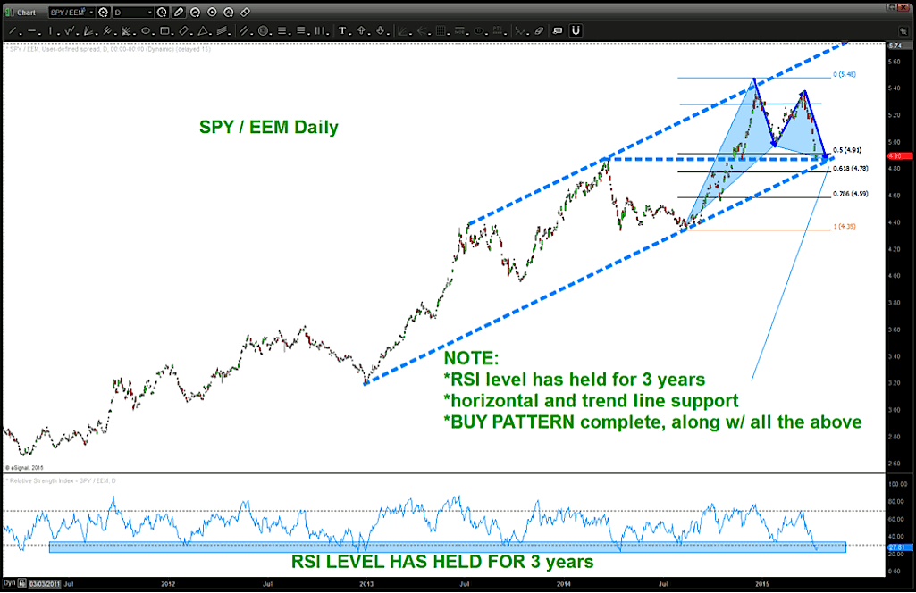
In the chart above you’ll see multiple indications that this ratio “should” start back up again. As the chart says – two intersecting support lines, RSI level that has held for 3+ years and, most importantly, all with a BUY PATTERN present.
Why is this a big deal?
Well for traders of equities, it’s obvious. But there’s a couple more reasons: it should give us a GOOD idea of the next move in the US Dollar and Crude Oil. Check out the chart below.
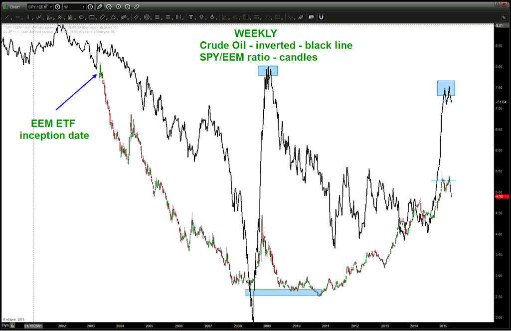
Note, the chart above has crude continuous contact INVERTED so you can see the correlation. They trend together and, at big inflection points, they inflect together. The Crude Oil and SPY/EEM ratio should be respected and watched together.
Now what about the US Dollar Index? Check out this chart:
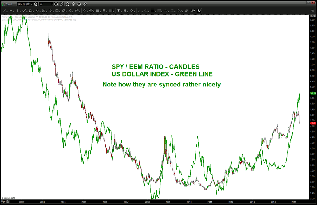
See how nicely they are synced? Again, pay attention to this ratio and look for PATTERNS to manage risk.
So, we are at somewhat of a checkmate point for the Emerging Markets and the implications to Crude and the Dollar…
- Is the PATTERN going to work for SPY/EEM and cause crude to tumble again and the dollar to continue it’s ascent? OR does the ratio fail at the levels shown and the dollar sells off while crude rallies ….?
- Don’t know, but rest assured I’ll be watching closely.
Have a tremendous week and thanks for reading.
Follow Bart on Twitter: @BartsCharts
No position in any of the mentioned securities at the time of publication. Any opinions expressed herein are solely those of the author, and do not in any way represent the views or opinions of any other person or entity.
 Ready To Break Out?")


")


