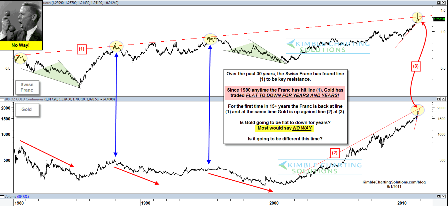
Back in 2011 I shared that it looked like the tide for precious metals was going to turn and that they should be “flat to down for years to come“.
I thought 4-years ago that the guys comment in the chart said it all… “No Way” did the majority think Gold would be flat to down for years to come, after 10-years up in a ROW! Here’s the chart from that 2011 post. Click to enlarge.
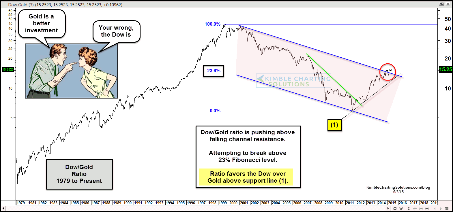
As you know, a continued debate for decades has been: Are stocks better than Gold or the other way around?
The chart below looks at the Dow Jones Industrial Average to Gold ratio since the 1970’s.
The Dow Jones to Gold ratio broke above falling resistance shortly after the article was written back in 2011. Now the ratio is working on breaking above a 14-year falling channel and attempting to break above the 23% Fibonacci ratio.
Bottom line: The Dow Jones to Gold ratio has been correct in suggesting to own the Dow Jones (i.e. stocks) over Gold the past 4-years and until it takes out the support line (1), the message remains the same.
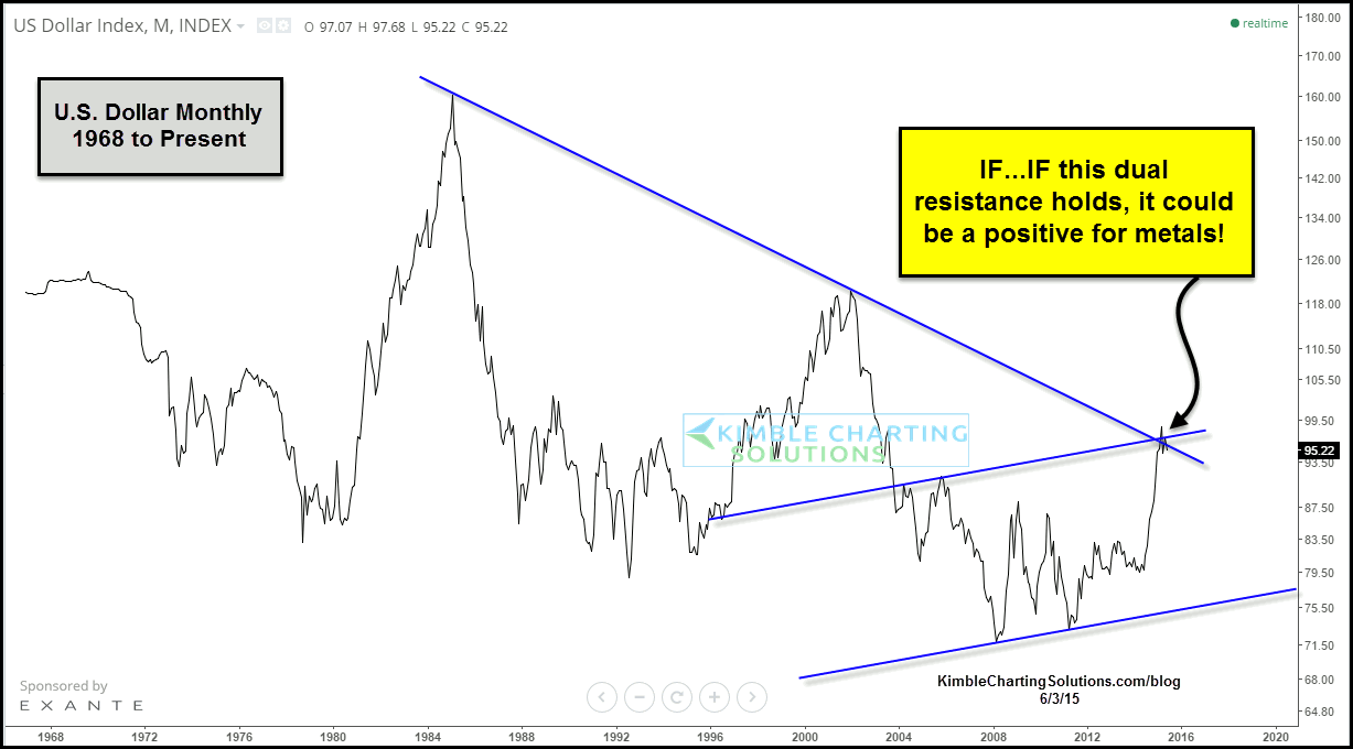
IF, a big IF, the US Dollar would fail to break out here, it would be of help to the precious metals complex. Another intermarket indicator to keep on your radar.
Thanks for reading.
Twitter: @KimbleCharting
Author does not have a position in any mentioned securities at the time of publication. Any opinions expressed herein are solely those of the author, and do not in any way represent the views or opinions of any other person or entity.

 Rolling Over At Key Fibonacci Level?")


